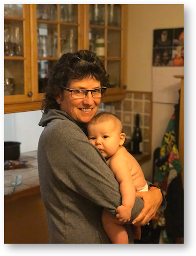
 This week Apple released iOS 10.1, which included the beta of the new Portrait mode for the iPhone 7+. Portrait mode applies what they call a depth effect, blurring things in the background while keeping the focus sharp on faces in the foreground. The effect is limited to the 7+ because it uses the dual cameras to produce this effect. Two lenses, and a LOT of math.
I’m a huge fan of portrait photography, so this effect was a big contributor to my decision to go with the 7+. Spoiler: I love Portrait mode. I’ve taken dozens of portraits so far of adults and children, and the crisp focus on peoples’ faces really makes them pop out of the photos.
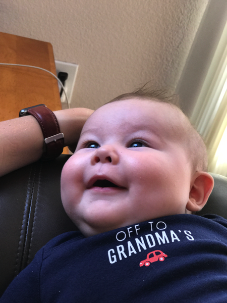
Like the HDR mode on iPhones, you get two copies of every photo. One is a “normal” image and the second has the depth effect. Having the two side by side really highlights the advantages of using portrait mode. For example, I took a shot of my grandson Forbes in Lindsay’s arms. In the normal shot, there’s a stupid outlet just to the left of his head that really distracts from his adorable face. The depth effect image blurs out that stupid outlet.
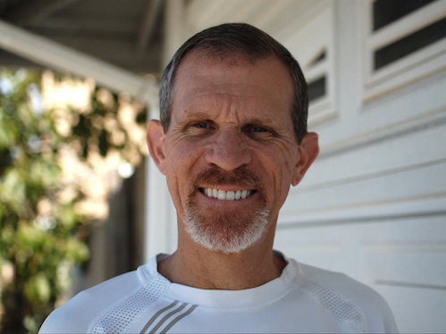
Another example was when I took a shot of Steve outside when I was testing and didn’t notice that there was a leaf from a tree sticking out from behind his head. In the normal shot it looks terrible, definitely a throwaway shot, but with the blurred background in the Portrait shot it’s not at all distracting.

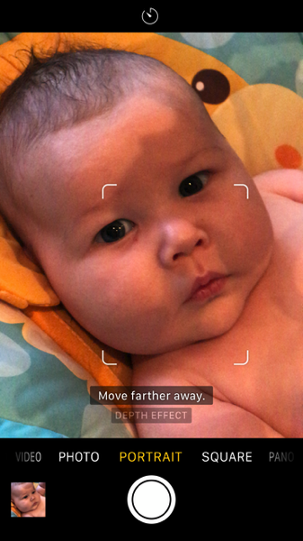 When you start to take a photo in Portrait mode, you’ll get some on-screen clues of what to do. If you’re the correct distance from your subject(s) and it can find any faces in view, Portrait mode will put little boxes around the faces and try to focus on them. If you’re too close to your subjects it will say “Move farther away” or “Place subject within 8 feet” if you’re too far away. Portrait mode will also tell you if it’s too dark to pull the effect off. Also of note is that it uses the smaller field of view of the “zoom” lens, which is 56mm but we’re so used to the wide angle lens that it feels like a zoom.
One of the immediate temptations is to test this mode on something other than faces. Remember I said it takes a lot of math to pull this off, right? Well that math includes focusing on the eyes, nose, and mouth of people. So of course I took a picture of our dog Tesla. I thought it worked surprisingly well.
 Then I tested it on a creepy halloween doll sitting next to a creepy rat. The doll was focused appropriately but the rat had too much depth to his face for the math to work properly. And remember, this isn’t designed for rats, dolls or dogs!
I was pleased with the depth effect from Portrait mode but I thought it might be fun to do a direct comparison to an equivalent lens on a DSLR. A true portrait lens is the 35mm equivalent of 90-130mm, but that size lens would be a distinctly different field of view, so I wanted to get as close to the iPhone’s lens as possible.
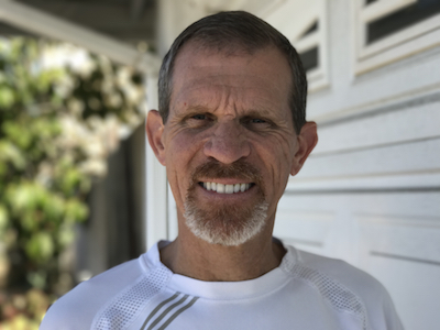
I borrowed Lindsay’s Nikon D40 DSLR and her 50mm f/1.8 lens. I knew that the iPhone’s 56mm lens was f/2.2 so I put her camera in aperture priority and set it to f/2.2. I chose Steve as my subject and put him in front of some ivy and a white garage door. He was wearing a white and grey shirt, and we made sure he wasn’t in bright sunlight.
I took several photos and got two (one on each camera) that were framed just about the same. The first interesting observation was that the lens information from the iPhone 7+ image wasn’t what I’d expected. Apple creates the depth effect using both of its lenses and when it combines them, the resulting image (at least in this example) turned out to be f/2.8 and 57mm. In other Portrait mode images I took, the f-stop and equivalent focal length were different. Interesting, but still close enough for me to compare to the DSLR.
I opened the images from the two cameras, and adjusted the exposure, saturation and aspect ratios till they were comparable. I didn’t want those things to distract in a direct comparison. (Click images below for full resolution.)
Then I enlisted a few of my photography buddies to look at the two images. I told them I preferred they not look at the EXIF data to learn anything about the images but to tell me which camera took which photo and to critique the two. Bart Busschots, Steven Goetz, Allister Jenks, Mark Pouley, and Victor Cajiao all jumped in to talk about the comparison of the photos.
Because they’re photographers, they all explained up front that they could easily tell which camera took which photo and after they pointed it out, now I can see it a mile away. Bart explained it well. He said that while the background blur from the iPhone 7+ is pleasing, on a real lens-created blur, anything bright in the background should look like a large out-of-focus version of what ever shape the lens’s aperture has. Once he said that I remembered seeing blurred out Christmas lights that looked like hexagons. Now when I look at the two camera’s images, I can clearly see that the one with the flatter blur is from the iPhone.
Bart did some serious “pixel peeping” and pointed out several areas where you could tell the errors in the math from the iPhone. There are a couple of spots where Steve’s white shirt is against a bright leaf and it has a small distortion. His beard isn’t all in focus even though it’s at the same distance from the camera. There’s a vertical gutter down behind his head and it’s oddly IN focus in one area.
From these criticisms you’d think the iPhone 7+ image looked awful, but Bart and the others did say that it took some looking to be that critical. They said that the effect was surprisingly well done. Remember it is in beta and for a first cut it’s pretty astonishing.
After talking to the guys, I took a more critical eye to the photos I’d taken earlier, and I could see the same kind of small imperfections in them too, especially with hair. Often on the edges, hair is out of focus.
If you’re hearing this, I’ve put quite a few images in the blog post, including full resolution versions of the DSLR comparison so you can see the effect for yourself.
Bottom line is that I’m thrilled with the new Portrait mode depth effect because it creates images that highlight the faces of the people I love. The iPhone 7+ is now my favorite camera I own.

A skeptical person might think this post was an excuse for Allison to have photos of her new grandson appear in her blog. Fortunately I’m not skeptical and I do like the photos of Forbes.
I’m always impressed by the quality of pics with Apple phones. I’ve taken many shots with my 5s that most people would not be able tell from the same pics taken with my D90 Nikon. Apple phones make great backup cameras when the other gear is tied up or inconvenient to use.
As a photographer, I am quite impressed by this new ability.
Although the effect isn’t perfect, it is still quite good. Especially from a smart phone.
This isn’t something I would use for any of my work, but when I’m out with friends, and don’t want to carry around my pro level DSLR and a f1.2 lens, this will be perfect.
Now I just need to upgrade to the iPhone 7.
Sigh. 😛
@Steve – Not skeptical, cynical. But like she needs an excuse.
Also… Awwwwwww, how cuuuuute.
This was a great blog entry. I don’t have a iPhone7 yet, one day. I appreciated the critiques. And congrats again, Grandma, loved the baby pictures and the rubber band effects on the arms.