Sports Authority rocks, Evan on the International Mac Podcast app for iPhone, and Blind Search to see which search engine you really like from blindsearch.fejus.com. Extensive Blackberry Storm 2 review – Industrial design, touch screen, editing typos, orientation, keyboard and screen real estate, moving applications, documents, audio and camera. In Chit Chat Across the Pond we talk about the under appreciated Mac Mini.

Listen to the Podcast Once (57min)
Today is Sunday December 13th, 2009 and this is show number 237. Last call for you to send in audio reviews for Bart to play on the Bartcast next week. I need them by this Monday night (tomorrow as I’m recording) or I won’t have time to send them to him!
I have a story to tell that has nothing to do with tech but it’s so fantastic I have to talk about it on the show. We bought Kyle a bike for his birthday and gave it to him about 3 weeks ago. He’s just started college and he was delighted to speed up his commute across campus and to get a little freedom to ride off campus. Well 3 nights ago some JERK stole both of his wheels. He had a cable lock around both wheels and the frame, and a U-lock holding the frame to the bike rack, which is the only reason his frame is still here. We were very sad about this, and debated the wisdom of even trying again.
 I thought it was worth it so we carried his bike back into the Sports Authority where we bought it. I gave the guy a plaintive look, showed him the cut cable lock (that we bought there, and asked if maybe they could cut us a deal on getting this situation remedied. I meant like maybe a percentage off on new wheels, but he said, “well, the wheels are no problem but I’ll have to ask my manager about the lock.” He wandered off and Kyle and I asked each other, “did he mean the wheels are going to be free? that couldn’t possibly be the case, right?”
He came back and told us the wheels were definitely free, and they’d give us 25% off on the lock! Amazed we explained that we had planned to come in anyway for some minor adjustments to the bike (it was clicking in all gears). They said they’d have to send away for new wheels and it could take as long as two weeks but we were so grateful we didn’t care. then it got better.
The manager got involved in the discussion and he said, “why don’t we just give you a new bike? that way you wouldn’t have to wait two weeks.” Jaws on the floor as a third guy scampers off to see if they have one in his size, but sadly they didn’t, back to plan A. And then it got better still.
A FOURTH guy gets involved and he says, “you know, we do have the newer model of his bike in his size, it’s the same price, would that be ok?” And we walked out of Sports Authority with a brand new bike, slightly improved model, 25% off the cost of a new lock, and this bike needed NO adjustments.
If you’re trying to decide where to buy sports equipment, I sure hope you will consider what happened to us when making your choice of stores and pick Sports Authority if you have one near you. The customer service we got was nothing like I’ve ever seen before and I would have a hard time justifying shopping anywhere else after the way we were treated. Go Sports Authority!
Evan on the International Mac Podcast App for iPhone
=========insert Evan IMP==========
Hey Allison and Nosillacast listeners, Its Evan from the iPhone app weekly podcast coming at you with another review of a GREAT iPhone app. This weeks app is the International Mac Podcast app. Launch the app and you are given a list of 7 different options. The top one is “Download”. Tap that and you are taken to the iTunes app on the iPhone, and to the IMP directory, with a list of all past episodes available to either stream, or, of you are on wifi, download.
The next option is “Blog” which, without leaving the app shows you the most recent blog entries. Just Tap to read. The Next option is “Team” which gives you a list of every IMP team member, and a thumbnail picture of the person. If you tap the name of a person, and I imagine that is supposed to display information about the person. But for me it is just blank. For every person I tap I get just a blank page. Not sure if it is just me, or if this is a bug for everyone. Something to improve in the next version I guess. The next option in the list is Contact. Which opens a blank email message with the contact address for the IMP team. The next option is “Listen Live” Which, when the team is broadcasting the live recording of the show, allows you to listen in and get a piece of the action. The next option is one that takes you into mobile safari, and takes you to the impodcast.tv home page. The Last option is “Twitter Feed” which again, takes you into mobile safari, to the twitter page for IMP. And I highly recommend you follow them.
The IMP app is available in the app store for free and I have given allison the iTunes link, which I am sure she will out in the shownotes. To find out more about what I do you can follow me on twitter at twitter.com/vanmo92. Check out my new site at iPhoneappweekly.com.
Thanks Evan – as soon as I heard your review I downloaded the IMP app right away. At least this week you didn’t cost me any money! Thanks again.
Blind Search
 Have you heard of Blind Search? It’s not what you think – this time it’s not an accessibility site to be discussed on Down a Blind Alley with Shane Jackson! The idea of Blind Search is to let you open your mind up to different search options. Blind Search does this by returning search results for you from three search engines: Google, Bing and Yahoo!, but it doesn’t tell you which set of results is which. You just get three columns of results, and your job is to vote on which column you think gave you the best results. After you vote for the best one, the three columns reveal their true identity. I think this is a great experiment to do on yourself – perhaps you’ve convinced yourself that Google is, and always will be, the be all to end all of search engines and nothing will ever dethrone it (come on, you really DO think that, don’t you?) – maybe it’s time to test yourself and give the other two a chance. Check it out at blindsearch.fejus.com. Note that it’s NOT at blindsearch.com, that’s a link farm, it’s blindsearch.fejus.com. Let me know what you find out!
ScreenSteps
 When I need to create a tutorial, I turn to ScreenSteps immediately. So easy to write up the instructions, drop in screenshots with annotations and then publish to my blog is a joy. But sometimes I just need one or two screenshots and a small bit of text to put in an email and then I have to revert back to tools like Skitch and typing in the email. Don’t get me wrong, Skitch rocks, love the drop shadow and all, but the annotations are pretty lame and all it does is take screenshots, nothing else. I never thought to ask Trevor and Greg if they could make it easy to write a quick email with ScreenSteps steps in it, but they did it without me even asking! In the new ScreenSteps there’s a clipboard button when you have a lesson showing – click that and then paste into an email and you’ve got a beautifully formatted email showing your dad or brother or customer how to do something on the Mac or PC. It’s so easy, you’ll actually enjoy teaching them! Check out ScreenSteps at screensteps.com and don’t forget the coupon code NOSILLA for 25% off the purchase price of ScreenSteps Desktop.
Blackberry Storm 2
You may remember my review of the Blackberry Storm a year ago, I think my final line about it was that when they took it away I felt like someone stopped poking me in the eye with a stick! I had actually let the battery run down so I wouldn’t have to use it for the last week – it was that awful. Today I’d like to tell you how the Blackberry Storm 2 from Verizon measures up. I’ll compare it to the original Storm, the Blackberry Bold and the iPhone.
Industrial Design
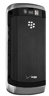
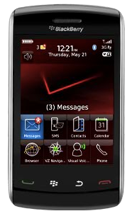
First off, I love the industrial design of the Storm 2. It’s sleek and slender, with rounded edges on both ends so when you hold it in landscape mode it’s very very comfortable. It has a soft finish to it that’s pleasing and since it’s a touch screen there are no ugly hinges or big nasty buttons. It’s simply gorgeous. The screen is bright and crisp.

Touch Screen
Speaking of the touch screen, rewind to how much I truly despised the original Storm’s touch screen technology. It was beautiful to look at, but absolutely horrible to use as a touch screen for typing. You had to literally depress the entire screen to get it to register a single letter. That was the main reason I so thankfully gave the darn thing back. The good news is that the Storm 2 has a much better touch screen. Some functions can be simply selected by touching the screen, like selecting the to: field in an email and then the subject and the body. But to type you do still have to use their “patented SurePress Technology”. You don’t have to depress the entire screen any more, it depresses right where you’re pressing. I’d love to know more about how they do this, because when the phone is off, you can’t indent on the screen anywhere, it’s completely stiff. Only when the phone is active does the screen react physically to you – must be some sort of piezo electric film I’m thinking. Even though this new screen isn’t as annoying as the Storm 1, most people pick it up and assume they can just touch, and when they figure out they have to push on the screen, they sadly look at me and ask, “why?”
While the Storm 2 touch screen is substantially better, I still prefer the typing experience of a traditional Blackberry keyboard like the one on the Bold or the 8820 series, or the iPhone’s touch screen. I’m about the same speed now on the iPhone and Bold, but getting fast on the iPhone virtual keyboard did take a while and definitely did require a leap of faith to begin to just trust it like Steve Jobs told us to. I think it’s possible that with a really long time on the Storm 2 I’d get good on the keyboard, but two weeks of use was not long enough I’m afraid.
Editing typos
RIM made an interesting choice on what to do when you make the inevitable typo. On the iPhone if you make a mistake, it puts the word it thinks you meant to type up above your finger. If you ignore it and go on your merry way, the iPhone replaces your typo with the correct word, arrogantly assuming it knows better than you. This might seem a poor decision, but in reality it encourages you to just fly on that virtual keyboard and assume that the iPhone will simply clean up after you. That’s the trust bit I was talking about earlier. When you really let go and assume Steve knows best, your typing speed will improve dramatically on the iPhone. It takes most people a very long time to get to this point though – six months seems to be an average! But back to the main point – Apple chose to have their word inserted if you ignore the correction when it pops up.
RIM made the opposite choice – if you make a typo it offers you not just one word but several words – and if you ignore it, it assumes you really meant to type it the way you did. That’s almost never the case, if it looks like it’s a typo, it usually is! With the Storm 2, like any phone, you inevitably will have typos to fix after you’re done typing, so let’s walk through the different methods to edit after the fact and compare them.
This is where I really hit a wall with the Storm 2. I don’t think I ever got it where I wanted it, finally I learned to just resort to putting it on some location to the right of the word and then erasing everything up to that word and then retyping it. very poor user interface in my opinion.
Orientation sensor
I was pleasantly surprised with how easily and quickly the Storm 2 rotates from portrait to landscape mode. The iPhone does this pretty well but every so often you find yourself rotating back and forth to try and get it to pay attention. The Storm 2 reacted 100% of the time and always virtually instantaneously.
When you flip the orientation of the Storm 2 the keyboard layout changes. The default in landscape is QWERTY, but in portrait it defaults to two letters per key (which is just silly for anything but pure email writing – can’t predictably write names or urls or anything like that). If you go into the settings you can change the keyboard for portrait to something worse – you can make it have THREE letters on each key so you have to hit the key several times to get the letter you want, just like back on my first Motorola Startac! finally you have an option to change the portrait keyboard to QWERTY. Pure silliness to choose anything else in my opinion.
Keyboard and screen real estate
Unfortunately when the onscreen keyboard comes up, it often takes up an awful lot of the screen real estate. For example, I loaded up App World, the application you have to install to get to the application store (yeah, I know, that’s odd, isn’t it?) to try and find a Twitter application. Unfortunately the App World store is still bereft of many applications, and I didn’t find anything but Übertwitter in there again. But anyway, when you go into the store, you see the search line, one application name, and the rest of the screen is taken up by the keyboard! You have to scroll one at a time through the applications. I thought it would be better in portrait mode but while you do get two entire application names to view at a time on screen that way, the keyboard covers about 60% of the screen.
It wasn’t clear to me why the keyboard has to show in that mode, it’s there all the time instead of getting out of the way until you ask for it. On more than one occasion I was in an application where the keyboard shouldn’t have shown like looking at my calendar, but the keyboard was stubbornly in the way.
Moving Applications
On a standard Blackberry you can move applications around on screen. You click on an app, then launch the menu and choose move. Drag it around on screen until it’s where you want and then let go. Not on the Storm 2 however. I can select it, choose move, but I can’t move it. Dragging without hard clicking doesn’t have any effect other than to scroll the whole menu screen, and if I push on it first, it deselects it from the move command. There must be a way to do it but I never figured it out so I gave up.
Documents
I was very surprised when I received a Microsoft Word attachment in an email and I tried to open it, and it said “this protocol is not supported by this handset”. I thought all smart phones supported this format these days? maybe you have to buy or download Documents to Go or one of those kinds of applications, but I didn’t have to do that on my Blackberry Bold or my iPhone so again the Storm 2 disappointed me.
Audio
As I mentioned, the screen on the Storm 2 is gorgeous and video playback on the device is excellent. I tested out the headphones for a phone call and while they were very tinny sounding, the voice was clear. Oddly the microphone pickup is placed about 4 inches below your chin when wearing the heapdphones. The person I called said that when I was talking the voice was clear and loud but when I stopped talking the mic picked up a lot of ambient noise. This seemed to vary over time, not sure if that’s a problem with the mic pickup or what the problem was.
Camera
I tested out the video camera on the Storm 2 up against the iPhone 3GS and the Blackberry Bold. the lighting conditions were tough – watching TV in a semi-lit room, and then switching to having it look at my laptop screen which was partially dimmed, and then letting the brightness up full on the screen. The Bold did the best job on this test – you could clearly see what was on TV and on the monitor, compensating nicely for the conditions. The iPhone did well on the closeup monitor, compensating easily as the brightness came up but the TV screen in the distance was blown out. The Storm 2 was blown out on the TV, the dimmed monitor and the brighter monitor. I don’t know if this is the best test of a camera, but the Bold produced the bet video results. I did find something interesting in the Storm 2 video though, they have a specific setting to allow you to view closed captions which is cool.
Surprisingly the still camera on the three phones was in the reverse order. I took a fairly close up image of a white card with the three cameras. The Storm 2 took a crisp picture with relatively good white balance – maybe a tad blue but not much. The iPhone took a crisp picture too but was significantly shifted to the red. The Bold was a dismal failure, it didn’t even focus properly.
Storm 2:
iPhone:
Bold:
Bottom Line
Time to bottom line this. The Storm 2 is a beautiful device with a fantastic screen, and very comfortable to use. The touch screen interface is much better than the original Storm but I still wish they didn’t make you push to hit a key. There are a few things they could tweak to make this a much more usable device, specifically the editing interface needs to change. I don’t think the Storm 2 is a bad device at all, but I still prefer typing and editing on the Bold or the iPhone over the Storm 2. The camera is fine, the phone is just fine, screen viewing for reading or watching media is fantastic, and holding the device is very pleasing. Overall I think I’d go with a B- for the Storm 2, but with a few firmware enhancements they could bring this up to a solid A.
Honda Bob
So I’m driving Kyle back form school on Friday and we got to talking about when people retire. I brought up Honda Bob and my fear that he would ever retire. I said, “even if Honda Bob retires, I’m assuming he’ll keep taking care of OUR cars till we die.” And then Kyle says, “but what about ME? I’m going to be driving long after Bob dies – so what am I supposed to do?” Ok, so it was kind of morbid but was pretty indicative of how great we think Honda Bob’s service is. If you’d like to be this passionate about your mechanic, and if you drive a Honda or an Acura, AND if you live in the LA or Orange County areas, give Honda Bob a call at (562)531-2321 or send him an email at [email protected]. HDA Bob’s Mobile Service is not affiliated with Honda, Acura or Honda Worldwide.
Chit Chat Across the Pond
Bart was “shattered” after doing 8 of 12 hours on IMP Live on Saturday where Stu hosted 12 independent episodes in 12 hours. I got to be on the show for the Podcasting segment (show #8) and it was delightful! Look for the shows starting on Tuesday the 15th for 12 days straight! Check it out at http://shownotes.impodcast.com/implive/shows/twelve
shownotes.impodcast.com/implive/shows/twelve
Security Light
Patch Tuesday has been and gone – remember to wake all those Windows VMs to patch them!
Adobe Releases major security bulletin – Flash needs to be updated to 10.0.42.34, and AIR to 1.5.3 (more at adobe.com). Download latest Flash Player from get.adobe.com/flashplayer/
Followups
Google Chrome Beta for OS X hits the digital shelves – and it’s a real beta, not a GMail beta-in-name-only kinda thing. Download from google.com
Thunderbird 3 hits the shelves! Find it at www.mozillamessaging.com
Main Topic – Under Appreciated Mac Mini
Allison just got a Mac Mini, loving it already, does everything we want finally. This teeny little box can drive HD video on my 55″ TV (ok, so a Zune can do that too) and it looks amazing. It’s basically like having a 55″ monitor. Discussion of how we use the Mac Mini and how cool it is for such a little box and so little money.
monoprice.com link for the USB/mini-displayport to HDMI adapter
Well that’s it for this week – if you’re listening on Monday and have time to drop me an audio review or a dumb question for Bart, send it on – if it’s after Monday don’t bother because I’ll be outta here. Bart REALLY wants to play the Dumb Question Corner music, so try to come up with something dumb for him? I didn’t ask but I don’t think his bandwidth could sustain a live video feed so don’t be looking for him at GMT-8 on Sunday night for a live show. I’ll be online a bit in the evenings on vacation but for the most part I’ll be basking on a warm sandy beach, so good luck with all that snow and freezing rain and stuff. I guess I’ll talk to you in two weeks! Thanks for listening, and stay subscribed.

I am so behind on listening to any podcasts, it’s shameful. But I had to read the new review on the Storm 2. My husband upgraded his Curve to a Storm 2.
I really dislike it, every time I tried to type something, it never fails to type the wrong letters! It drives me bonkers, so I don’t touch it.
But he has been getting used to it, and he doesn’t mind it so much, and he really really likes the ability to open documents too.
can he actually view attachments? Word didn’t work for me, wondered if I was just being lame. It’s not a bad device really, just some odd choices. In about a month ask him how he fixes typos, curious if he’s got a good way of doing it other than the fail I created!
Hey you talked about the mini with Bart. And you mentioned a HDMI-Adapter for it to get a Video+audio connection. But the audio is very bad at this segment in the podcast and i cannot find it here. What is this adapter,i neeed it too.
thanks
Michael
Allison, I don’t know if he opened Word docs, but he can open Excel docs. He definitely has the “documents to Go” app. It comes with Verizon I guess.
So, on the Bold, you could open attachments? I keep asking him if he is really truly happy with the phone, and he keeps answering yes. He likes it. He’s gotten used to all the stuff that I can’t stand. LOL I think his 30 days are just about up, if not already up, so he’s gonna be stuck with it.
I really hate that extra effort to push the screen. So much easier on the iPhone. Maybe that’s why he likes it, he never really used my phone.
I asked him about typos last night, and he really didn’t answer. I think he types so slow, that he doesn’t really make them maybe. hmm. I know that word hint/correction option thingie really really bugged him initially. We couldn’t type our town no matter what, but he must have figured out something, because he says it’s okay now. I dunno. boggles my mind!
I really have to listen to the show…sigh. so much cool stuff I am missing out on.
Hey Michael, good call – I forgot to put that in there! adding it in the shownotes and here.
monoprice.com link for the USB/mini-displayport to HDMI adapter
Thanks for the Storm 2 review – I was wondering what you would think of it. Im surprised that RIM has been so slow to react to Apple, but the Bold is a solid device and it seems like the Storm is getting better and better.
this is my favorite unlocked blackberry yet. great screen, much better than the first. email is easy as usual, great for my business. Games are fun for when i’m bored, me and the kid love it. got 2 at gsmauthority.com and couldn’t be happier. great unlocked phone imo.