Pando sent me a shirt, Soundflower and Soundflower from cycling74.com/downloads/soundflower let me down, how to make a 96 picture poster from Jim Heid at macilife.com, Free Fractal Maker from apophysis.org along with some beautiful fractal images at the url is too long to repeat, Soundsource from rogueamoeba.com/freebies, cool flash clocks beeks.eu/Screensaver.htm, Free Cell phone services from David Pogue, start of a series on Google tools, including finance.google.com, blogsearch.google.com, and books.google.com. A snotty Zune review, Pathway for wiki search at pathway.screenager.be.
Subscribe to the Podcast –> 
Listen to the Podcast once – 31 min 02 sec
I really feel for my friends in the midwest and east coast with the dumping of snow they had this week, but I gotta tell you it was rough around here too. On Monday morning it RAINED nearly an eighth of an inch here! I had to DRIVE in rain, and my husband’s new car got wet. It was awful. It’s so funny around here, for the first rainfall of the season people actually leave work early. We march around saying dramatic things like “Storm Watch 2006!” The poor weather people, they have these fancy new doppler weather systems “Live Doppler 7000!” and nothing to report 90% of the time! I swear you could make a recording and just play it every day. it goes something like this, “early morning low clouds followed by hazy afternoon sunshine.” I hope all of you stayed snug and warm this past week!
Pando
For all of my shareware and freeware reviews, I try shoot a note off to the developer to let them know they’re getting some press. If I’ve written a scathing review I won’t necessarily do that, but mostly I only tell you about the good stuff, so it gives me the opportunity to get to know the developer if they respond. I’ve gotten to know some very enjoyable people this way, and to thank them for the cool work they do for all of us. A few weeks ago I reviewed the free software Pando, which is an awesome cross-platform method of transferring large files to your friends using an interface that’s so easy it feels like you’re just sending an email. I sent a note to the development team over at Pando, and they wrote back that they were not only excited to hear that I liked the software and reviewed it, but that they were going to send me a shirt!!! Isn’t that cool? Many thanks to Shlomit and Richard for their kindness. I put a picture of me wearing my Pando shirt in the shownotes.

Soundflower
Last week I told you about a few shareware tools recommended by our listener Big C, but he actually recommended one more to me. Big C went on to say: “Also for recording your audio there are two programs you should look at. Soundflower (from cycling74.com/downloads/soundflower) along with Line In (http://www.rogueamoeba.com/freebies/). There are walk throughs on how to hook it up. Simply put it allows most every recording program to record from your own internal sound card. If you hear it you can record it.
I had heard of SoundFlower before but I’ve never gotten a good explanation of what it actually DOES. I headed over to Cycling74, and found out that it’s an open source project which is cool, but there’s no Windows version, only Mac. They don’t exactly give great clues for what it’s for on the installation site, it simply says “free inter-application audio routing utility for Mac OSX”. I didn’t say it was CRITICAL that I know why I’m installing something, so of course I downloaded and installed anyway!
The download went fine, but Soundflower is one of those nasty apps that makes you reboot after installation – I hate that! I reboot as seldom as possible so it irks me when I have to do it. so I rebooted, and I couldn’t find Soundflower anywhere on my disk! well that’s weird. My ADD kicked in and I didn’t do anything with this for a week or so, till yesterday when I thought, gee, maybe I didn’t install it right. I downloaded it again, installed it AGAIN, and rebooted AGAAAIIINNNN, and sure enough, there’s no Soundflower anywhere on my disk! there was an app included called Soundflowerbed, and i dragged that to my apps folder, but when i double click it, absolutely nothing happens at all!
I’m sure I desperately need this software, but does anyone have a clue to what it does? Or where it even is? or why the soundflowerbed program doesn’t even open?
96 Picture Poster
 If you’ve got a Mac and you’re trying to think of a great gift for a really close friend or family member, one of the coolest things you can do is right at your fingertips. You can create a 20x30inch photo poster with 96 photos making up the image. Imagine a collage of photos of you and your best friend from childhood to today, or pictures of yourself growing up just for your mom, or even a poster for yourself that collects your favorite high school photos together to take with you to college so you can bring your memories with you.
Automator scripts, which we’ve talked about before, make it possible to automate actions that are already available (if tedious to repeat) on the Mac. A dear soul went to the trouble of writing an Automator script for the rest of us that takes 96 square-cropped photos from an iPhoto album and makes them into one giant jpeg or PDF file suitable for high quality printing. You can even print it straight from iPhoto by the Apple photo printing service.
This Automator script has been around for a few years, but I just used it again to wow a friend of mine with a very special gift, and I thought it might be a great time to share this with the holidays coming. The full instructions are available from Jim Heid on his Macintosh Digital Hub website at macilife.com and of course I put a link in the shownotes.. You can head right over there and follow his great instructions, or you can follow along here.
the steps are pretty darn easy – first create an album in iPhoto by clicking the plus sign on the bottom left. then bring your first photo, set your constraint on cropping to square, and then move the little square around on your photo till you have it just the way you like it, and hit crop. rinse and repeat 95 more times until each photo is now square. open your album with your 96 square cropped photos, and do an Edit–>Select All (or hold down command-A to select all). Now you need to download the Automator script from macilife (again, a link is in the shownotes).
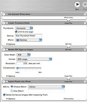
 Installation of the script will create a folder on your desktop called Thumbnail Poster Files. In there you’ll find the workflow we want to run, called “Create Thumbnail Poster.workflow”. If you double click this workflow, it will launch Automator with the workflow all set up on the right hand pane of Automator. At this point, depending on your version of iPhoto and the speed of your machine, it may spend some time indexing your iPhoto library. I remember a couple of years ago when i did this it took forever, maybe like 10 minutes, but this year in iLife 6 on the MacBook Pro I didn’t even see it if it did it, so either the machine is really fast, or the newer version of iPhoto changed things. In any case, if it seems locked up on your version, just let it finish.
Right now you’ll realize that I sold you down the river a bit, I am teaching you how to make a poster with square photos, but it turns out you can actually make them with horizontal or vertical rectangular photos! I did that for two reasons, it’s the only way I’ve ever done it, and because it’s hard to find a full set of 96 photos you like that are ALL horizontal or ALL vertical! I also made you crop your own photos, which the Automator script will do on it’s own if you let it, but I would hate to have you got through all this and then end up with Aunt Gertrude’s head cut in half because iPhoto didn’t know where to do the crop!
now that you’ve forgiven me, in the Thumbnails pulldown, pull to Square, name your output file, and choose where to save it from the next pulldown. You can also adjust some things about the jpeg resolution and change where in your iPhoto library it’s going to put the file, but I’ve always just left the defaults alone. We’re finally coming to the fun part. simply hit the Run button and Automator will do all the rest!
When it finishes churning, it will create two files – a pdf version and the jpeg. The jpeg is the one you want – the pdf was about 200MB, and that just irritated the people I gave it to to create the poster for me – while the jpg was only around 10MB. Your newly created photo poster will come into the “Last Roll” album, and now you can click Order Prints at the bottom of the iPhoto window and order a 20×30″ photographic poster for only $22.99! I didn’t have time to wait for it to be mailed to me and so it was $65! at the local Kinkos, so I highly recommend going through Apple’s print service, which is run by Kodak.
I may have made this sound really complicated, once you’ve downloaded the Automator action, all you do is select all your photos and then hit Run in Automator! it’s just that easy!
free fractal maker for windows
According to Wikipedia, a fractal is “a rough or fragmented geometric shape that can be subdivided in parts, each of which is (at least approximately) a reduced/size copy of the whole”. If you haven’t seen a fractal image, you’re in for a treat in this next tip. While fractals are computed mathematically, they can be beautiful works of art that make you think of real life beauty. There’s a reason for that – fractals are a natural phenomenon that kind be found all around us – in clouds, trees, seashells. TechRepublic has a whole slew of awesome fractal images on their site (the url is too long to repeat, look for it in the shownotes) where you can lose hours of your time if you really like this stuff. if you really like the fractals, consider making some of your own. There’s a freeware tool for Windows licensed under the GPL that will allow you to make fractal images on your PC. The tool is called Apophysis, and is available at apophysis.org (spell apophysis).
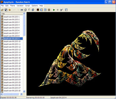 I downloaded and installed Apophysis on Windows XP under Parallels on my Mac. When you first launch Apophysis, you see a large frame on the right with some crazy fractal on it, and along the left panel a list of randomly generated Flames. not sure why they call them flames, but there you are. i clicked through a bunch of them and found some pretty ones (not as cool as any of the ones on the TechRepublic site, but still kinda neat. Then i went into the editor, and in there I clicked the transform tab and I was able to drag these triangle points around and change the flame image real time. I found where you can change the color of each of the triangles which is evidently related to the colors in the fractal but I didn’t play with it long enough to do any real damage. If you like math and you like art, I think Apophysis might be a fun project for you to play with, go check it out at apophysis.org.
SoundSource
I discovered a new freeware application all by myself! Here’s the problem statement. When I’m recording a podcast, I frequently have to mess around with the audio inputs and outputs to switch over to my microphone and headset after I plug it in. it’s not that going over to the apple and pulling down to System Prefs and clicking on audio is all that hard, or even using Quicksilver to bring up the System prefs is really hard, but what if I could get to those switches more easily? Another problem when doing recordings is remembering to turn off all programs that might make sound. Last week i forgot that Yahoo’s clock widget chimes on the hour – it’s a pretty little chime, but definitely not something I meant to have ring out during the show! I have to remember to quit my mail, shut off iChat, and all sorts of other things.
![]() SoundSource from rogueamoeba.com/freebies looks like it might just solve all those problems – and it’s free! I downloaded and installed SoundSource, and the installer did something very interesting – it gave me the option of seeing what files it had installed.
SoundSource from rogueamoeba.com/freebies looks like it might just solve all those problems – and it’s free! I downloaded and installed SoundSource, and the installer did something very interesting – it gave me the option of seeing what files it had installed. 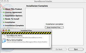 SoundSource has an AWESOME icon – it’s of a little blue sorta potato looking guy inside a box holding a rifle and he’s got like this ninja red headband and sunglasses and a great grimace on his face! of COURSE I put a picture of it in the shownotes. It could be that this is the Rogue Amoeba icon for everything, I’m not sure but I know I liked it!
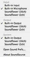 Ok, enough with how cool it looks, let’s get back to what it does. Sound Source puts an icon in the menu bar of a pair of headphones, and it gives a pulldown menu with three sections – Input, Output and System. you can also get right to the sound preferences from there. Strangely enough, in each of the sections, I can see the built in sound, but also Soundflower with either 2 or 16 channels. what the heck? I can’t find Soundflower, but here it is invading Soundsource?
Let’s test it now. In Soundsource I chose my headset microphone as the input. I went over to GarageBand where I do my recording and unfortunately it hadn’t switched the mic input there, I had to use the GB preferences to do it. Well, it failed on solving problem 1. Problem number 2 – the one where system sounds come through into my recordings is a tougher one. I still had Soundsource seeing the headset mic as the input, and both Output and system were set to built in output. I started recording in GB, and while talking into the headset I sent myself some email so the ding sound would normally come through to the mic. I heard the ding in my headset, but when I played back the recording in GB, the ding wasn’t there! Yay, this is cool! It looks like Soundsource solved my more difficult problem and that makes me happy. now the real trick is whether I can remember to set it every week while I’m recording – what are the chances of THAT?
cool flash clocks
Listener HDAbob sent in a link to a cool site where people have created some really interesting clocks using Flash. I like some of these so much I’d love to have them as a hovering clock on my system, like maybe as a Yahoo! Widget. Unfortunately they only exist on the website. One of them is available as a screensaver for Windows so check that out. the url is beeks.eu/Screensaver.htm (note the capital S in Screensaver). Enjoy!
Free Services to Inspire Your Cellphone By DAVID POGUE
David Pogue is a wonderful technology columnist for the New York Times. I came across an article by David where he explains a whole bunch of cool free-ish services you can get on your cell phone. for example, would you like to have free directory assistance? for the price of a 20 second ad, you can get it at 800-free-411. Check out the link in the shownotes to David’s article and check out all the fun stuff you can do with your cell phone.
Google tools
We all know and love Google and wish we’d bought stock early on, but how many of the Google tools do you really know about or actually use? Search is the king of their tools, and you’ve probably used Google Images to find images, and maybe you’ve fooled around in Google Video (but you probably like YouTube better). Google Maps are pretty popular and Google Earth has caught a lot of attention. I told you about Google Alerts back in August (that’s the thing where you can have an email sent to you every time some news breaks on a topic you’re following). Would you believe there’s more than THIRTY more Google products?
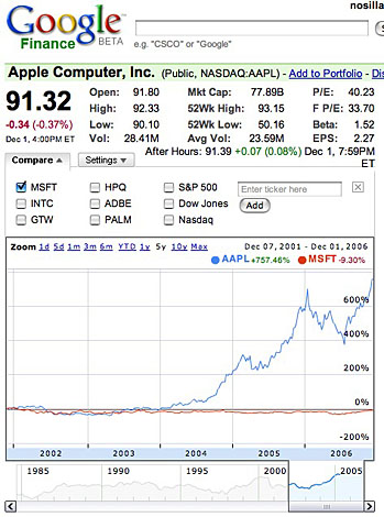 I’m going to start going through some of the tools I’ve checked out recently (but hadn’t ever noticed before). I have been using Yahoo! finance to look at stocks for a long time, I never noticed there’s a Google Finance too and of course they’ve done a better job of it. At finance.google.com you can type in a stock symbol – let’s look up Apple just for fun, shall we? if you don’t know the symbol, you can type in the name and google figures it out for you. Right off the top that’s better than Yahoo, there you have to either know the symbol, or go through their lookup menu. At first glance Google’s finance page looks about the same as any other stock site (except of course just a little bit more pleasing to the eye), but I noticed a couple of awesome features in the graph. if you put your cursor over the graph, you’ll see a tiny little blue ball riding along the shape of the curve, and in the upper right of the chart it shows you the value of wherever you’ve slid the ball around to on the graph.
Next try this – change the option along the top to say 1 year. It changes instantly of course. now look below the graph, you’ll see a slider bar against the background of the entire number of years the stock has been around (in our Apple example, just around 1985 is all the way back). Slide the slider and the graph above changes real time as you slide to the year you’re sliding to. does that make sense? go check it out so you can see what i mean. You can also just drag the graph by pushing on it with your mouse and moving! again, so intuitive to have it work that way.
Now let’s do something even more fun. on the upper left you’ll see a pulldown that says Compare. You can enter any ticker symbol you like, but for this explanation, let’s choose Microsoft, which is one of the default choices they have out there – so click on the button that says MSFT and then click on the link to change it to 5 years. this is a personal favorite chart of mine – it shows Microsoft at -9.3% over the five years, and Apple as up 757%! it’s beautiful. (sigh) If you change it to 10 years, it Microsoft goes up 197%, but Apple is up 1414%! it’s actually not until you hit the Max which takes it to 1984 that Microsoft has actually grown more than Apple (Apple is up 2656% and Microsoft is up 28K%. anyway, this was supposed to be an explanation of a Google tool, but you can see through this illustration how useful the Google finance page can be.
Have you checked out Google Blog Search? it’s available at blogsearch.google.com. Nice empty interface, type in your search term, how about “freeware”? Google Blog Search comes up with a whole slew of blogs about freeware that I’ve never even heard of! they let you see their RSS and Atom Feeds, and they link over to Google Alerts where it will search blogs and send you an email whenever someone posts about freeware! Boy is THAT a way to get a lot of email if you’re bored! I tried to narrow it down by searching on Macintosh Freeware, and I found two of my favorite apps being talked about – Pando and AppDelete made the first page! It found nearly 7000 blog hits on Macintosh Freeware! Guess I won’t be doing a blog alert on that one either! In any case, if you’re looking for blogs talking about a specific topic, this is a great place to search for it.
I’ll do one more Google tool this week – how about Google Book Search? this is the very controversial effort by Google to scan in all of the books in the library. I know it sounds crazy but that’s what they’re trying to do. It’s controversial because of copyright laws, and especially because most books don’t identify the copyright holder so their permission wouldn’t be possible to get anyway. Let’s see what we can find. I started at books.google.com, and typed in Lassie. The first hit was Lassie Come Home, so I clicked on that link, and in front of me was about 45 pages of the book. They refer to these as previews, and there’s a blurb that says pages 46 to 251 are not part of this preview. In any case, I could scroll through the pages with the scroll bar, or like any good google tool I could do it by clicking and dragging with my cursor for very smooth scrolling. On the right side there are links to the contents, where to buy the book, and a search field for the book. I remember reading the Lassie books as a child, and they talked frequently about tricolor collies, so I did a search on that term, and it found 3 hits, and allowed me to click a link to see the phrase on the appropriate page. I’m afraid I got a bit caught up in the story line – I loved the Lassie series as a young girl! anyway, check out Google Book Search if you need to find a term in a book you remember, maybe to settle a bet, or to find the perfect quote.
Zune
I’m sure you’ve all heard about Microsoft’s Zune player, right? It’s pretty funny that they dubbed it the “iPod Killer” before it even came out. The reviews are just awful on it – it’s 44% bigger in volume, and 17% heavier than the 30GB iPod! the one thing people like is that the screen is bigger, I think it’s 3 inches vs. 2.5 inches, but it turns out the resolution is exactly the same, so the pixels are just bigger. Anyway, my son and I decided to go over to CompUSA to look at it. When we picked it up, the bulk compared to the iPod was much more noticeable that the .15 inches thicker it is, but it’s also squared off instead of rounded edges like the iPod. Actually reminded me a lot of the first generation 5GB iPod, clunky and sharp corners. The sad part was that it wouldn’t even turn on – it kept showing a charger symbol, but when we unplugged the charger it showed that it was almost out of power and then promptly died. Great ad i thought! then we went over to some fake display models they had, and we saw the lovely brown model. Good gracious, what were they thinking? Did you want a device that looked like mud (or something even worse?) As if that weren’t bad enough, they added a thin green band around the middle of the sides, it just sets off the mud brown something awful. I would love to have seen the expression on Steve Job’s face when he first got a glimpse of this thing with the words “iPod killer” around it! I’m not discounting MS to come back with something way better but for now it’s at least a good comedy discussion piece!
Pathway
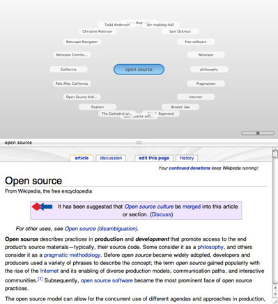 Do you have ADD like me? Have you lost the will to concentrate as Leo Laporte once said? Do you find that when you’re surfing the web you look up suddenly and realize you don’t know how you got to where you are and how to get back to what you were supposed to be working on? A 21 year old Belgian student has come up with a way to solve this problem, at least when you’re searching in a wiki. He wrote an application called Pathway which is a Mac donationware application. He says it’s free to use but if you like it, please donate using his paypal button. It’s available for download at pathway.screenager.be.
I downloaded and installed Pathway to try and get a feel for how it works. First you enter in your search term, and the wikipedia version you wish by language. you’re then faced with an upper and lower pane – the bottom half is the wikipedia entry, and the top half is the Page Web as they call it, which is a graphical map of how you’ve been surfing. to explain this I’ll have to use an example. I started by searching on the term “open source”. I see the wikipedia entry below, and above there’s a blue rounded button with the word open source in it. In a split second, a whole bunch of white buttons floated in an oval around the open source button, each one of which is a link in the page below. so I can see netscape, open source initiatives, pragmatism, and free software for example. I can click on a link in the document, or click on one of the links in the oval.
I clicked on a few links randomly in the page view and in the web view, and pretty soon I’ve got a pathway I can see from my initial search on open source all the way to where I ended up. Here’s where it really gets cool. I can click on any of the buttons I’ve passed through and instantly get back to that page. on the left side there’s a sequential list of the pages I’ve visited, i can jump to them using those links as well. the map can get pretty messy pretty quickly, but you can scroll around in it by clicking and dragging, and there’s a zoom scroller right on screen. I should have mentioned one other thing, on the right there’s a drawer which is constantly updated with the table of contents for the site you’re visiting. I didn’t realize that wiki’s had a table of contents for a given page, so I learned something right there. You can jump to anywhere on that page using the TOC as links, but you haven’t actually left the page yet so you won’t see any changes to the map.
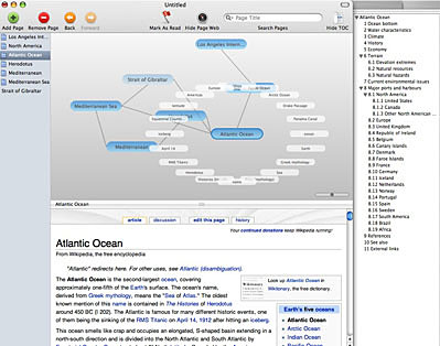 As if this weren’t enough, you can also add a page in the middle of your journey – let’s say you decide to jump to an unrelated topic, you add a page and you get a new blue button just out in the middle of some empty space on your map view. By the way he calls it a Page Web, not a map, but that sounds very confusing so I’ve just decided to rename it! You can remove a page too, so something that linked to areas of exploration on your map simply disappears and they’re no longer linked. The software has no undo function, so use this button with caution!
You can jump straight to a site in your browser from Pathway which is nice too. You’re supposed to be able to save your pathways but I saved one and closed it, and when I tried to reopen it, it came back with an error “the model configuration used to open the store is incompatible with the one that was used to create the store”. what the heck does that mean? what store? There’s also a revert menu pick under edit that i can’t seem to figure out what it does – I tested to see if it’s the undo button but it doesn’t undo – can’t figure out what it DOES do. within your map, you can click on one of the buttons representing a page in wikipedia and mark it as read, and it makes it a paler blue with a darker border so it looks different from the other pages. That would be nice when you’re trying to find something again.
The final cool thing about Pathway is if you find a web page in wikipedia that you want to save for later, you can hit export page. It creates a web archive that when opened from the finder brings up the saved page in your browser. this would be very handy for offline viewing at a later date. Over all I think Pathway is a very cool piece of software that could provide a lot of utility when doing research in wikipedia. I just wish it worked on the entire web, wouldn’t that be awesome?
Looks like that will wrap it up for this week’s episode of the Nosillacast, keep your great feedback and ideas coming by sending me emails at [email protected], or if you have a hankering to hear your voice on the virtual air, send me a voice recording at [email protected]. don’t forget to head on over to the forums and enjoy the discussions over there at podfeet.com/forums. Thanks for listening, and stay subscribed.

For all new Mac users and for the experienced Mac users, I remind them every now and them that Google has a special search box for them.
http://www.Google.com/mac
Previously, that web page showed the Google logo in the gorgeous original iMac colours. However, now the marketing folks have taken over that page and turned it into a Google Toolbox for Mac users. On that page, one can now quickly access Google’s services for Macintosh, such as:
– Google Toolbar for FireFox
– Google Earth
– aaah, just visit that web page and see for yerself
Have you ever tried Grokker? It is a search engine based on Yahoo, but you get to sift through layers of info..give it a try.