 You have probably figured out by now that I’m not an artist. That doesn’t keep me from being interested in applications to create art and to appreciate those who use them well. I used to think all digital art was created using pixel-based drawing and painting apps. It turns out that amazing art can be created using vector design programs.
I bought Affinity Designer, a vector app from the same people who brought us Affinity Photo. I joined a Facebook group for Affinity Designer and have been amazed at what these people can do. I had no idea everything from cartoons to paintings could be created all with vectors. I’ve been happy to use Affinity Designer to create such masterpieces as the Security Bits, Tiny Tip, and Dumb Question Corner logos. See opening statement about my artistic talent.
I’ve wanted to do a full-scale deep-dive review of Affinity Designer for the podcast and also a tutorial for Screencasts Online, but after my best efforts I’ve only scraped the top surface of what it can do. I even bought the book and started working through the lessons but much of it was beyond my skills, so I don’t think I can do Affinity Designer justice.
While Affinity Designer is quite moderately priced for a pro app at $50, for some even that price is too high. It’s also only available so far for the Mac and Windows, but not for iOS. I’ve been itching to use my Apple Pencil with a vector design program on the iPad Pro.
Enter Vectornator Pro, a vector design application for iPhone and iPad from vectornator.io/…. (Why is the coolest stuff at .io domains?) If you’re an Affinity Designer pro, i’m sure you would find that Vectornator is not nearly as capable as Affinity Designer, but let’s see what it can do and see if it can meet your needs. It used to cost $7.99 but for some reason, it’s now free.
One of the reasons I like Vectornator is that I was able to figure out how to use it without reading the manual. But eventually I had some questions and went hunting for the manual, but didn’t find one on their website. There are two short video tutorials you can access from within the app (which actually did explain the two things I was confused about). I searched their website and found a link to their blog, which is noted on Medium (medium.com/vectornator). I started reading some of the blog posts and eventually stumbled across a post in April where they linked to the secret manual. I’ll save you some hunting and post a link to the Vectornator Pro manual here.
I said up front that Vectornator runs on both iPad and iPhone, but I’ll concentrate mostly on how it works on iPad. It does have great support for Apple Pencil but it’s definitely not a requirement. If you’re skilled with your finger more power to you, but you may want to use a stylus of some sort.
I’m going to describe Vectornator assuming you’ve never used a vector design program before. This will entertain the real designers amongst us.
First Start
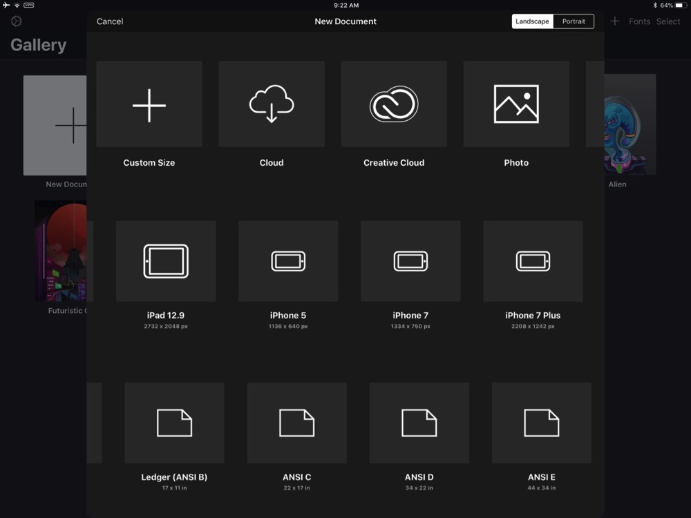 Just to make you feel bad about your skills, Vectornator opens to the Gallery showing five amazing drawings done with the app, but we won’t look at those, ok? When you hit the new document button, you’ve got a ton of options. Vectornator invites you to open existing documents through Integration with cloud services via the iOS Files app, with Creative Cloud for the Adobe folks, or Apple Photos.
You can create new documents with standard screen sizes like 1024×768 up to Ultra HD, and also screen sizes of all of the Apple iOS devices from the iPhone 5 size up to the 12.9” iPad Pro. I think this shows an attention to developers and designers of iOS apps.
Regular Shapes
The left sidebar has all of the tools. You can start with some standard geometry like rectangles and ovals, or a get fancier with polygons and stars. After you click and drag to draw in a shape, you’ll immediately get a popup on the bottom of the screen with a slider. Rectangles automatically come with rounded corners and you get a slider to change the radius to your liking. The star has a slider for how many points you’d like, and the polygon for the number of sides.
Without a shift key on iOS, it wasn’t obvious to me how to draw circles and squares instead of ovals and rectangles. The first video tutorial explained how to achieve this objective. Touch the screen with one finger and start to drag, then touch the screen with a second finger. As you continue to move your first finger to draw your shape, it will stay a square/circle.
This is a little tricky because two fingers on screen are used to pan the canvas around. The difference is in the timing. Two fingers starting at the same time are to pan, one finger with a slight drag and only then adding the second finger gives you the control of a shift key.
The video explains that you could attach an external keyboard to your iOS device, but note that the Apple Smart Keyboard shift key does not work to make squares and circles.
While we’re on the subject of missing keys, another one you might want is the alt key. If you had an alt key, selecting an object and dragging would let you duplicate the object. The workaround for the missing alt key is very different from the shift key solution. In the upper left of the canvas area, written in very dim grey is the word “alt” with the alt key icon.
To use it, select an object, tap alt once and then drag your object. It will be duplicated. You can drag again to duplicate again, because the alt key stays held down until you tap again to release it. If you’re like me, you’ll forget to tap alt when you’re done and accidentally duplicate your object again, and then tap the undo button. If this sounds too tricky, you can select your object(s) and tap on the Edit menu and select Duplicate.
Formatting Objects
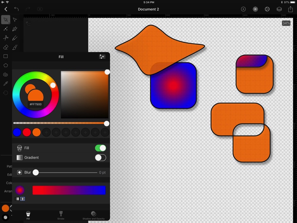 Vectornator at first starts by filling objects with bright turquoise. In the bottom left there’s a bright turquoise circle just begging you to change the color. You really can’t miss it. Once a color has been chosen (along with the other settings I’m about to describe), the app keeps that color combo until you change it, even across documents. Nice consistency.
Tapping on the fill color (the bright turquoise when you first start), brings up a lot of options. You’ve got a standard color wheel, plus a square area on which you can drag your finger to change opacity from left to right and the brightness fo the color from top to bottom. There’s an icon in the upper right of this menu to switch from the color wheel to RGB or HSL sliders.
There’s a slider for opacity below the two color options and when you find a color you like, you can add it to your palette of saved colors. They put in blue and red with a bunch of plus signs next to it to give you a hint that you can save colors. That’s what I mean about Vectornator being easy to learn.
There’s a switch to simply turn off the fill or you can add a two-color gradient. You can choose between a linear and radial gradient with the tap of a button. At first the radial gradient didn’t look right because I couldln’t see the center, and I didn’t see how to modify it, and that’s when I figured out you need to tap out of this fill menu I’ve been describing.
With the shape you’re messing with selected, you’ll see two highlighted circles on your shape with a line between them. Dragging these two circles around changes the radius of the gradient just like in any other tool. Finally in the Fill menu you can blur the whole object with a slider.
On iPad, the fill menu takes up a fair amount of screen real estate, so you need to tap away and grab the canvas with two fingers to position your object so you can see it with the fill menu open. On iPhone the Fill menu takes up the entire screen, so you can imagine how much flipping in and out you’d have to do in order to see what you’re doing. I’m not saying the developers didn’t do a great job with the screen real estate they had, but rather that the iPhone might be a bit tedious in which to work.
The menu I’ve been talking about is really more than just Fill. At the bottom you can flip over to Stroke and Shadow/Opacity. I better not go through this in excruciating detail or we’ll never get to the actual vector part of the program! In short you can change the color and width of the stroke around an object and even make it dashed, and if it happens to be a line you can add arrow heads here.
Vector design programs rely heavily on your ability to control where the center line of the stroke of an object lies. Imagine you’re trying to line up two rectangles, do you line up to the outside or inside edge of the stroke, or perhaps the middle? You can control where that line is within the stroke menu.
Beyond setting the color and angle of a drop shadow (you know I love me a nice drop shadow), in the Shadow and Opacity menu you can also change the blend mode of the object as it affects the one below it. There’s at least a dozen of the usual suspects like darken, lighten, multiply, etc.
I’m a precision person, with engineering boringness wired into my DNA, so when I use colors, I like a standard palette where I can pick the same color precisely. But artsy-fartsy types aren’t held to such rigidity. They like to grab a tool and pick a style from something they’ve already created. Vectornator has those people covered – there’s a little eyedropper than you can tap around on screen to apply a style from one object to another, changing thing like fill color, stroke style, thickness and color.
Vectornator employs the touch interface quite well. Dragging objects around with your fingers is quite natural, One of the joys of working in a vector design program is that you can zoom in as far as you want and everything scales perfectly with no jagged edges. Doing this with a finger pinch on iPad is natural and quick.
Vector Drawing
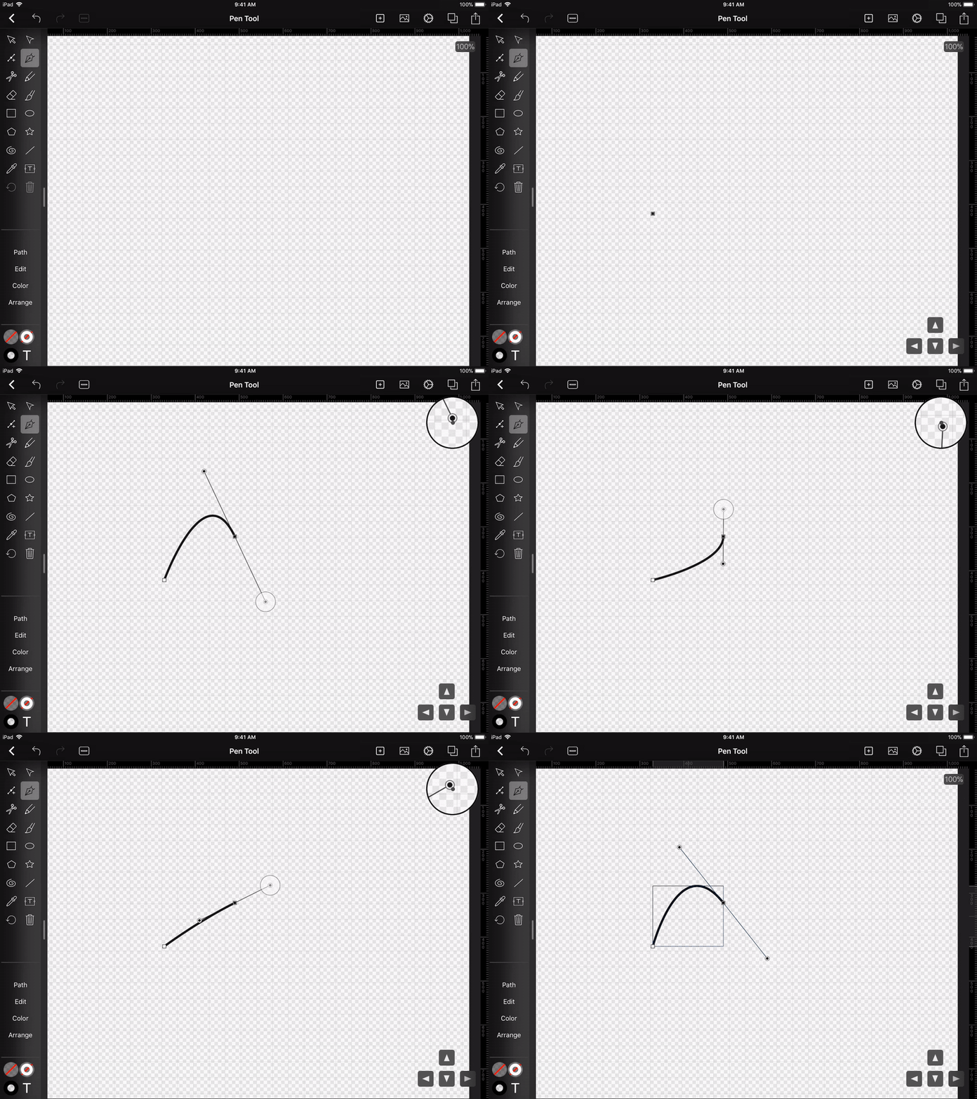
FreeHand drawing with a vector-design program is very different from drawing with a pixel editor. With the pen tool, you can tap on screen to add a corner point and multiple taps will create a path with sharp corners.
But if you want to draw a curved path, you tap and drag. At each point, you can control the shape of the curve you’ve drawn. The controls are difficult to describe, and are a little bit hard to wrap your brain around even when you’re using them.
Each anchor point you drop has or is part of what’s called a Beziér curve. The curve is controlled by a line that is tangential to the curve at the point you’re editing. The length of that tangential line changes how sharp the curve is and changing the angle of the line changes the curve’s shape as well. I said it was hard to describe. Luckily I found a great little animated GIF in the Vectornator blog that is worth a thousand words so I put that in the shownotes so you can see what I mean.
Vectornator lets you easily create shapes using the pen tool (it looks like a fountain pen if you’re old enough to know what those are). Once you draw your coarse shape, you need to switch to the regular cursor arrow to select points and then drag their control lines around to modify the shape to your liking.
There’s a tool that looks like one of these control lines that has a little + next to it. By experimentation I figured out that if you have a control/anchor point selected, and you tap that icon, the anchor point will be deleted. That’s a good thing because it’s easy to drop too many points and it actually makes it a lot harder to adjust the shape smoothly.
I had to watch one of their video tutorials to find out how to add a new anchor point. First select the entire object by a tap or dragging around it. Tap that icon (wish I knew what it was called), and then tap between two anchor points and it will add a new one. Be sure to tap on another icon to stop adding anchor points when you tap on screen again.
You can also add anchor points via the menu called Path down in the bottom left. Instead of adding a single point, it basically doubles the number of points by adding one between each of your existing points. I would think this would be an easy way to start smoothing out some curves.
Interacting with Objects
In the little I know about vector design, I’ve learned that designers create interesting objects using Boolean operations on multiple objects. They join objects together to create one object that’s a superset, or subtract one from another, cutting away part of one, or they take the intersection of the two, or do the reverse and exclude them which leaves everything but where they overlap.
Of course Vectornator supports all of these functions. It’s in an odd menu in my opinion. If you first select more than one object, then the Path menu will contain these options. They even support masking of one object from another which probably means something to designers. You get a little “M” on masked objects, alerting you to the fact that you can also unmask them later at your pleasure.
There aren’t a lot of menus in Vectornator, which is kind of a relief from the complexity of a high-end tool like Affinity Designer. At the top left there’s a dashed rectangle with an X in it which allows you to deselect objects.
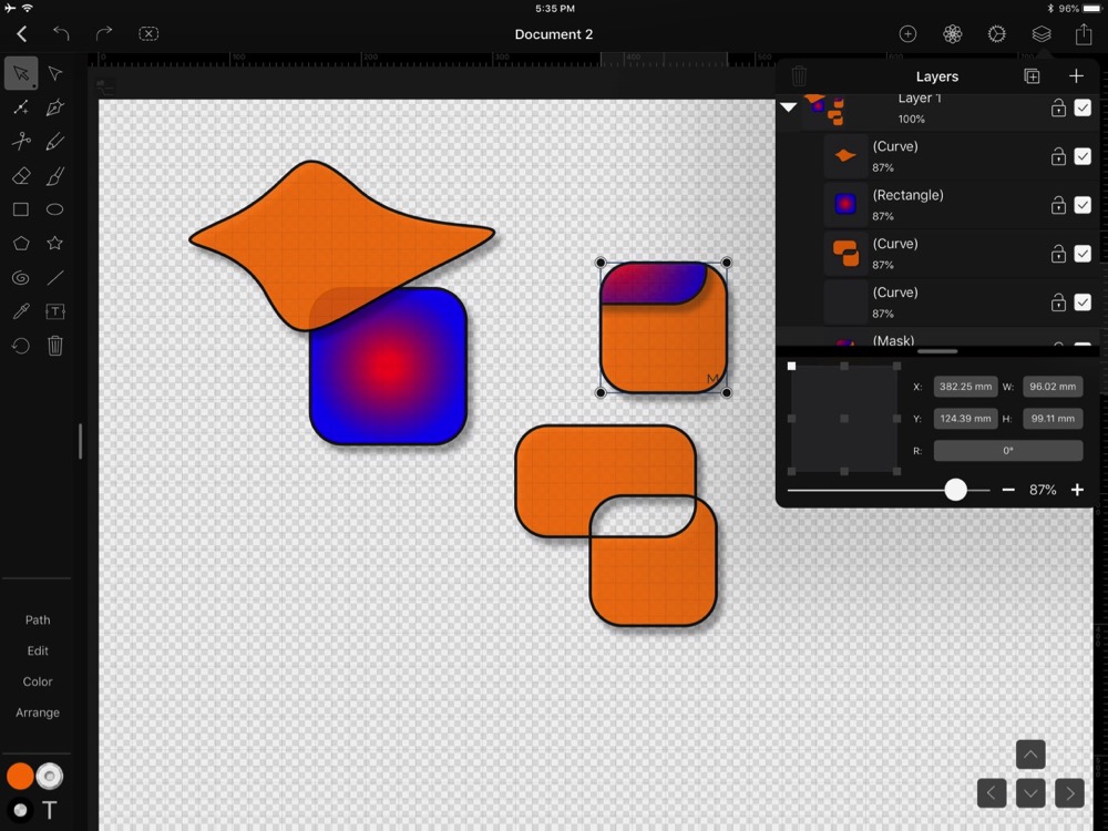 Vectornator supports layers, which is essential in a design tool. Within the layers menu you can drag objects up and down, lock them, deselect them so they are invisible and change their opacity, position, size and rotation. I should mention that there’s also a dedicated rotate tool in the toolbox as well.
You can group objects within a layer using the Arrange menu, and grouped objects get a little “G” on them which is a hint that they can be ungrouped later if you so choose. Within Arrange you can also move objects forward and back, move objects all the way to the front or back, flip them horizontally or vertically, and you have a smorgasbord of options for alignment.
Settings
The Settings menu has three tabs. One to control the canvas with things like grid options, size and color space. The next is for snapping options. See engineering brain above and you’ll know that I love to be able to turn on snap to edges and points, and turn on the grid and to see rulers. There’s even smart guides you can turn on that make it much easier to be precise. In the third tab you can connect a Wacom stylus and you can also tell Vectornator to only accept drawing input from your Apple Pencil. I think it’s nice to be able to swap back and forth between Pencil and finger but it’s good the option exists.
I should have mentioned it earlier, but Vectornator supports slideover and split screen on iPad. This feature allowed me to write most of this review in Keep It in a small column to the right of Vectornator and still be able to test out the features of the app. Pretty cool stuff.
Bottom Line
If you’ve wanted to learn to use a vector program but were daunted by the pro-level apps, the free Vectornator for iOS might be just enough for you. Having it on the iPad with Pencil support and having it for free makes a great combination. I’m sure now I’ll be able to create great art.

