I’ve done a lot of reviews of screenshotting apps, and recently explained the hidden treasure that is the built-in screen capture utility. To be perfectly honest, 95% of the time, that’s what I use on the Mac. I take a lot of casual screenshots, open them in Preview mark them up real quick and send them off to explain things to people.
I figured out a little trick with annotating in Preview that makes things so much easier. In order to motivate you to learn the trick, let’s review the hard way first.

In the Preview toolbar, you’ll see zoom in/out, share, a greyed-out pencil, rotate the image, and finally and tool that’s a circle with a little pen inside. This icon will show the markup toolbar.

With the Markup Toolbar showing there’s a lot more fun to be had. I’m going to jump right to the main part of the tip but then we’ll play around with some of the other tools and describe the problems they solve.
The actual Tiny Tip
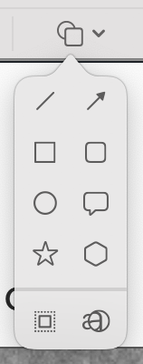
Let’s say you want to draw a rectangle around something to draw your recipient’s attention. One of the tools is entitled Shapes and the icon is a rectangle on top of a circle. Tapping on this reveals options for a regular line, an arrowed line, square and rounded rectangles, ovals, thought bubbles, stars, polygons, a mask and a loupe.
In our example, we want to draw a box around something. The process would be:
- Select the Shapes icon to get the dropdown
- Move down to the rectangle icon and select to drop the box into a seemingly random location on your screenshot
- Drag the box so the top left corner is actually where you want it
- Drag the bottom right corner to resize to outline your desired target
That’s two menu picks, and then two additional drags to get the box in the right spot, and that inefficiency drives me bananas.
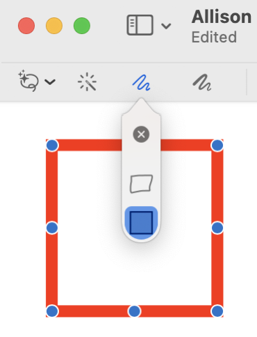
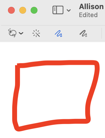
Now here’s the exciting trick. The third icon in the tool bar is the sketch button. Select it, and using your trackpad or mouse, draw a close approximation of a rectangle right where you want it. It will look awful, of course, but when you let go, it will automatically turn into a perfect rectangle! It’s delightful how well it works. Now of course you may need to adjust it just a smidge by dragging one corner, but usually the first corner was right where you wanted it. I find this to be much more efficient.
Right after Preview changes your childish attempt into a true rectangle, a drop-down menu comes out of the sketch Icon. This menu includes two options, one of which is to change the perfect rectangle back into the sloppy one.
This technique of drawing with your trackpad or mouse works with all of the normal shape tools. If you get close to a circle it will draw a real circle. You can use it to draw a triangle too, but I could never get it to draw an isosceles triangle perfectly where every side is the same length. Surprisingly you can draw perfect lines with arrowheads. It takes some short practice to get the hang of the arrowheads but once you do get it working you’re going to want to draw arrows on everything.
If you draw a straight-ish line (with or without an arrowhead) you will get a straight line. But if you draw your line slightly curved you will get a curved line with a control handle in the middle allowing you to modify the curvature. I tend to forget that is has this feature and I’m always delighted when it happens. Even if you meant a straight line and it creates a curved line you can always straighten it with that control handle
And now for even more
Since we’re here, and the Tiny Tip is out of the way, let’s learn a little bit more about some of the tricky things you can do with Preview.
Instant Alpha
Let’s say you have an image but it’s on the wrong background color, or you don’t want the background at all. In Preview, it’s very easy to select the entire background and remove it. The tool/concept is called Instant Alpha, and it’s the second icon from the left in the Markup Toolbar. Once you’ve selected Instant Alpha, just drag across the color/area you’d like to remove to select it.
Note that as you drag, moving up and down changes the tolerance, so if it’s selecting more than you want, slowly slide up to select less and slide down to select more. If you have a solid background that is in high contrast with the area you want to keep you don’t need to use these finer adjustments but if there is a gradient to your background or the color is a little too close to the image you want to keep you may have to fiddle with it a bit. As always, your mileage may vary and how well this works.
Stars and Polygons
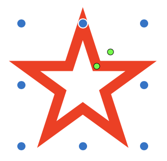
I purposely neglected to tell you that you can draw perfect five-pointed stars by hand. I skipped over the stars because I wanted to tell you more about what you can do with them in Preview. When you draw a star it will have 8 blue resizing dots. Imagine a box enclosing your star; you’ll have resizing dots on the four corners and one on each side of the box. These 8 blue dots only do one thing, they resize the star while keeping the proportion of the star. If you want to distort the star, hold down the shift key while dragging one of the dots.
That’s not terribly exciting but they also come with two green dots. The inner green dot can change the star points from being long skinny lines to having a fatter inner middle to the star. Clumsy to explain, but when you drag the green dot I’m sure you’ll understand what I mean.
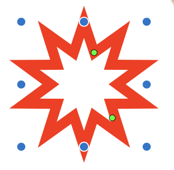
The outer green dot is even more fun. It travels on a circular path. As you drag it clockwise on the circle it increases the number of star points and when you drag it counterclockwise the number of star points decreases.
I don’t think you can draw polygons by hand, at least I can’t, and in any case, it’s easier to just drop one in with the shapes menu. By default, you will get a hexagon, but like the star, you’ll get the inner green dot which will change the number of sides to the polygon as you rotate around the circle. I bet you’ve always wanted to know how to draw a perfect dodecagon in Preview.
Mask and Loupe
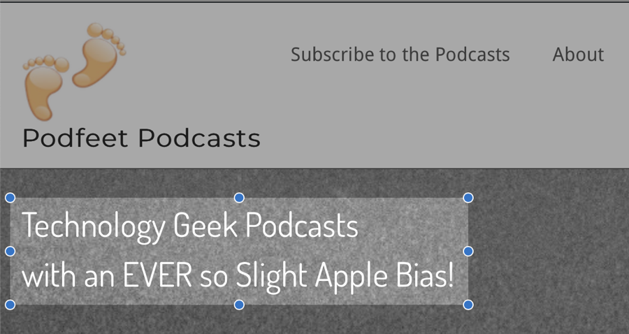
I mentioned that the shapes menu includes two features called mask and loupe. The purpose of the mask is to select a rectangular region to which you would like to draw your viewer’s attention. The mask accomplishes this by darkening the rest of the image outside of that rectangle.
It’s pretty obvious how it works when you drop one in and drag it to the size and location you desire on your image. But there is one tricky bit. If you deselect the mask by selecting a different tool, it is not entirely obvious how to edit the mask to change its size and location or even delete it because when you click on the highlighted region, the mask is not selected. Instead, you have to click anywhere outside of the mask region to select the mask.

This makes it very difficult to work with an image after you place a mask, because you can’t select other geometry placed on the same image. If the other geometry is outside of the mask area, when you try to select that geometry it will instead select the mask. I’d suggest adding the mask as the last thing you do on an image.
I’ve never found a problem the loupe solved, but it is a slick little feature. The loupe is a circular area that is zoomed in. It has a blue dot for resizing the circle and a green dot that when rotated around the circle increases or decreases the magnification. Like I said it looks pretty nifty but I haven’t yet had a need to point to something that fits inside the circle. Probably a lack of imagination on my part.
Signature
I don’t do a lot of work with PDFs, other than opening the occasional user manual or saving my own documents as PDFs, so I have never found the need for the high-end PDF applications like PDFpen. I’m sure it’s terrific but not being a lawyer, I don’t have the problems that it solves.
I do occasionally need to sign documents though. With Preview, you can store your signature right in the application ready to be dropped into the appropriate field on a document. In the toolbar of Preview, select the signature icon and choose Create Signature.
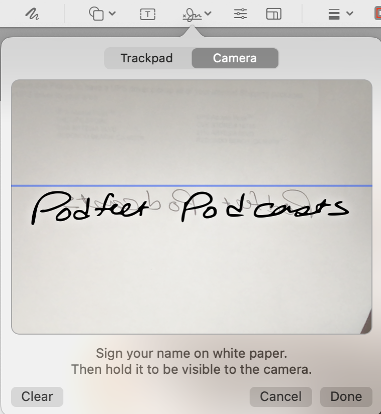
The default option is to create your signature using your trackpad so it looks like a three-year-old signed the document. If you are seeking a more professional look, sign your name with a real pen on a physical piece of paper. Now choose the second option in Create Signature that says Camera.
Simply hold your handwritten signature up to the camera, being careful to align it on the blue horizontal guideline so that it’s straight. Preview will recognize it as a signature and save it to your list of signatures.
Now whenever you have a PDF that requires your signature, you can simply open it in Preview and drop in your signature, and move and resize your signature like any other object to fit on the dotted line.
Part of me feels a little bit queasy about storing my signature in Preview because it does mean anyone with access to my computer and login could sign things on my behalf. Then again, anyone with a hardcopy of my signature could steal it and do the same thing, so maybe it’s not that much worse than a physical signature.
Adjust Color
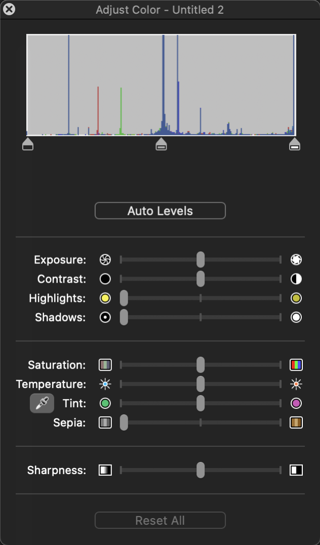
There’s a feature I always forget about in Preview, and that’s Adjust Color. This tool is represented by three lines with little circles on them representing adjustment sliders.
I’ve been mostly talking about screenshots in this article because that’s my most common use case. But let’s say you’ve got a photo in Finder and you don’t like the exposure or color on the photo. Adjust Color gives you a surprising amount of control over the image. It’s got a levels adjustment at the top where you can move the white and black levels sliders and the midtones. If you’d like some help, there’s an Auto Levels adjustment.
If that’s not enough control, you have sliders for exposure, contrast, highlights, shadows, saturation, and temperature. There’s a tint slider that also has an eye-dropper for doing an auto-white balance. You even get a slider to change your image into a sepia tone.
And after you’ve messed up your image entirely and you realize you don’t remember where the defaults were for the sliders, there’s a useful “Reset All” button.
Image Dimensions
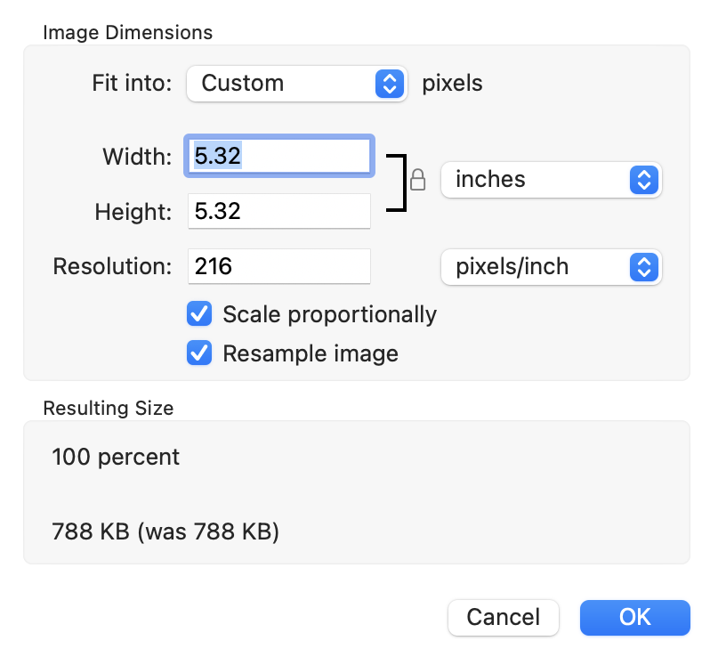
There’s a tool in the toolbar that I actually never noticed before, called Image dimensions. In this window you can scale and/or resample your image with full control. You can scale by size using pixels, points or percentage and you can customize your own size or choose from some standard pixel options.
Speaking of size, I skipped over the first icon in the toolbar which is the selection tools. Of the options in this tool, I only ever use the rectangle selection tool, because I’m usually interested in cropping an image. With this tool, I do a click-drag to get my area, realize I missed my desired size or location, and then use the blue dots on the corners to adjust it. A quick command-K and the image is cropped.
I like that the rectangular marquis tool tells you the pixel dimensions when it’s selected so I can get a precise dimension, and the shift key lets me get a perfect square.
There’s also an option for an oval/circular selection area, and a lasso tool to select if you’re really an anarchist.
The one tool I couldn’t figure out on my own is the Smart Lasso tool. I have to confess that I had to find an Apple support article to explain it to me. It seemed like its job was likely to be able to select an object by its edges without having to precisely select those edges yourself, and I was right.
When you click and drag with the smart lasso, where you drag will be a fat red line. In order for smart lasso to select the object correctly, the fat red line needs to be right on the edges of the object you’re trying to select. Like all tools of this sort (including Instant Alpha), your success will vary widely depending on how much contrast the object you’re trying to select has vs. its background.
The Professor and Maryanne
All the rest of the tools are pretty self-explanatory. You can drop in text, you can change the font, you can change line thicknesses and line types, and you can change the color of the border and fill of the geometries you insert. I like that you can change these attributes before dropping in geometry and text or you can change the attributes of existing content.
Bottom Line
I enjoy teaching about the built-in tools in macOS because of how much I learn that they can actually do. I usually get complacent using a tool for only the things I understand it can do, but when I have to teach it, I start poking every button to figure out what it does. I hope you learned a little bit in this Tiny Tip that turned into a full tutorial.
