Exactly four years ago today, Bart Busschots came on Chit Chat Across the Pond to talk about three of his favorite apps. The first one he talked about was Yoink from Eternal Storms Software.
As Bart explained it, Yoink lives as a little shelf on your Mac’s screen and allows you to drag things into and out of that little shelf. Eternal Storms explains you can drag things like a file from the Finder or an image from a website over to the edge of your screen, and Yoink will slide out allowing you to drop them there until you need them later. I think the main idea is that you can stash a bunch of stuff and then switch to the app where you need said stuff and “yoink” the stuff back out.
Bart was very enthusiastic about Yoink and so I bought it for the small sum of $8 on the Mac App Store. Yoink is also available in Setapp now so you can give it a try there if you have a subscription.
I was super excited about trying Yoink, but for some reason, Yoink on my Mac didn’t really solve a problem for me. I also found that I don’t have a screen edge for Yoink to live on. I do most of my Mac computing using my MacBook Pro extended to a big display to its left. The big display has my dock on the left and there is no right edge because the cursor slides right off to the MacBook Pro’s display.
So that was pretty much that.
Since that time, I’ve fallen in love with the entire concept of a clipboard manager, using Copy ‘Em as my clipboard manager of choice. I love to be able to copy several things one after another and then switch to the app where I need those things and just paste paste paste. It’s possible that if I’d seen the light on the entire concept of clipboard managers earlier, Yoink’s interface would have worked for me.
I love having a clipboard manager so much on my Mac that I really miss it when I’m on my iPad. Copy ‘Em is available for the iPad, but the way the apps are sandboxed from each other, it doesn’t automatically receive what you’ve copied. I tried for a long time to make it work for me and had very limited success so I gave up.
I’m not sure what compelled me to give it a try, but I realized recently that Yoink is available for iOS and iPadOS.
Apple makes it hard for clipboard managers of any type, including Copy ‘Em and Yoink, by not allowing these apps to receive input from other apps unless they’re both open at the same time. I know this is for security reasons but not being able to do things in the background really makes clipboard managers kind of limited in their value.
You can open one app, copy, then open an app like Yoink and Yoink can immediately receive the clipboard, but it can’t do it without that dance back and forth between apps. Avoiding the switching back and forth between apps is exactly the reason to use a clipboard manager in the first place. There is a way to avoid the switching dance.
On iPadOS you have two good options to keep Yoink visible: Slide Over and Split View. In a second I’ll get into explaining how to do that, but first let’s talk just about the look and feel of Yoink.
Yoink shows you everything you’ve copied in what I’m going to call a block view. It’s a set of nice rounded rectangles with a title in a blue bar on each block. The title is the beginning of the text, or the title and URL if you’ve copied a link or the name of the image file you’ve copied. It’s a very clean interface and gives you just the information you need. You can drag items in and out with your finger (for the most part) just like you can drag with a mouse into and out of Yoink on the desktop. In order to get into how this works though, we need to do some iPadOS learning.
How to Use Slide Over and Split Screen on iPadOS
If you’re not an iPad user, let me elaborate on Slide Over and Split View and how you enable them. The first thing to understand is that both are very fiddly to enable.
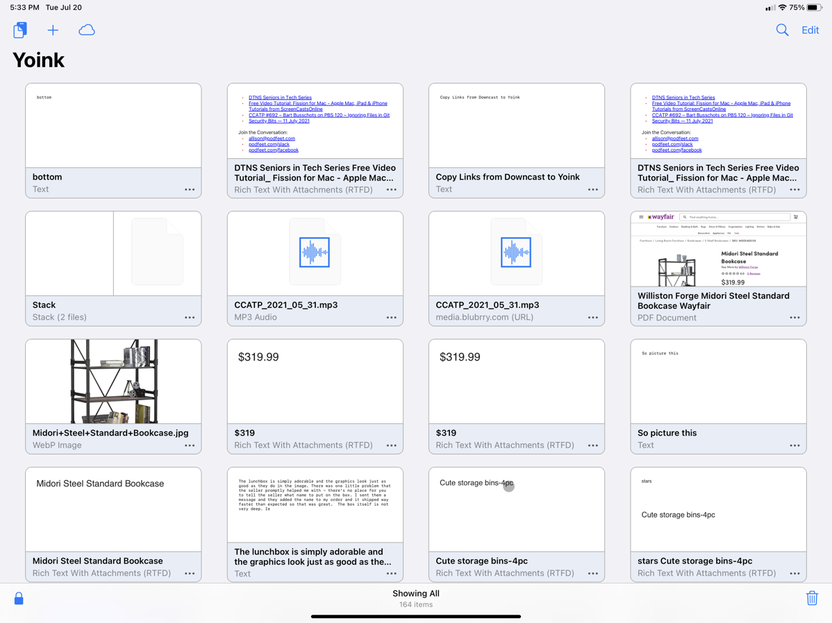
I’ll use an example to help illustrate the process. I’m trying to find a way to organize the closet in my den to be more logical for storing computer equipment. It’s basically a clothes closet with tons of unused space, and I have to hang my microphones from hangers on the rail and my laptops and other equipment are stored in really cruddy plastic drawers on rollers in the closet. I’ve been researching sites and getting photos and links and measurements, and I’m collecting all of this information in the app Notability. I like Notability because it’s cross-platform between my Mac, iPad, and even iPhone if I get desperate.
In Safari I open a site like Wayfair and I find a set of bookshelves that might be the solution. I can copy the URL, command-tab over to Notability and paste, then command-tab back to Safari, copy the title, command-tab back to Notability and continue this back and forth dance until I have the dimensions and a photo in my notes. But this is inefficient. If we can get Yoink open on screen at the same time, then it will collect all of the copied information, and then we can drag it in one fell swoop into Notability. At least that’s the theory.
To do Slide Over or Split View on a supported iPad we will need access to two apps at once. We’ll call one app the main app, and the app that will split in, or Slide Over we’ll call the secondary app.
To use Split View or Slide Over, the secondary app will be dragged up on the screen from the dock. If you don’t have the secondary app already in your dock, simply open it and it will be in the right side of the dock where the most recently launched apps live.
Let’s start with Slide Over. Launch the main app, and then drag the secondary app up to the right side of the screen. As you start to drag it out of the dock, you will forget to tap and hold before dragging, and the dock will just slide back down. At least that’s the way I do it close to half the time I try to use this feature.
Let’s try it again. Tap and hold on the secondary app’s icon in the dock and it should darken a bit. Don’t hold too long or you’ll get the pop-up to share the app. Ok, you’ve got hold of it now, try again to slide the secondary app up out of the dock and let go of it when it’s about halfway up on the screen. This should enable Slide Over, which puts the secondary app in a little floating palette. At the top of the Slide Over window, you’ll see a little grab handle.
You can use this to move the Slide Over app to the left side of the screen or to slide it off-screen to the right. Drag your finger in from the right side of the iPad and it comes right back. Unless you’ve got Safari open, in which case it will go back to the previous page you were surfing. Did I mention this was fiddly? If that happens, slide your finger in just a smidge and you should see a little chevron in the middle right side of the screen. Drag that in from the right and your Slide Over app should come back.
If you want a pro tip, you can even switch between Slide Over apps if you’ve got serious dexterity. Slide your finger up from the bottom of the screen under the Slide Over app, and you’ll see whatever other apps are available in Slide Over kind of fan out for you to choose one. Depending on which main app you’re running, you may be able to see the bottom of the Slide Over app. If you can, there’s a black bar at the bottom that you can slide your finger on to switch between Slide Over apps. What I’ve never figured out is how iPadOS decides what apps to keep in Slide Over. I can tell you it’s never the app I need or want at the moment!
To use an app in Split View instead, you do the same dance of making sure the secondary app is in the dock, at least temporarily, and then trying valiantly to drag it up on screen to the right but don’t let go just yet. Drag all the way to the right of the screen. If both your main and secondary apps are updated to support Split View, you’ll see the main app start to shrink to the left, and a black area will be revealed on the right. Let go of the secondary app and you’ll have both apps in a 50/50 split on screen.
If you don’t want a 50/50 split, you can drag the handle in the middle of the split to make it 75/25 or 25/75 depending on your needs. When Split View was first introduced, probably more than half of the apps didn’t support it, so you may have given up on even trying to use Split View. The good news is that these days most apps are compatible and I can’t remember the last time I tried to use Split View and it didn’t work.
You may think that I’m just really clumsy at explaining this, but that’s not it. Both Split View and Slide Over are challenging to enable, but with enough practice, you can do it with possibly as high as an 82% chance of success. For more info, I put a link in the shownotes to Apple’s support article about multi-tasking.
Using Yoink
Now why was I giving that elaborate explanation of Split View and Slide Over again? Oh right, so we can have Yoink on screen so it’s allowed to capture the clipboard!
So picture this. I’ve got Safari open as the main app and I bring up Yoink in Slide Over. Now and only now, when I select the text description of the bookshelf I’m interested in and hit command-c to copy with my keyboard (or use my finger like an animal), I’ll see a pop up on the screen that says “Yoink pasted from Safari” and whatever I copied will now show in the Yoink shelf.
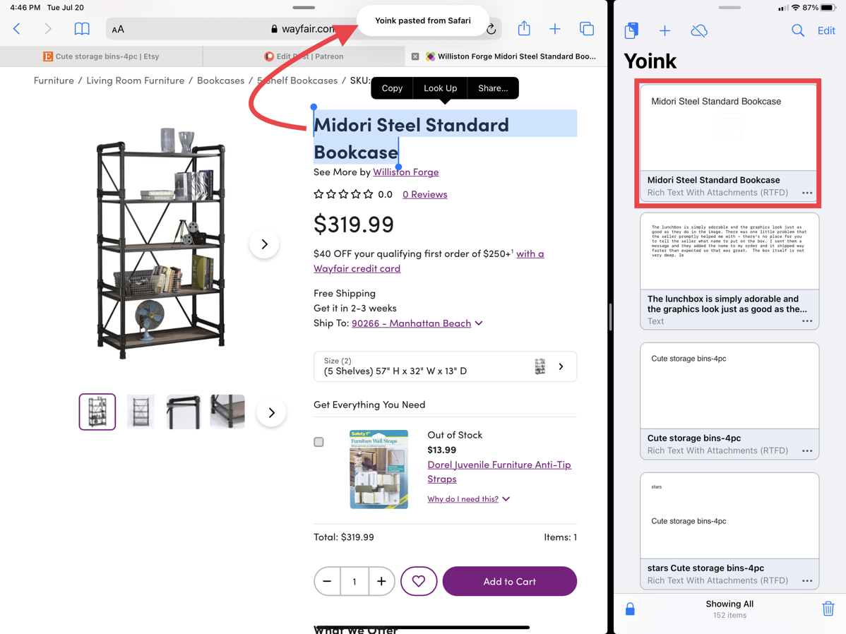
You’ll remember Bart loved the yoinking itself, dragging and dropping to throw things in Yoink. That works in Yoink on iPad, so if you don’t have a keyboard you might like it better than using Command-C to Yoink things. It works pretty well with images, but I found it a bit trickier to do with text. Yoink has the concept of “stacks”, which allows you to put multiple things together and then paste them all at once. I kept finding that dragging text to Yoink, it really wanted to stack my text with the image I’d just Yoinked. I finally gave in and let it stack it, but when I used the Yoink feature to paste the stack, it completely ignored the image.
I practiced some more doing drag and drop with text and I think I’ve gotten the hang of dropping it as its own thing in Yoink, but for me, as a physical keyboard user, it’s way easier to just hit command-c or even tap the copy popup to get it into Yoink than it is to accurately drag and drop into Yoink.
Once I collected the title, URL, price, dimensions and image of a possible bookcase solution, I changed my main app to Notability. Going this direction, dragging and dropping out of Yoink and into my note-taking app was way easier than using the keyboard.
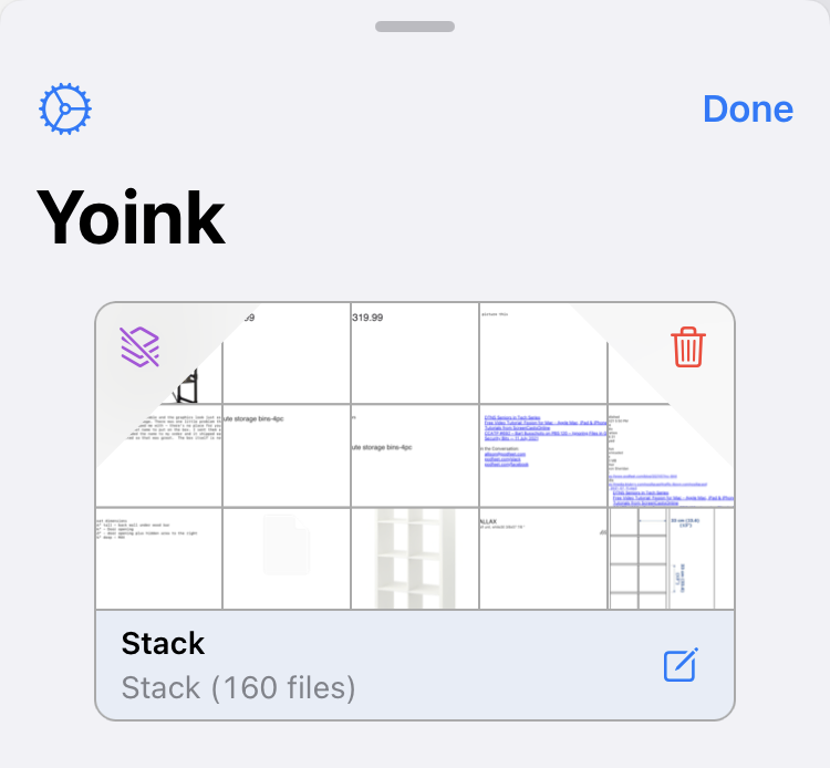
There are more features that kind of confuse me in Yoink. Let’s say I’ve got a block of text I’ve Yoinked. As I said, I can drag it into a text application, and that works just swell. But if I tap on the block representing the text in Yoink, it slides over and shows it to me in a larger, more readable form. In the bottom left is a bulleted list icon which when selected shows all 160 items I’ve put into Yoink so far. I can select one from the list to reveal it. Not sure why I’d do it that way though instead of just choosing it from the block list in the first place.
Speaking of the block list, there’s a three-dot icon in the bottom right of each copied item, which when selected allows you to perform several operations. You can delete the copied item from Yoink. But if it’s text, you can also go into edit mode which is kind of cool. You can also select all, which selects every single thing you’ve ever copied into Yoink. I wasn’t sure what to do with it next, so I tapped the little icon in the bottom left which turned all of my Yoinked items into one giant stack! Not sure why I’d want to do that either but I was offered a delete icon or an UNstack icon which I availed myself of to get back to where I started.
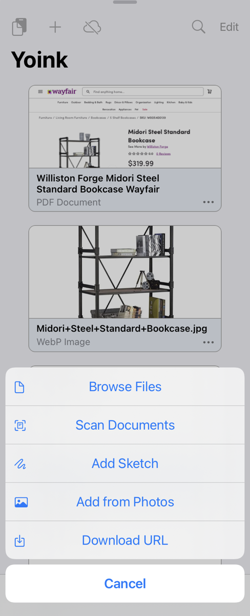
Yoink on iPadOS can do even more. In the top of the Yoink window there’s a plus button that brings up several interesting options. You can browse the Files app and basically Yoink anything out of there that you like. Kind of like how you can Yoink from the Finder on the Mac.
You can scan documents from the iPad’s camera but not during multi-tasking, aka Split View or Slide Over. You can add a sketch, so if you’re Jeff Gamet with artistic talent and an Apple Pencil that might be fun. You can import images and maybe even videos from the Photos app on iPadOS. The most interesting thing I found in the plus menu that I’m not sure I need is the ability to download files from a URL right within Yoink. I pasted in the URL for a recent podcast episode and it downloaded the audio file directly into Yoink. Cool feature, but I’ll have to wait and see if that solves a problem for me.
If you do own Yoink for the Mac, in theory you can turn on iCloud sync so you have all of your Yoinked items on both platforms. I say “in theory” because I had turned it on once before but noticed it was off again on my iPad. When I enabled it this time, I got a 503 error. A 503 error means the website’s server is unavailable. So … not sure what that’s about.
One of the tedious things I do each week is copy the bulleted links from Feeder which gives them to you in your podcatcher and then paste them over into Patreon on the web (along with the title and link to the blog post about the show). This is tricky because I want pretty links. If I forget to post to Patreon before I go down to relax on the couch after the show is buttoned up, I really want a way to do this from the iPad in my easy chair. Before Yoink I really had no way to do this.
I think I’ve figured out how to do it with Yoink but it was not at all easy. I opened up Downcast and went to the NosillaCast and looked at the shownotes for the latest episode. There were all pretty just like I wanted them. Selecting was tricky because if you’re not careful the links will just open when you touch them. I eventually got them selected, and was treated to seeing them in Yoink and they were still pretty.
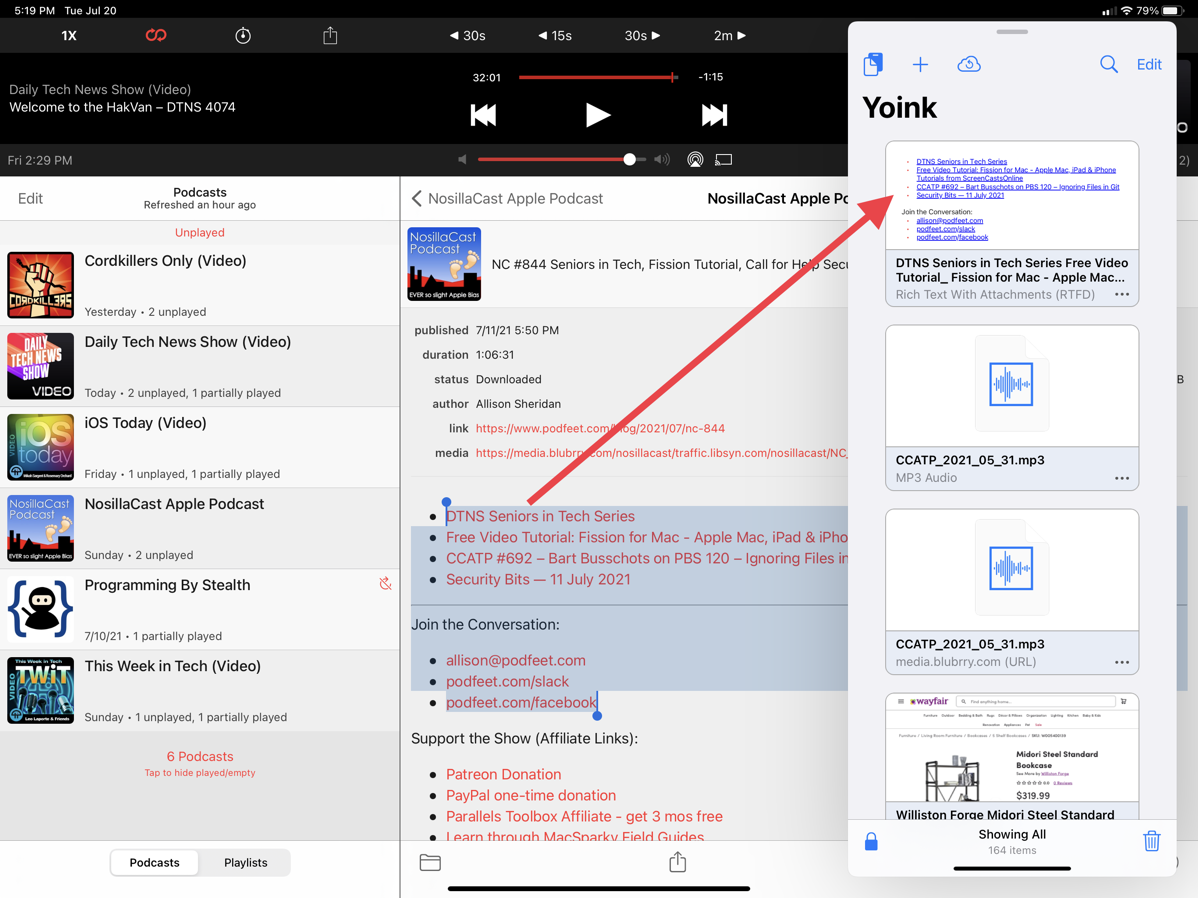
Now in theory I should be able to switch to Safari, start a post for Patreon, and then just drag those bad boys in. Instead, when I tried to drag them into Safari, Safari simply opened the first link in the list.
Ok, let’s try tapping on the yoinked item so I can see the text up nice and big. At the bottom of that page is a share icon. Tap that, hit copy, tap, and hold in the text window in Safari … and no paste option comes up. Hmmm. Great news though, now Yoink now has a second copy of the links because when I copied it, it decided to grab it yet again.
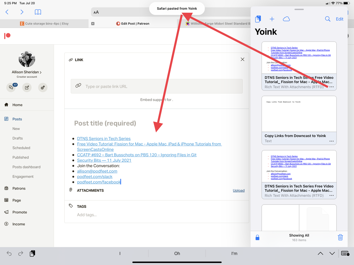
Finally, I cracked the code. Back in the block view, I tapped on the three-dot icon for the links, and I got a different copy button. When I used this copy button, I was rewarded with a paste option in Safari’s text window, and the links were pasted in perfectly.
I’m going to make a confession to you now. Approximately 0% of you will ever need to do what I just figured out. But I needed to document somewhere how I finally got that to work, so I took advantage of your attention and did it right here. I’d apologize but you know I’m not actually sorry about that, I’m rather proud of it.
The bottom line is that I find Yoink a bit fiddly to use, but I think it’s designed about as well as it could be given the constraints Apple has put on the developers.
The important thing though is that I know it’s actually good at solving a problem for me because I’ve continued to use it. If it hadn’t suited my needs I would have stopped using it. I think if you’ve been missing having a clipboard manager in iPadOS, and it makes you keep reaching for your Mac to be productive, Yoink might be the right tool for you.
According to the developer, Yoink collects zero information from you, and it’s available for iPadOS and iOS for a grand sum of $5.99US.
After I finished tested Yoink and writing up my findings, I started wondering whether I’d given Copy ‘Em a fair shake on iPadOS. I wondered, did I ever try having it up in Slide Over or Split View while I worked?
I ran it through the same scenarios I’ve described with Yoink and sure enough, Copy ‘Em works really well too on iPadOS. I was even able to copy the pretty links a little bit easier with Copy ‘Em – if I tap and drag from the far right of the list of links, it doesn’t open any of them and lets me drag them in with my finger.
So there you have two options now for clipboard managers on iPad OS – Yoink from Eternal Storms software and Copy ‘Em from Apprywhere.


FYI Yoink is available from the share sheet on iOS so you are able to copy items into it without having to have the app already opened. I tested that from Safari on my iPhone while reading this article by sharing a link to the page into Yoink and it worked as expected.
Interesting, David. I tried that yesterday and couldn’t find Yoink in my shareable items, but now it’s there. It sort of works but not for what I need. In my example where I want to copy the pretty links from Downcast, a copy with Yoink in Slide Over gets the links, but using the Share option the links are stripped out and it’s plain text. I might write to the dev, Matthias Gansrigler, and ask him if that’s something changeable on his end or if it’s another joy of the constraints of iOS/iPadOS.
I just noticed something else very curious. In writing this comment from my Mac, I made a typo spelling “something”. When Grammarly noticed it and highlighted it, the correct spelling showed up in Yoink…on iPadOS. THAT’S curious…
I wonder why it didn’t show up at first. Curious… Since I’m not often sharing “pretty links” I didn’t test it that way but it makes sense (given Apple’s strict guidelines for apps using the share sheet) that it wouldn’t be able to do everything the full app can do. More than anything I wanted to make sure you were aware that it was available through the share sheet as an option for sharing other items such as a single link, a photo of a shelf, or whatever.
As to Grammarly and fixed spelling in Yoink, I that’s very interesting. Not sure how that happened!
I own and love Copy ‘Em for Mac, installed but didn’t (yet!) pay for the iOS in-app-subscription that is needed to allow cross-platform clipboard syncing.
Can you say a little more about when that sync didn’t work for you? Did you contact the dev about the issue? Thanks.
Hi Rob – Maybe I didn’t write very clearly. Copy ‘Em syncs between iOS and macOS just fine. It was syncing in Yoink that failed with a 503 error (server unavailable), but it seems to be working now. Sadly there doesn’t appear to be cloud syncing with the Mac app. I don’t need it really but it would be a feature some would want.