Hi Allison. It’s Rick from Baltimore.
One of my favorite features that I think debuted in IOS 15 is the ability to change font sizes by app rather than system-wide.
The problem to be solved is I like to enlarge the font on both my iPad and iPhone to make things more readable for my aging eyes. Pre IOS 15, I could go to Settings and make the font larger, however, this was a universal setting and applied to all apps that support Dynamic type sizes. In some apps, the larger font did not render correctly, or was too large and scrolled off the screen or changed how a web page looked. For example, some web pages in Safari were almost unreadable due to the larger font size I selected.
In IOS and iPadOS 15, I can go to Settings, Accessibility, scroll to the bottom, and tap Per-App Settings. Then I can add an app and customize font size and many other options to my liking, and those changes only impact that individual app. So now I can have Apple Notes app show the larger font I like without ruining Safari web pages etc.
If this existed pre-IOS 15 I apologize but I don’t recall seeing it.
As soon as Rick sent this awesome tip over, I checked with Shelly Brisbin, author of the book iOS Access for All, because if anyone knew about it, it would be Shelly. She confirmed that this is a brand new feature of iOS 15. Great find, Rick!
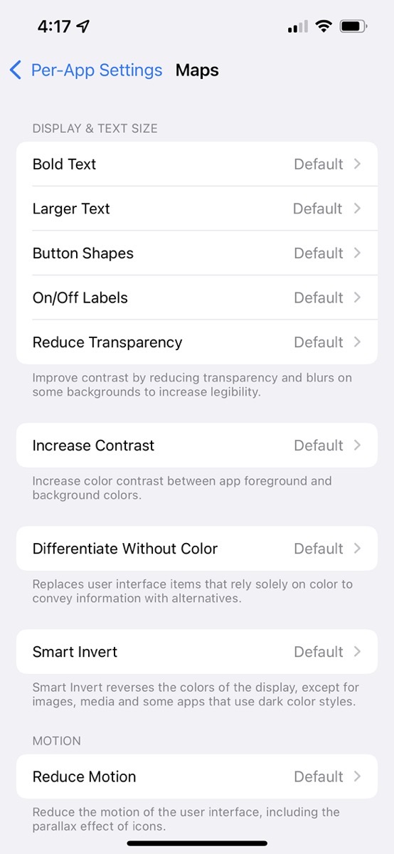
The app that has given me fits since day one is Apple Maps. If you zoom in to try to read a street name, it will briefly be larger and then shrink down to microscopic size. I followed Rick’s instructions to go to Settings > Accessibility and then chose Per-App Settings. That took me to a pretty empty screen with an invitation to Add App. I chose Maps and I was delighted to see an absolute plethora of options.
For each option, if you leave them as default, it will follow whatever global accessibility changes you’ve made. That’s really slick because maybe like Rick, you want the font size cranked up for most apps, but for Safari you can change just its font size to work better with web layouts.
Under Display & Text size, you can enable/disable bold text and larger text, add shapes to buttons, turn on/off labels and reduce transparency and blurs to increase legibility. You can increase contrast. You can replace user interface items that rely solely on color to convey information with alternatives by turning on differentiate without color.
Smart invert reverses the color of the display (except for images) which might be very helpful in just some applications. You can reduce motion on a per-app basis including the parallax effect of icons. I know that is really annoying for some people. Finally, you can disable auto-play video previews. I might want that disabled system-wide!
Even if you aren’t suffering vision loss (yet), you might want a few apps to adapt more to your needs without changing the entire iOS interface. You might also be in the opposite situation. A friend of mine likes her font size really big, so she has it set to a large size system-wide, but some apps look simply awful like Rick said, and she was delighted when I showed her Rick’s discovery of per-app accessibility settings in iOS 15.
Thank you so much for this, Rick!

