Hi everyone! My name is Chris, I’m from New Zealand and I wanted to tell you about a project I’ve been working on.
My job is product photography, and every week I report to my boss as to how many products I’ve completed. I had been giving him a report with four graphs that I made in Numbers, but I was never happy with using it for page layout. I didn’t like the look of the graphs or how fiddly it is to update each week. It’s also prone to error when updating and just wasn’t satisfying to make.
The Problem to be Solved
What software can I change to that will make preparing this document faster, with less manual editing to reduce errors, and preferably be better looking?
I suck at making graphs in Excel, so that’s out. I have Affinity Publisher and that would make a beautiful document but I’d still have to generate the graphs somewhere and import them. Fine for doing once but every Monday morning? Yeah, nah.
I had a vague memory from my Linux days of something called LaTeX, which apparently is pronounced “Latek”. A quick google revealed it to be a free, open source, professional typesetting system dating from the 1970s, so I took a punt that it could do my pretty graphs, and went and installed it, and then ran through a beginner’s guide. LaTeX is available for every platform including iOS.
A LaTeX primer
LaTeX dates from the late 1970s, before the days of WYSIWYG. It works by compiling plain text files, which contain markup to control the look of the document.
The most basic LaTeX document looks something like this:
    \documentclass{article}
    \begin{document}
    My first document in \LaTeX
    \end{document}
In the terminal, compiling that file using pdflatex will result in a pdf file that looks like this:

Why does the word LaTeX look weird? The backslash before it means it’s a special command that prints the logo. Other markup can control the font, style, or size. For example:
\documentclass{article}
\begin{document}
Text can be \textbf{bold}, \textit{Italic}, \Large different
   \huge sizes \normalsize or \sffamily different fonts
   \rmfamily by the use of markup
\end{document}

In this example, \textbf stands for BoldFace and makes any text inside the curly braces bold. \textit does the same but italic. \normalsize resets the font size to normal. \sffamily switches to whatever sans-serif font has been set, and \rmfamily switches back to normal (roman in LaTeX parlance).
Having said that, LaTeX on its own is fairly limited. Out of the box, it only supports 1970s style bitmap fonts, for example. The good news is we can extend its functionality by using Packages, which are third party extensions to LaTeX, such as:
\usepackage{_package name_}
LaTeX has nearly 6000 packages available, so it’s possible to do some amazing things, given the right package. The trick is to know what package to use to achieve what you’re trying to do. Common packages include:
- fontspec for using modern fonts
- amsmath for amazing looking equations
- biblatex for bibliographies
- microtype to improve the look of justified text by adjusting character spacing
- pgfplots for amazing graphs
- coffee to put realistic-looking coffee stains on your documents. Yes really

You may be wondering what the \documentclass business at the top of the sample document is all about. LaTeX uses the document class you choose to set common page parameters. The Article class is good for documents like the one I’m trying to create here, but for longer documents the Memoir class is amazing, it has ‘oneside’ and ‘twoside’ options that change the default margins so that on two-sided documents the text block is closer to the middle of the page. If you measure a novel you will see the margin between the text blocks in the middle is usually about the same as the outer margin.
It also puts blank pages in where required in two sided mode so each chapter begins on a right-hand page. The benefit of having this intelligence built-in is you can generate a ‘twoside’ pdf designed for printing and binding, and just by changing that one word to ‘oneside’, when you compile it, the margins change to the same both sides and it no longer puts blank pages in before chapters.
This is the essence of why LaTeX is so good. It has a couple of centuries of typesetting experience built-in by default, but by use of markup in your document, you can change any of its parameters. Don’t like having your paragraphs together with an indent and no space between each paragraph? Just add these commands in the preamble (above \begin{document}) :
    \setlength{\parindent}{0pt}
    \setlength{\parskip}{12pt}
And now you have block paragraphs with no indent.
LaTeX is designed with the idea of separating formatting and content. It’s not uncommon to have a main LaTeX document with all the formatting in it, and use \include{filename} commands to add in other files which have (mostly) content and no formatting. The difficulty is that you can sometimes end up with quite a lot of markup in the content if you are doing math or a lot of tables / lists.
Fun fact: Wikipedia uses LaTeX commands for its equations, if you view the page source and copy out the code for any equation you see, then paste it into a LaTeX document, it will compile and look exactly the same as in Wikipedia.
LaTeX editors
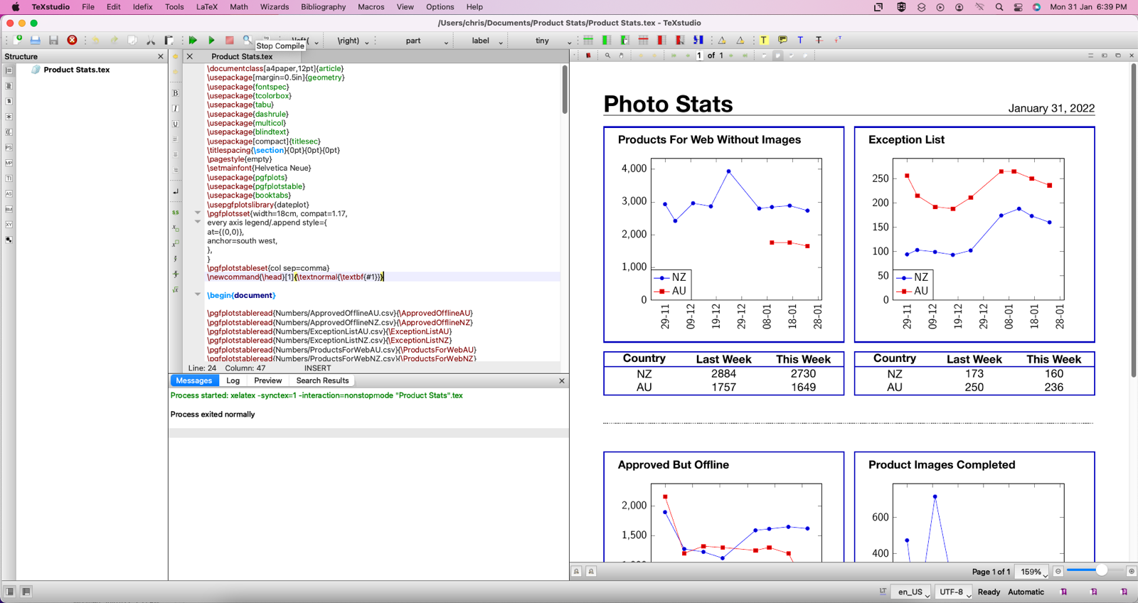
Because we’re editing plain text files here, there are a number of editors available to make your life easier. I have more or less settled on TexStudio, which has a lot of word processor features like a button for bold, italic, etc, but also has a ton of LaTeX commands built into the menus. It also has code completion, syntax highlighting, and much more. But my favourite feature is the Compile button (also F5) that runs the compiler, shows any errors, and brings up the resulting PDF file in a preview window, so you can make small adjustments to your code and see changes more or less in real-time.
TexStudio looks like this:

Using LaTeX to create my document
Now we know a bit about LaTeX, how do I create my report in it? LaTeX has been around since the 1970s and is continuing to be developed, which means pretty much any question you might have has already been asked and answered online. Because of its complexity, I figured the best way to proceed was just to start. I apologise for the compressed amount of details here, it would be a very long blog post otherwise.
I began by creating a blank document and writing the header. And it looked terrible. So off to Google we went! I learned how to use modern fonts by using the fontspec package, how to adjust the font size by using \Huge – LaTeX font sizes are designated by words like \Huge, \Tiny, \Large, this makes sense when you realise they are relative, not absolute, and change when you alter the master font size.
I learned how to add today’s date automatically by using \today, and I learned how to put a dotted horizontal line in by using \hdashrule
Now we have a great-looking header, but how do I get graphs? Enter the \pgfplots package. It’s one of several graphing packages available but seemed the easiest to use for a noob like me. It’s a derivative of \tikz which will make the below code make sense. Getting it to generate a simple line graph was actually quite easy, with plenty of examples in the manual.
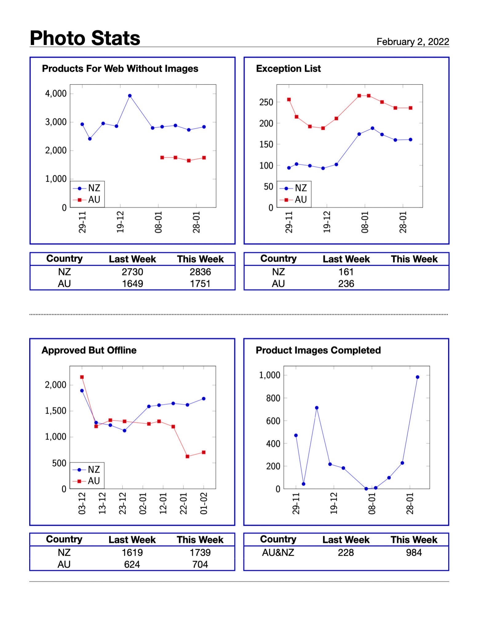
I was able to create my document with four graphs, and summary numbers underneath each one in a table. Great! I manually entered data for a few weeks, but by that time the data was starting to overwhelm the document and I really wanted to get the data out of the main document and into an external CSV. Enter \pgfplotstable which allows me to push the data off to an external CSV file.
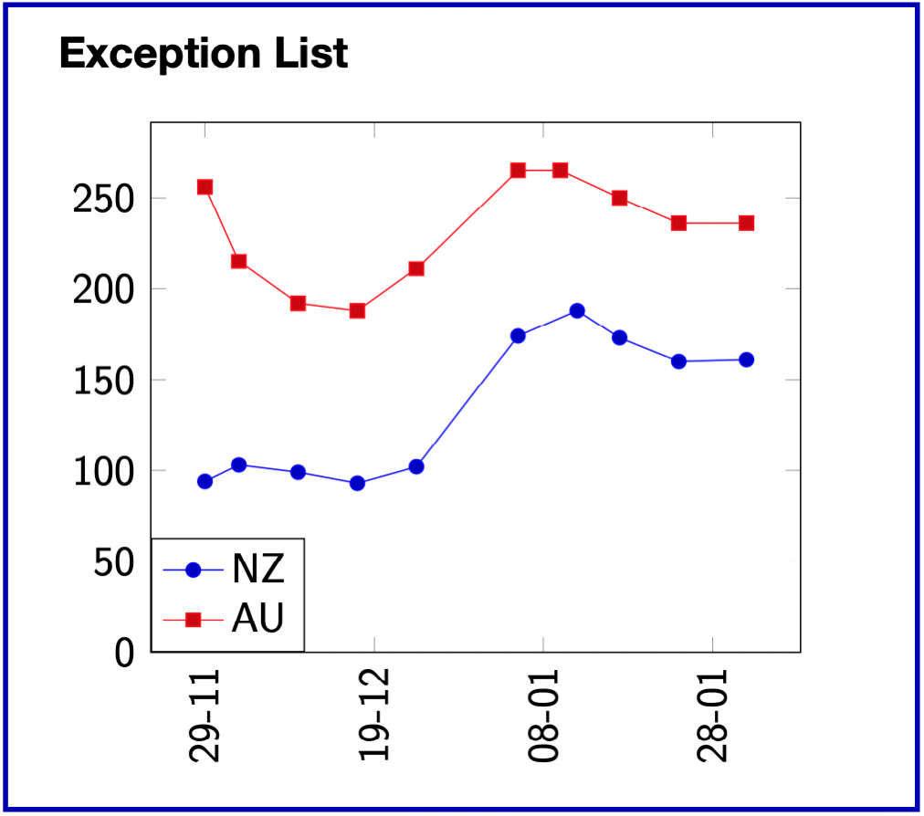
The completed code for one of my graphs, inside a blue coloured box, using data from an external csv file looks like this:
\begin{tcolorbox}[colback=blue!0!white,
        colframe=blue!75!black, sharp corners]
{\bfseries Exception List}
\newline

\begin{tikzpicture}[font=\sffamily]
\begin{axis}[
date coordinates in=x,
xticklabel=\day-\month,
tick label style={/pgf/number format/assume math mode=true},
every node near coord/.append style={font=\tiny},
width=8cm,
xticklabel style={rotate=90},
ymin=0
]

\addplot table {\ExceptionListNZ};
    \addlegendentry{NZ}

\addplot table {\ExceptionListAU};
   \addlegendentry{AU}
\end{axis}
\end{tikzpicture}
\end{tcolorbox}

And that results in this graph.
Now that I have a document with four of those graphs all pulling data from an external CSV, two thoughts occur. Firstly, I don’t have to edit the file to generate my document, but I do have to edit it to change the summary numbers.
Wouldn’t it be nice to automate that? Secondly, wouldn’t it be nice to automate the whole thing? Enter Mac Shortcuts.
Automating with Shortcuts
I won’t show you my shortcuts here because they are very long and very messy, since I was just shooting for a proof of concept and it’s about the least efficient bit of code you can imagine, so a brief explanation will need to suffice. Sorry!
The first shortcut I built did the following:
- Open each CSV file
- Split the file by new lines
- Grab the last two lines, split by comma (as a CSV is comma separated)
- Put the last two numbers (representing this week and last week’s completed product shots) into containers in Data Jar
The next shortcut has a Text action into which I have pasted in the LaTeX file contents, with the summary numbers represented by placeholders. The shortcut then does this:
- Assign that text to a variable
- Grab the numbers from Data Jar that I saved earlier.
- Go through the variable and swap out each placeholder with the number it retrieved from Data Jar
- Take the completed text and save it out to a text file
- Using ‘Run Shell Script’, it runs the LaTeX compiler on the text file to generate a PDF
- Opens the PDF with Preview ready to print or email
I’ve created a master shortcut that runs both of those individual shortcuts and added it to the menu bar, so all I have to do is generate this week’s numbers out of our accounting system, drop them at the bottom of the CSV files, and run my shortcut. About five seconds later a nice pdf file pops up. Neat!

If you’re still with me this far in, here is the final document.
If you would like to see the full LaTeX code generated by my shortcut, please click here
Thanks for staying with me, hopefully, this is as clear as mud!


I use LaTeX in my mind maps. I use an open source mind map application called Freeplane.