Jump to Tips
- Changing Dock Attributes
- Increase Size of Text Input Windows in Safari
- Rearrange Menu Bar Items with ⌘ Key
- Color Eyedropper
- Look Up Any Word
- Advanced Spotlight Searches in Finder
Welcome to Part 5 of my Tiny Mac Tips. This is an ongoing series I started in order to teach my dear friend Jill from the Northwoods how to move from an adequate Mac user to a proficient one. If you missed the earlier installments, here are links to them all:
- Link to Tiny Mac Tips Part 1
- Link to Tiny Mac Tips Part 2
- Link to Tiny Mac Tips Part 3
- Link to Tiny Mac Tips Part 4
Changing Dock Attributes
If you’ve been using the Mac for any length of time, you know about the Dock. You know you can drag icons out of the dock for apps you don’t use, and drag other Applications into the dock that you use more often. You know you can drag apps side-to-side to rearrange them.
You probably know that you can change the Dock behavior in the Dock & Menu Bar System Preference Pane. You can change things like how big the Dock items are, the level of magnification, and more.
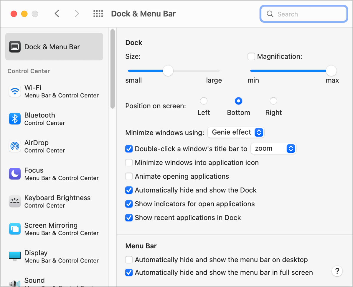
But did you know you can do a lot of these same functions without even opening System Preferences?
The Dock is broken up into three sections, designated by two thin, vertical lines. The far left section is the apps you’ve chosen to always live in the Dock. The next section has apps that were recently open and which may now be closed. The final section on the far right of the Dock holds Trash, Downloads, and any documents you’ve chosen to hide. You can remove Downloads from the Dock but Trash is a permanent fixture.
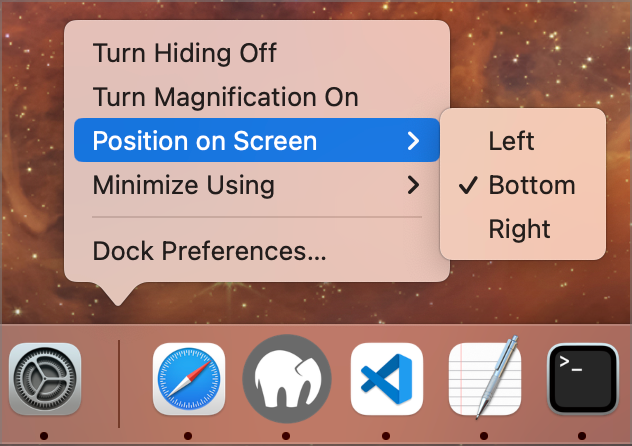
You probably knew that too, but those vertical lines separating these sections have magical powers. Click and hold on either one and drag up and down to change the size of the Dock and the app icons inside it.
To access even more controls, right-click in the space around either vertical line, and you’ll be rewarded with a popup menu. In this menu, you can toggle hiding on and off, you can toggle magnification, you can change the position of the Dock on screen from left to bottom to right, and you can toggle the minimization effect between the genie and scale effects. Finally, you can open Dock Preferences directly from that popup menu if there’s something more advanced you’d like to do.
Increase Size of Text Input Windows in Safari
This next tip is probably one of the tiniest of all. Have you ever been on a website where you were given a free-form text box, and while they let you type a lot into the box, the box isn’t large enough to see all that you’ve typed?
If you’re a Safari user, look in the bottom right of that text area. You may see two tiny diagonal lines in the corner. If you do, you can actually drag the bottom right corner and resize the text box so you can see as much as you need.
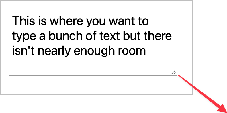
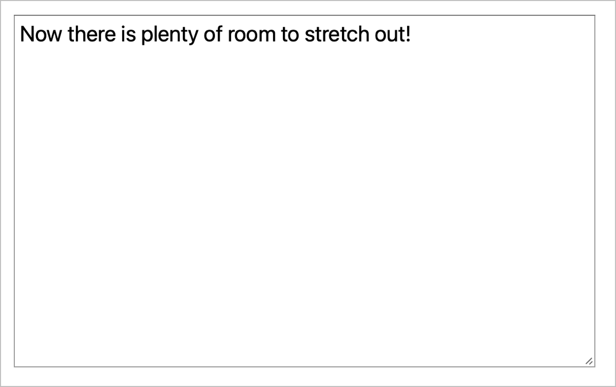
It’s not a life-changing trick but I’m always happy when I see those tiny lines indicating a resizing handle for the text area.
Rearrange Menu Bar Items with ⌘ Key
Here’s another really quick trick. Menu bar items seem to proliferate on our Macs, and the order of them seems mysterious. Near as I can figure, they seem to be in the order of most recently installed applications, with the newest on the left.
Have you ever wished you could rearrange them? If you hold down the Command (⌘) key, you can click and drag them right and left to your heart’s content. Well, not actually to your heart’s content. You can’t change the order of a few of the Apple menu bar items like the clock and Control Center. They have a sacred order and don’t even think about trying to move them.
Most of the Apple menu bar items can be removed from the menu bar, using that handy dandy Dock & Menu Bar Preference pane we were just chatting about.
Color Eyedropper
This next tip takes a while to explain, but is actually quite easy to use and is very powerful.
One of the hidden treasures of macOS is the built-in Color Picker. Let’s set up a problem to be solved to show how powerful it is. The Color Picker works across all standard Mac apps. Developers get it for free, and most choose to use it. I’ll use Preview for my example since we know everyone has that built-in app if they’re using a Mac.
Let’s say you’ve taken a screenshot and some sensitive information is in it that you’d like to obscure before posting it publicly. In the Preview app, open the Markup toolbar by clicking on the little pen inside a circle. In the toolbar, you can choose a shape to obscure the sensitive information (I recommend a rectangle) and to the right, you can choose the fill color.
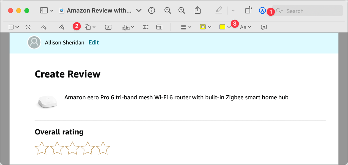
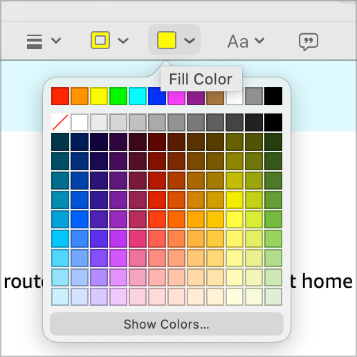
If you select the fill color you’ll get a dropdown with a grid of colors from which to choose.
We could pick any old color to cover up the sensitive information, but it would be very obvious that we’d done so if we used a red box to cover up something on a blue background. Ideally, we’d cover it up with a color that matched the existing background.
At the bottom of this grid of colors, it says in wee tiny letters, “Show Colors…” and if we select that, we get a window with five tabs with different options on how to choose colors.
By default, it starts at the color wheel tab. This lets you drag a target around on the wheel to choose a color, and you can set the darkness of the color chosen and even the opacity.
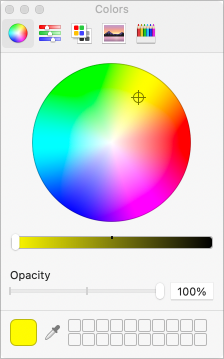
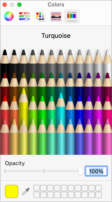
There are also tabs to let you use sliders to change color, a tab with a a narrow set of predefined colors like “red” and “blue”, you’ll see a tab to let you choose by spectrum, or you can even choose from a box of colored pencils.
All of these are swell options and I admit I often just use the narrow color option list to simply pick “red”, but we want a very specific color. In the example screenshot I took from Amazon’s review page, my name is shown in the screenshot over a light turquoise background. I want to draw a box to cover my name that is the exact same color.
On every one of the tabs of the Colors window, down at the bottom, you will see the color you have chosen, with a tiny eye dropper next to it. This is the Color Eyedropper and it’s magical.

Simply click once on the eyedropper, and then move your cursor over the color you want to use. You’ll see a big circle magnifying your cursor position. The information you see in the magnifier will help make sure you get exactly what you want, in case there are multiple colored pixels right near each other. When you’re over the color you want, click once.
Now back in the Color window, the color in the bottom left is the one you chose from your screenshot. In Preview, the fill color will also have changed to the color you’ve chosen. You can draw a rectangle now over the information you’d like to obscure and it will disappear leaving no trace of the previous information.
Well, there’s one more step. Preview also has an outline color, so you might get the perfect light turquoise rectangle, but if the outline color is set to red, you’ve got a smidge more work to do. You can change the outline color to none by selecting the white box with the red line through it, or you can use the Color Picker to set the outline color to be the same as the fill color.
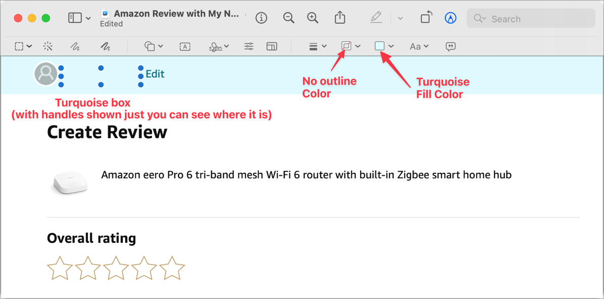
This is definitely one of those tricks that sounds super complicated when explained but is super quick in execution.
My example was in an image-editing application but the Color Picker and Eyedropper are available all across macOS whenever you need to choose a color. You can even use it for text color, and you can use the Eyedropper to grab color in completely different apps than where you’re working. Practice looking for the Color Eyedropper whenever you pick a color and you’ll quickly become proficient at getting exactly the color you want.
Having the Color Picker with the Eyedropper built into just about every app where you need color is a really powerful feature of macOS.
Look Up Any Word
Do you remember the old days when if you didn’t know a word you were reading you would go pull the giant physical dictionary out of the bookcase and look up the word to find out what it meant? If not, go ask your parents or grandparents. I still have mine for nostalgia’s sake.
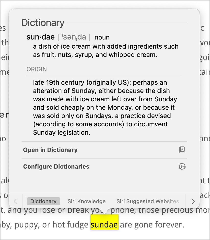
If you’re on a Mac, you can do the same thing from the comfort of your own fingertip.
Simply tap and hold on any word, and you’ll get a popup showing you the dictionary definition of that word. I use this all the time to increase my vocabulary. If I use Look Up on the word “sundae”, the dictionary tells me:
a dish of ice cream with added ingredients such as fruit, nuts, syrup, and whipped cream.
At the bottom of the popup, you’ll see a list of other resources available to give you more information. If you’re not just looking for the definition of a word, but instead say you want to know more about a country or region mentioned in the news, you can flip through the options to look at Siri Knowledge, or Siri Suggested Websites.

The list you’ll see to choose from is contextual and based on the word or words you look up. For example, in a news article about the Russian invasion of Ukraine, I can select Volodymyr Zelensky and then press and hold and it opens Siri Knowledge first instead of the dictionary. I am also offered Siri Suggested Websites or News.
If you need a different dictionary, you can select the gear next to “Configure Dictionaries”. This will reveal a list of the reference resources it’s using. You can deselect any of the selected sources, add new sources, and change the order of precedence. For me, it defaulted to a few English dictionaries, but I can choose from a multitude of different dictionaries in other languages as well.
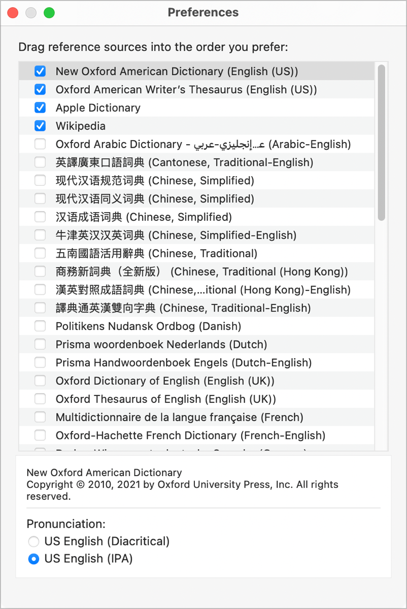
I’m trying to stay focussed on macOS tips, but I would be remiss if I didn’t mention that Look Up exists on iOS and iPadOS as well. Your options may be slightly different, but it functions essentially in the same way.
Advanced Spotlight Searches in Finder
We all know about Spotlight searching on the Mac using ⌘-Space, but there’s another way to utilize the power of Spotlight to create tailored searches in the Finder.
If you open a Finder window in any view, if it’s wide enough, on the far right side of the window’s toolbar, you’ll see a magnifying glass. If your Finder toolbar isn’t visible, in the Finder menus choose View → Show Toolbar (or use ⌥-⌘-T) to toggle it on.
Let’s start by doing a simple search for a file by name. With a Finder window open to any folder at all, click on the magnifying glass in the toolbar, and start typing any text string. For my example, I’d like to find a cross stitch pattern I made for my grandson Parker. It was a baby towel I cross stitched with baby Avengers superheroes on it. Look how cute it is!
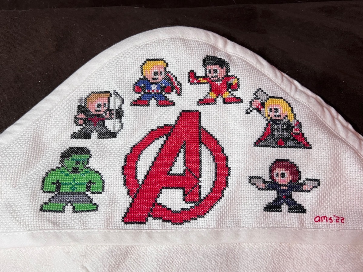
I have a lot of files with “cross stitch” in them, but let’s make it challenging for Spotlight and I’ll just search for “cross”.
As you start to type, the display of the Finder window will change. Right under the toolbar, you’ll see “Search: This Mac” followed by the name of the folder you were in when you started. This means you can isolate your search to just that original folder, or you can search your entire computer. By default, it starts with the entire computer.
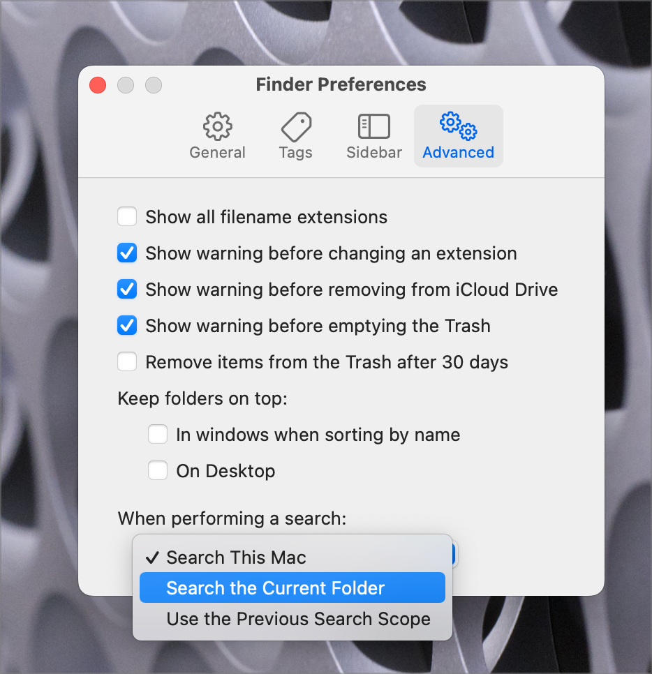
If you more often want to do a search like this from the specific folder you’ve chosen, you can change that default. Select Finder from the menu bar and open Finder Preferences. If you select the Advanced tab, at the bottom you’ll see, “When performing a search:” and a dropdown showing “Search this Mac”. You can change it to “Search the Current Folder” or “Use the Previous Search Scope”.
Now that we have that housekeeping out of the way, let’s have some fun making more powerful searches.
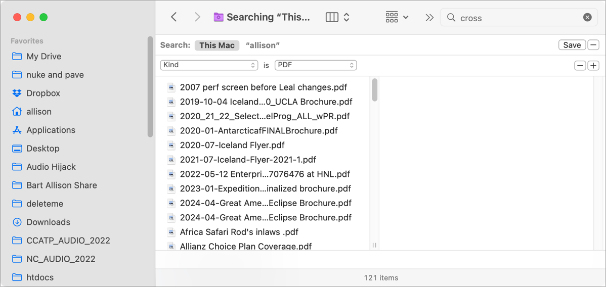
After I typed the word “cross” into Spotlight in the Finder window, it found 2,278 file matches. This demonstrates that Spotlight not only searches file names, but it finds the word matches inside the documents as well. I need to narrow the search down to find that Avengers cross stitch pattern.
Right under the search box in the upper right, you’ll see a Save button and a + button. We’ll come back to Save in a moment. If we hit the + button, we can add more criteria to narrow our search.
We now see another row of options with two dropdowns. They say “Kind” is “Any”. No wonder it found 2,278 matches to my query! If I select the dropdown that says “Any”, I can change the criteria to Application, Archive, Document, Executable, and many more. I’ll choose PDF for this exercise. This immediately narrows the search results from 2,278 to 121. Now we’re getting somewhere.
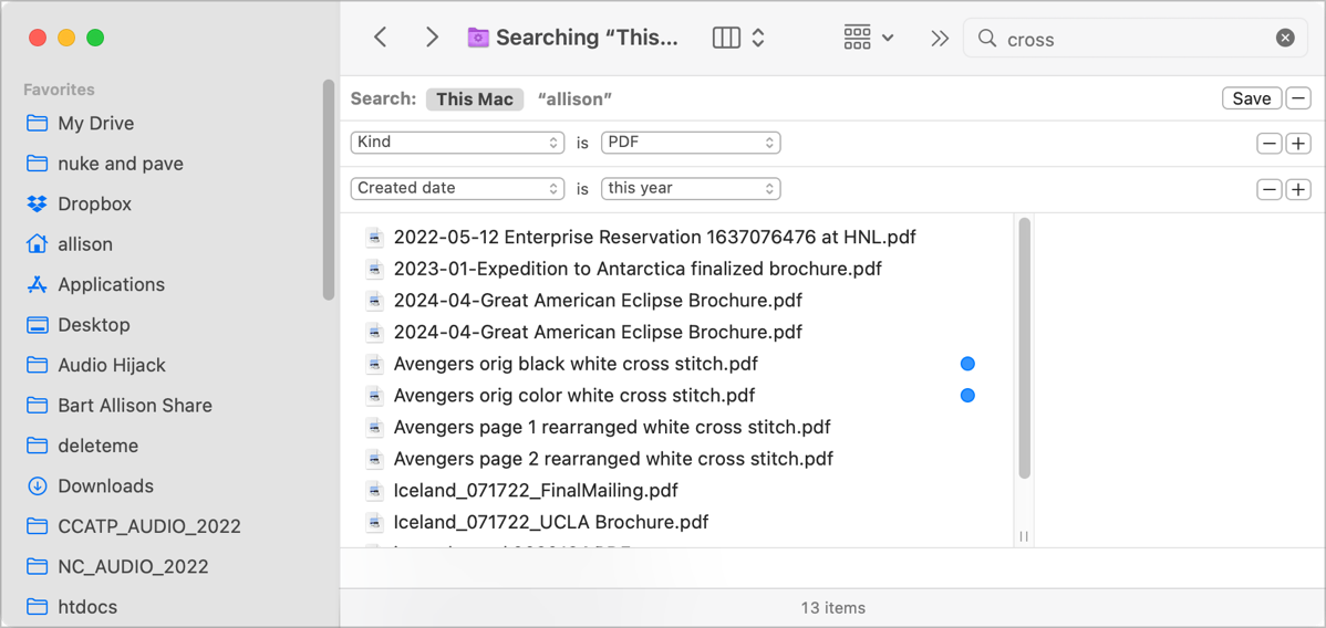
I know I worked on this cross-stitch project in the last year because Parker is just coming up on his first birthday. Let’s hit the + button again, and this time I’ll change the left dropdown to Created date. This changes the second dropdown to show “within last” followed by a field where I can type a number and a dropdown that defaults to “days”. I could type in 1, and change “days” to “years”. I’m pretty sure it was in 2022, so I’ll be lazy and change the “within last” dropdown to “this year”.
I now can see 13 PDFs all of which have the text string “cross” in them somewhere, that were created in the last year.
The real power of Spotlight comes when you start to investigate the vast array of criteria you have from which to choose. While the first dropdown field just shows options for kind, last opened date, last modified date, created date, name, and contents, below that it says “other…” Not only am I not going to list off all of the options under “other”, I’m not even going to count the options there are so many. I captured the list using the scrolling screenshot option in CleanShot X and if I shrink it down to see all of them, I can’t even read their names it’s so small. I put a link to the full-sized list in the shownotes for your amusement.

You’re going to have to trust me that if you can think of unique criteria to find a file on your Mac, Apple has them in that list of options.
I can prove it to you. In 2019, Steve and I went to Chile to see a total eclipse of the sun and to tour the amazing telescopes they have there, guided by an astrophysicist. The coolest one we saw was ALMA, the Atacama Large Millimeter Array. ALMA came into wide fame when it was one of the telescopes that were combined together to create the first image of a black hole.
ALMA is so high up that we had to take blood pressure tests before we were allowed to go up, and we were issued oxygen tanks to keep ourselves alive. It was also brutally cold, and the UV Index was 11. We took a photo of ourselves in front of the array. I thought it would be fun to try to find it on my disk using these advanced Spotlight search options in Finder.
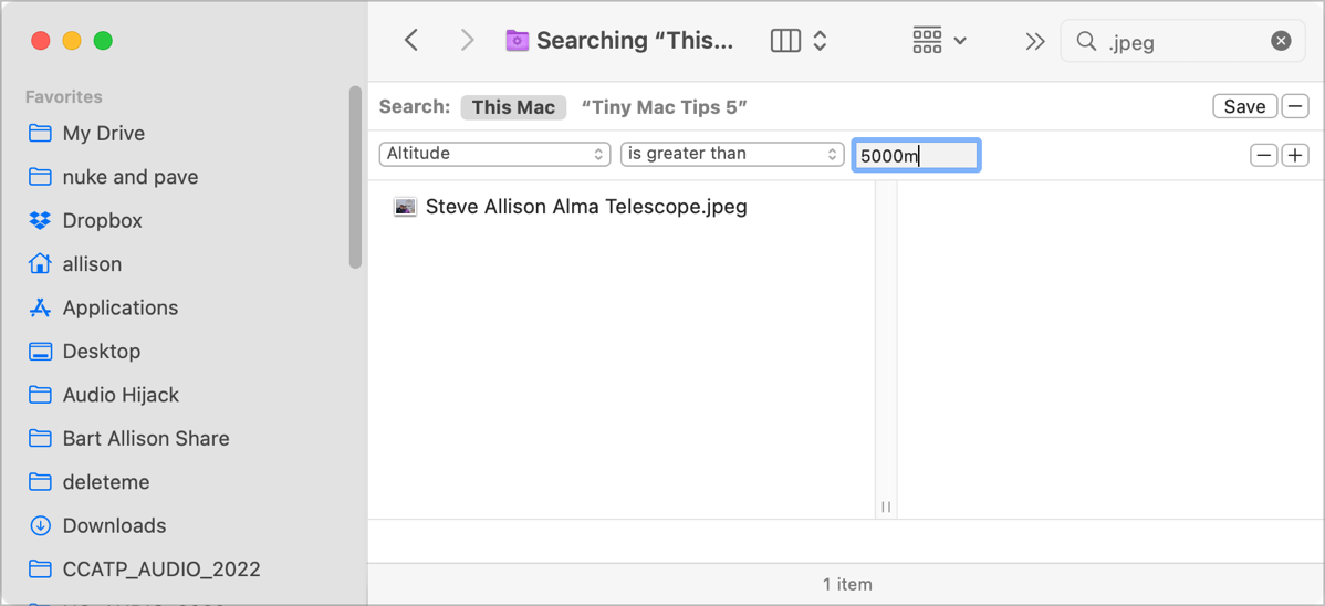
I knew it was a jpeg, so that was my first criterion in Spotlight search. I also knew that we were standing at 5042.9m above sea level (3.36 miles!) when the photo was taken on Steve’s iPhone. I suspected that the altitude information might be included in the EXIF data for the image.
Under the first dropdown, I selected “other” and from that giant list of options, I selected “altitude”. On the second dropdown, I selected “is greater than” and I typed in 5000m. I was rewarded with a file entitled “Steve Allison ALMA Telescope.jpeg”.

If you find one of these specialized options that you think you might want to use pretty often, there’s a checkbox next to each one to add it to the dropdown menu. I told you near the beginning that there’s a save button and that I’d explain it later.
Save creates a Smart Folder that will save in your User Library Under Saved Searches, or you can specify a location of your own for saved searches. You can also check a box to put the Saved Search into the sidebar of all of your Finder windows. As with all Smart Folders, you can right-click on it, select Show Criteria and from there modify the criteria to your heart’s delight.
I tend to use “regular” Spotlight for finding and launching apps and the Finder-level Spotlight whenever I want to find a file.
Bottom Line
I have to say that I’m having a blast telling you all of these Mac Tiny Tips so I expect this series to go on for quite some time. I’m learning more about the features as I try to explain them so I benefit right along with you. I expect that macOS Ventura will force me to go back through these to see how they’ve changed and to find new Mac Tiny Tips to help you be more productive.
If you enjoyed these tips, here’s a link to the next set of tips: Link to Tiny Mac Tips Part 6
