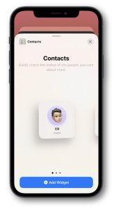
Home Screen widgets on iOS are a tradeoff between instant access to many applications and instant access to useful information. Even the small widget size displaces four potential spots for app icons.
Because of this tradeoff, I have had an on again, off again relationship with widgets. I’ll try out new ones offered by third-party apps, and occasionally revisit Apple’s built-in ones, but often their utility does not make the grade and I remove them in favour of more app icons. I like to keep my number of Home Screens minimal, so space is valuable.
 There is one widget which has kept its place the longest for me, and it’s one I only discovered while messing around with the built-in ones. If you haven’t seen it, you’ll probably wonder why I like it so much when I tell you what it is… it’s the Contacts widget.
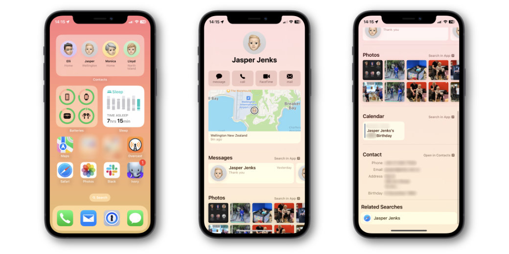
Sure, you might like quick access to some of your contacts, but there is so much more to what this widget does. In the form you see it on your Home Screen, you get one, four, or six contact avatars — depending on which size you choose. Below each is their name, and the name of their current location, if they share their location with you.
You may also see a small badge on a contact, to indicate they are driving, exercising, or possibly other things. I’m not sure what others may exist.
I have my wife, two sons, and my mother on a medium-sized widget and all of them show me their location, which is sometimes meaningful. Why sometimes? Well, the whole Find My treatment of location names is a little odd.
You may know that in the Find My app, you can add your own label to certain locations, so when my wife is at home, her location simply says “Home”. Same for my Mum when she’s at her home, and my son, who is currently living with us again. When both of my sons had their own places, I named them Chez Lloyd and Casa Jasper, just for a little variety.
If Find My updates their locations, these labels show fairly reliably. It’s what it shows when someone is on the move that is weird. More often than not, I see simply “Te Ika-a-Māui/North Island.” This isn’t any more helpful than if Allison or Steve showed as “California” or Bart showed as “Republic of Ireland.” It is hilariously broad as a location.
So, wait… didn’t I tell you this widget was really valuable? So far, it sounds a bit… hokey. It redeems itself when you tap on one of your four contacts. Then you see a screen that you cannot get to any other way. It’s not the Contacts app.
What you get is a vertically scrolling smorgasbord of useful information and possible interactions with the contact. At the top is their avatar and name. Below that are four buttons for “message”, “call”, “FaceTime”, and “mail”. Tap any of those, and it initiates the respective form of communication with your contact.
Below these buttons is a small Find My map, which starts updating as soon as the screen opens, so you’re not stuck with the ridiculous generic location. The map remains live while you’re on this screen. If you tap it, the full Find My app is launched, with the contact selected.

Below the map is a selection of recent message conversations the contact is part of, showing their last message in each. These are in a horizontally scrolling list, and tapping any of them takes you to that conversation. There is also an associated “Search in app” button which initiates a search in Messages for their name. This will give you the same conversations, plus links, photos, and more.
Next is a list of calendar items. I’m not big on calendaring with family. Or rather… they’re not big on calendaring with me. As such, all I see here is their birthday from the birthdays calendar, but I would guess any shared calendar appointments would also appear.
Below that is a section for photos the contact appears in, based on Apple Photos’ face recognition feature, or where their name is found in text within the image.
The penultimate section shows their basic contact information, including phone number, email, address, and birthday. There’s also a link to go to their entry in the Contacts app.
Finally, there’s an odd one — a Safari search for their name. This is just a button to push which launches the search. Given most of the sections above seem geared to family or close friends, this one seems a little odd to me. I cannot think of a situation when I would use it.
If you don’t tap one of the many controls offered on this screen, you can simply swipe or press the Home button back to your Home Screen. Which makes this a really useful, lightweight pseudo-app that is more useful than any single app it represents.
I’ve found so much value in this widget, it has lived at the top of my primary Home Screen for a long time now, and I don’t see myself removing it any time soon. When setting up a new phone for my Mum recently, I added it to her Home Screen too.

[…] The iOS Contacts Widget […]