I think the first time I talked about the wonderful menu bar app organizer, Bartender, was in January of 2014. When I do my annual nuke and pave, Bartender is in the top list of critical apps I install first. It also has a warm place in my heart because it reminds me of the gone-too-soon Tim Verpoorten on the MacReviewcast when he told us about so many awesome menu bar apps that he said someone should invent a menu bar app to manage them.
Over the last 9 years, Bartender just gets better and better. In 2021 Bartender 4 was a huge step forward, and now in 2023 we have the newly released Bartender 5 from macbartender.com.
If you are already a Bartender fan and you have not yet upgraded to macOS Sonoma, it’s important to know that Bartender 4 does not run under Sonoma. You’ll need to upgrade to Bartender 5. If you already own Bartender 4, you’ll be eligible for upgrade pricing and if you bought it from July 2022 then you get a free upgrade. If you don’t yet own Bartender, it’s only $16 and comes with a four-week free trial. In this day and age of subscription pricing, it’s refreshing, isn’t it?
Now that we have the pricing out of the way, let’s talk about the cool new features.
Menu Bar Item Groups
Bartender’s main purpose in life is to let you have a secondary menu bar to hold the menu bar items you don’t need to access as frequently. You may also have apps that have menu bar icons but you simply never view the apps in this way, and Bartender lets you keep those always hidden.
By hiding things you don’t need often, Bartender reduces confusion in the main menu bar. It’s also a critical tool if you’re using a laptop with limited screen real estate. To see the secondary menu bar (also called the Bartender bar), you can choose to have it show when you hover over the empty space in your menu bar or when you click on the Bartender icon.
Bartender 5 now allows you to create menu bar item groups. With groups you can have a single icon that’s always visible, or in the Bartender bar, but when you hover (or click) on the icon you get a little dropdown of just the items in that group.
This would probably be more clear with an example. When you open Bartender to the Menu Bar Items tab, you’ll see the familiar shown, hidden, and always hidden sections. You drag and drop the menubar icons up and down between those three sections. Below, you’ll find the menu bar items palette in which you’ll find two little lozenges: “Add a spacer” and “Add menu bar item group”. If you drag the add menu bar item group lozenge up into the shown or hidden bar, you’ll get a new window, allowing you to customize this group.
First, you get to create the icon, and/or title you would like to have for your group. The icon options are from what are called SF Symbols, which are those tiny black-and-white graphics. All menu bar icons are black and white now, and I think it makes it significantly harder to tell them apart. For that reason, I don’t choose any of the SF symbols for my menu bar item groups.
The real fun comes if you choose the emoji button instead of adding text. Let me explain with an example.
I really like iStat Menus from Bjango, but there are so many nifty graphs to monitor about my system that they end up taking up a lot of space in my menu bar. Making them a group is the perfect solution. In the emoji picker, I searched for graph and found a colorful bar graph that’s perfect for my iStat Menus group. I can actually tell it apart from all the other icons!
In creating a menu bar item group, I think it’s handy to switch on the toggle that enables you to simply hover over the icon for your group to instantly reveal the contents. The last step is to drag the menu bar items up into your group.
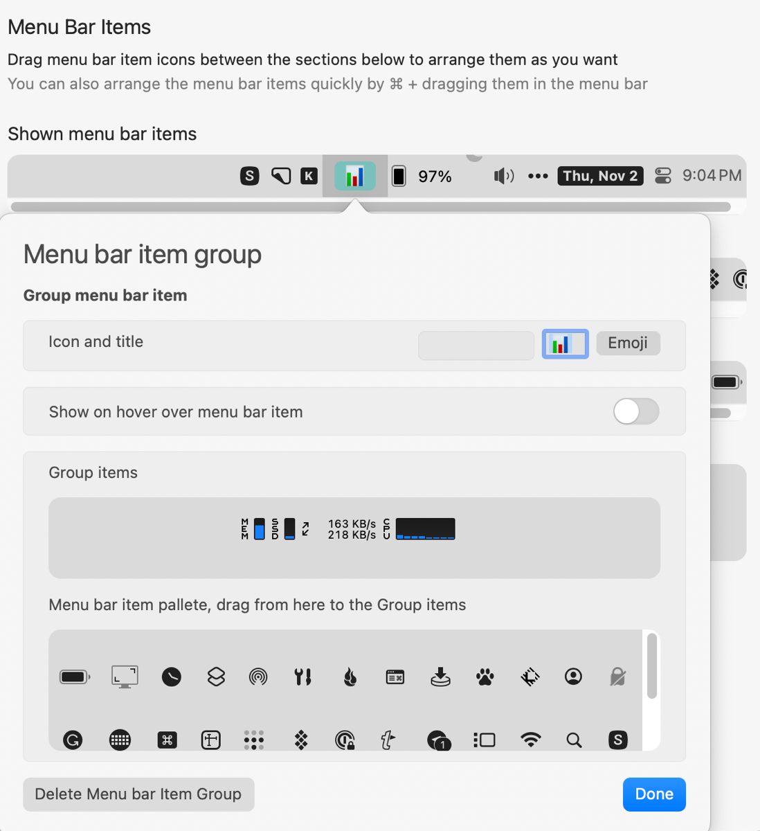
Once you’ve created a group, remember to remove the same items from the normal menu bar or you’ll see them twice.
I’m excited about menu bar items groups in Bartender 5 to keep my smaller laptop screen uncluttered and the items easier to find.
Menu Bar Style
Bartender 5 now gives us flexibility in the styling of our menu bars. The first thing you’ll find in the Menu Bar Style tab is the option to add a tint. You’ll see a nondescript, wide, empty lozenge. Tapping on it brings up the traditional color palette. When you choose a deep, rich color, don’t be surprised when the menu bar doesn’t turn that color – it just tints the menu bar with that color.
If you’re fancy, you can even add a gradient to the menu bar. The button is labled “Add Color Stop for gradient” which will add a little circle at each end of the color lozenge. Tap on one of the circles to change the color at that end. It can make for a very pleasing effect, or you can successfully create garish combinations that clash terribly with your chosen desktop wallpaper. You can even add more gradient stops to add more flair.
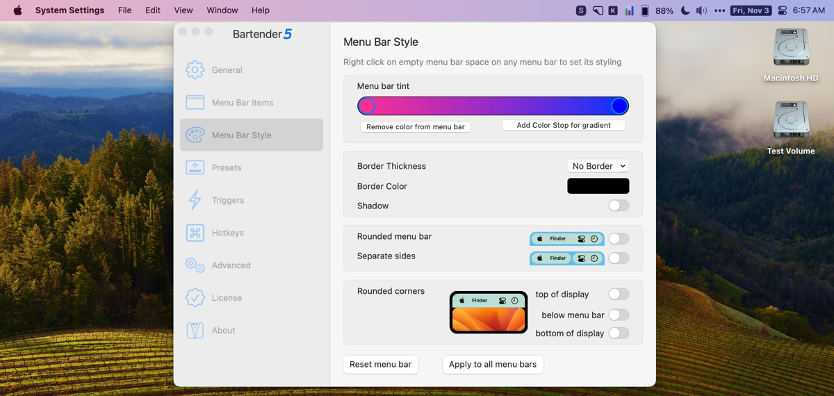
You can add a border to your menu of color and thickness of your choice, and a nice drop shadow to set it off.
For me, the real fun of styling the menu bar is the next section. If you toggle on the switch for “Rounded menu bar”, you’ll notice that the two ends of the menu bar are now rounded, forming a long rounded rectangle. But wait, it gets better. The second toggle, “Rounded separate sides” does something magical. The left menus next to the Apple logo and the right menus near the time become completely separate menu bars each with their own rounding. It looks really really cool, and it really highlights that these are two different menu bars.

Note that rounded menu bar and rounded separate sides are inverse toggles – if you flip one on, it flips the other off.
If that isn’t enough styling, you can also round the corners of your display (if it isn’t already rounded). You can round just the top, just the bottom, or toggle them both on for a fully rounded rectangle experience. If you aren’t using the rounded menu bar or rounded separate sides, it makes for a very pleasing look to have the screen rounded on all four corners. If you do have the menu bar rounded, I find it a bit unsettling that the diameter of the rounding of the menu is slightly different than the rounding of the display so you see a sliver of the display up in the corners.
There’s one more toggle in this section that might provide an improved experience for you. If you are bothered by the camera notch on your laptop, toggle on “below menu bar”. This toggle puts a black bar across the top, under the menu bar, and also rounds the top of the display below the menu bar. It’s hard to explain but it makes the menu bars feel like they’re floating above the main screen and everything looks very finished off. You can also no longer see the notch!
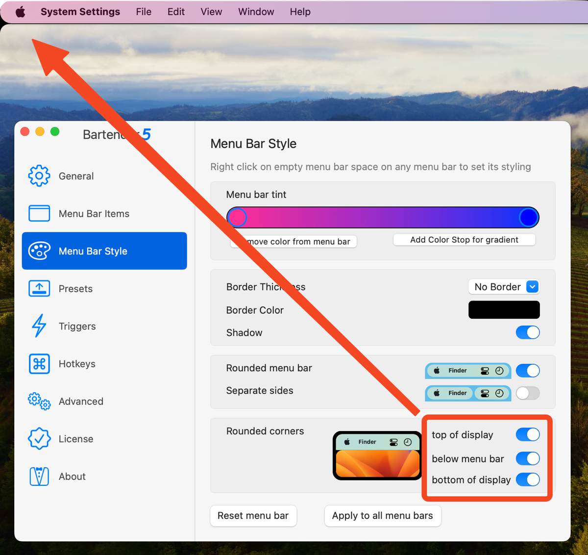
With this many toggles to play with to control the look and feel of your menu bars, you’re bound to find a combination that you find pleasing. If you do so many changes to your menu bars in your experimenting that it’s a hot mess and you want to start over, there’s a Reset menu bar button at the bottom of the Menu Bar Style tab.
You’ll also notice a button that says “Apply to all menu bars”. This is a hint at another feature of Bartender 5. By default, your modifications to the style of Bartender apply only to the current display. This is awesome because it’s quite likely that you’d want a different style for the menu bars on a small laptop display than your larger external display.
Presets
Ok, enough fooling around with the aesthetics of your menu bars, let’s get back into the power Bartender 5 brings to you. We now have Presets. If you’re anything like me, you have different contexts in which you work. For example, when I’m recording a podcast, I need to have quick access to some very specific menu bar apps, but when I’m recording for ScreenCastsONLINE I need to have the absolute minimum number of menu bar items showing during the recording to create a distraction-free video.
To create a Preset, you select the giant plus button. In the popup menu you can name the preset and even add a description. In my example mine could be called Recording, and in the description I could list the menu bar apps that will show if this preset is chosen, such as Audio Hijack, SoundSource, Do Not Disturb, and LogiTune to control my lights and webcam.
Next you have the same three areas we see in the main interface of Bartender: Shown, Hidden, and Always Hidden. Makes sense right? Below that you can add a spacer or add a menu bar items group just like the normal settings for Bartender.
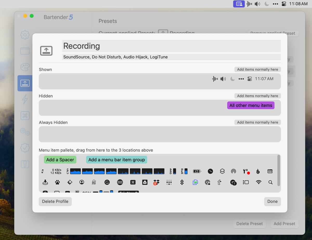
Once you have your preset set up, you’ll see it in a list on the Preset tab along with any others you’ve created. You can tap the button to apply a preset, and you can modify it by double clicking or tap Settings. In the upper right, you’ll see a button to remove the applied Preset to go back to your default.
You don’t have to launch Bartender Settings to switch between Presets. Simply right-click on the Bartender icon in your menu bar and the dropdown menu gives you access to changing Presets.
Here’s a big caution about using Presets. If you have a Preset enabled, and then go back to the Menu Bar Items tab where you create your defaults, you’ll see a warning. It shows you the name of the currently applied Preset, with a button to Remove Applied Preset. Below that is an explanation of why you need to remove the applied Preset. It says:
Changes made here when a preset is applied will not be saved to the default menu bar layout or to the preset
In more colloquial language, you’re spittin’ in the wind if you make any changes to the defaults while a Preset is applied. It’s not changing the Preset and it’s not changing the default menu bar. I think this is a big enough notification to catch your eye, but if you forget or don’t notice it, you’ll enjoy what Bart likes to call “spooky action at a distance” where changing something doesn’t affect what you think it should.
Triggers
Presets are super powerful and give you granular control over the different contexts in which you might work. But the best tools let you automate the switching of contexts. Rather than worry your pretty little head about remembering to switch Presets when you change context, Bartender can change your menu bar based on Triggers you define.
The Triggers tab looks a lot like the Presets tab with a giant plus button inviting us to add a new Trigger.
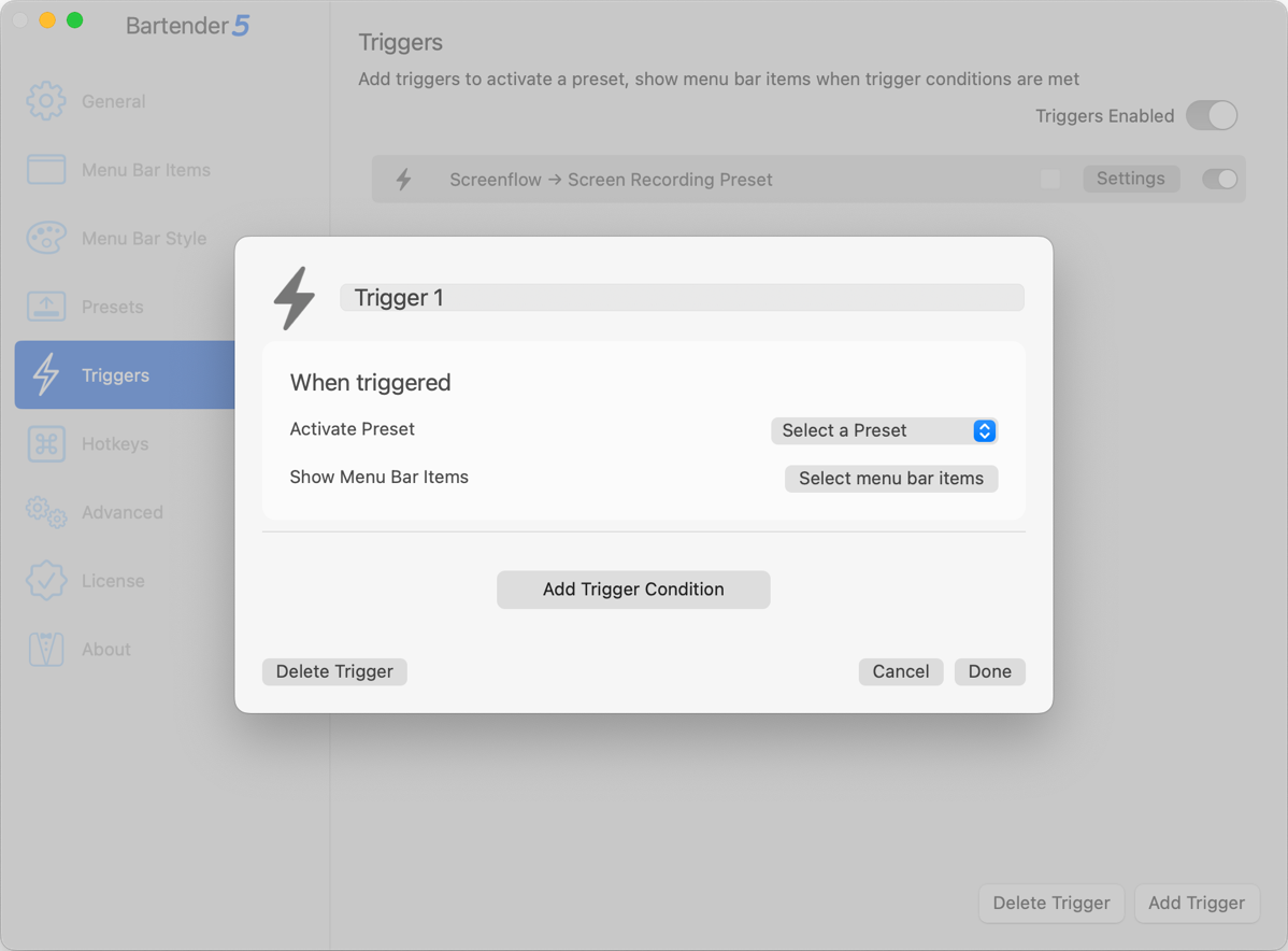
You’re invited to name it and then choose how you want the menu bar to change when this Trigger is fired. If you’ve gone to all the work of creating a Preset, you can choose to Activate a Preset from a pulldown. But you can also simply select menu bar items to include with this Trigger.

This selection method seems simpler than the normal method of dragging icons up and down between shown, hidden, and always hidden. You get a simple list of every menu bar item that’s currently available to you with the icon of the real app, the name, and the frustratingly black-and-white icon for the menu bar item itself. Check off all the ones you want to show and tap done. Easy peasy.
Next you need to add the Trigger Condition. You can trigger on an app, battery status, location, time, by script, or by WiFi.
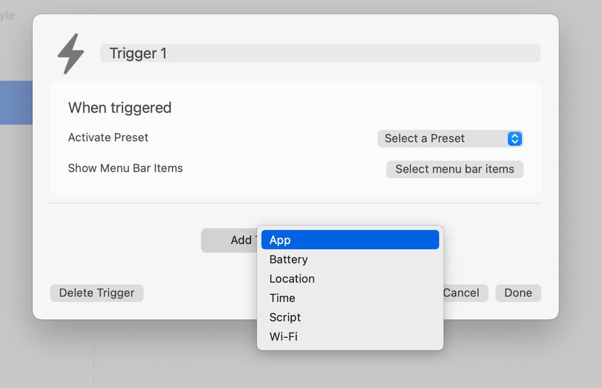
If you choose to trigger by an app, you can decide whether simply being open is when the menu bar will change, or whether you only want that change when the app is the front window. I suspect that the second option might be disorienting as you switch apps when working but there must be a case where that’s valuable.
Back to my recording example, podcast recording normally requires my lighting which is controlled by an app called LogiTune. That means just the fact that LogiTune is open could trigger my Recording preset to be enabled.
Now here’s something interesting I learned in talking to Ben, the incredibly responsive developer of Bartender. I just finished telling you that you can have your menu bar changed to a preset you’ve created, or you can select the menu bar items specifically for this Trigger. He explained that you can actually do both in the same Trigger. Here’s an example of where combining these options might be handy.
One of the things that drives us crazy with our devices is constantly watching our battery indicators. I’m convinced that watching it actually drains it. Hey, maybe that’s why my MacBook Pro loses battery? Anyway, I digress. If you really want to watch your battery when it’s low but want to lower your stress, you could set up a trigger to enable your standard Preset when the battery of your MacBook is above 30%, but below 30%, it adds that one icon to your menu bar.
If you want to have one set of menu bar items when you’re at work and one for when you’re at home, you can use a Location Trigger. It brings up a little map with your current location shown, but it’s zoomed way out. In my case, I could see more than one state at the default size. You then pinch and zoom around until you’ve got the area you want to trigger a change. Tap the Update Trigger Region and a circle of maybe a mile or two will be drawn around the area.
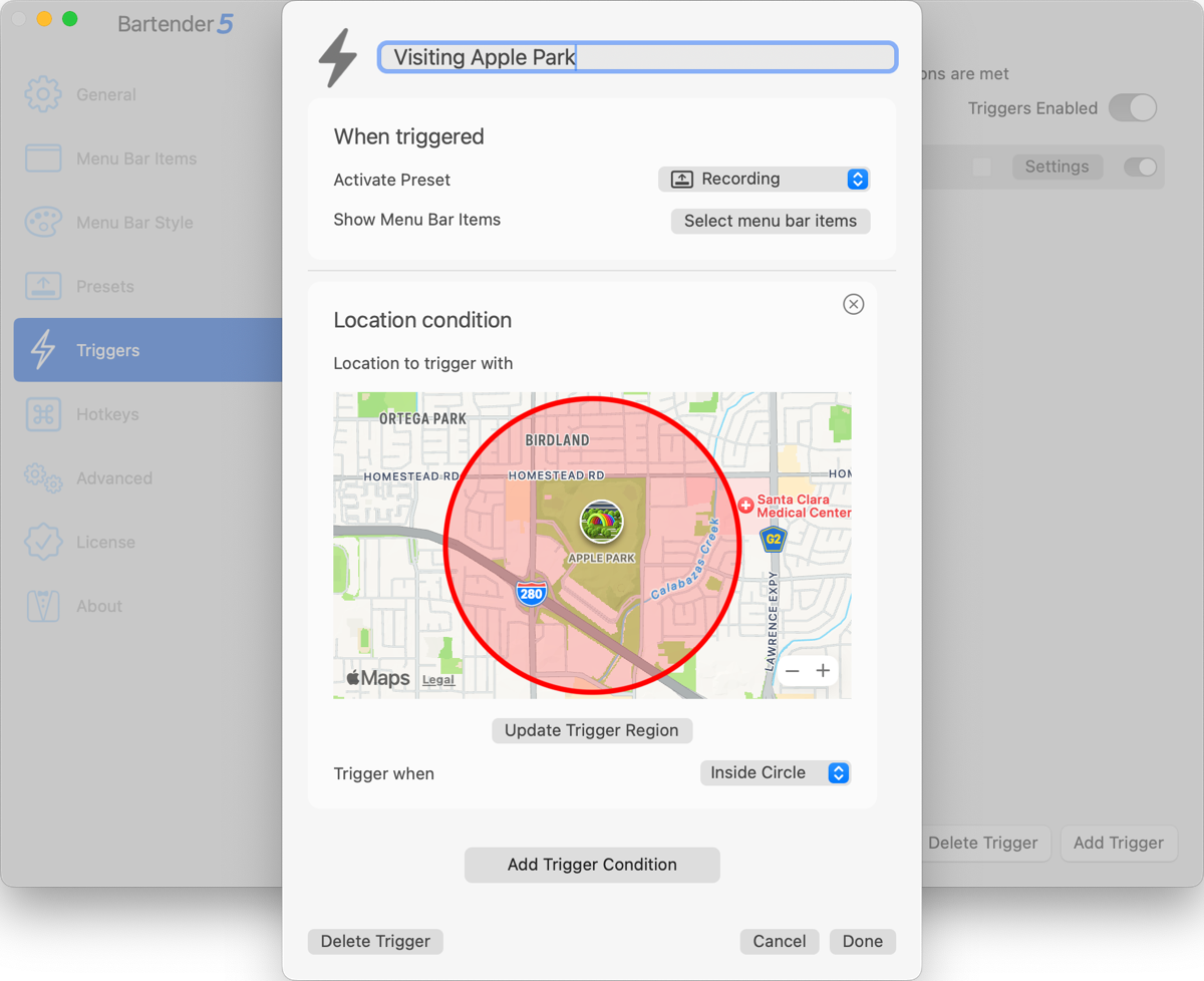
By default the Trigger fires when you’re inside the circle, but you can change it to outside the circle. I could see a simple setup where your menu bar looks one way when at home, and as soon as you leave your neighborhood, it changes.
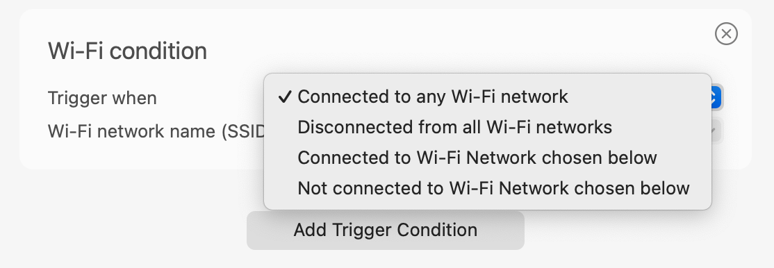
Setting Triggers by WiFi condition has several different options. You can set it to fire when connected to any WiFi network, when disconnected from all WiFi networks, or connected/disconnected from a specific WiFi network. This might be an easier way to define a trigger based on whether you’re at work or not. Another cool use of this option would be to set it so that when you’re not connected to your own WiFi network, be sure to show your VPN software’s icon in the menu bar.
If you’re a script kittie, you might enjoy using a script to trigger a change to your menu bar. I’d love to hear your story if you think up a useful script to trigger a change in your menu bar items.
Hotkeys
In version 4 of Bartender, you could define some hotkeys but they’re just enough different in Bartender 5 that they’re worth mentioning. You can define hotkeys to show hidden items, which you had before. But you can also set a hotkey to hide the left application menu.
If you’ve got a small screen, or you’ve got the resolution set particularly low to accommodate your vision, or you want to see a lot of menu bar items at the same time, being able to hide the application menu on the left might be the only way to see them. Like some of our other modifications, hiding the left application menu only affects the screen you have selected, not both displays.
You can set up a hotkey to show all menu bar items and do a quick search of menu bar items. I always forget that there’s a search capability in Bartender. I find myself scanning back and forth, back and forth, hovering over each icon trying to find the one I’m looking for. You can use a hotkey, or if you right-click on the Bartender icon in the menu bar, you can also trigger a search from there. I need to remember that!
You can also set a hotkey to navigate your menu bar items using just the keyboard. This may be your cup of tea if you truly hate to remove your hands from the keyboard. With a hotkey for keyboard navigation, it selects the first menu bar item and highlights it in blue. You then use the arrow keys to move from left to right to get to the desired menu bar item. To interact with the menu bar item, you hit the Enter key and then use the down arrow to navigate to the control within the menu bar app you want to manage, and again use Enter to invoke the command.
I’m often guilty of overcomplicating my descriptions, but this one is just as time-consuming to execute as it was for me to describe it. If you need to get to a menu bar item that’s in the hidden Bartender bar, you have to arrow over to the Bartender icon, Enter to open the hidden items, then arrow from left to right to get to the one you want, hit Enter, down arrow, and Enter again.
Again, maybe your cup of tea but I probably won’t take advantage of keyboard navigation in Bartender 5.
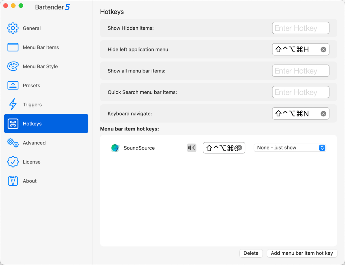
What I very well might take advantage of is the option to add hotkeys to invoke specific menu bar items. I’m going to set one of mine to open SoundSource from Rogue Amoeba.
I am constantly going in and out of SoundSource to toggle between my headphones and my speakers for audio out. You may be thinking, “Allison, you have a Stream Deck, why don’t you just assign a button to toggle between these two settings?” Well yes, that’s a grand idea, and I’ve tried that multiple times. Every time I try to do it, it works … for a couple of days. I literally just rebuilt a bunch of my Stream Deck settings 3 days ago when a big upgrade came through and messed a bunch of them up, and I was delighted to get my audio output toggle working again. And today it’s broken again.
Anyway, using the menu bar item hotkey section, I can use the button at the bottom to add a menu bar item hotkey for SoundSource, select the menu bar item from a list, and assign the hotkey. You can choose to have this hotkey left or right-click, or choose left or right-click with the option key. The last option is to just show the item, which is a great way to bring up a hidden menu bar item with a keystroke so you have quick access to it.
Advanced
Finally, we’ve got an Advanced tab with a few useful controls. We can tell Bartender to reduce energy usage on battery, change the delay before hiding temporarily shown menu bar items, show notifications, and to show all sections when command-dragging items. You can set whether to check for updates automatically and if you want to live on the wild side, you can allow updates to include test builds even though they might be unstable.
Bottom Line
I have buried the lead on my single favorite feature of Bartender. I had been planning for a long time to put in a feature request to Ben asking him if when Settings opened, could it please open to the menu bar items tab instead of General? My logic was that the General tab is where you set things up once and all of the fun was in the menu bar items tab. Before I got around to asking him for this change, Ben released Bartender 5 and he did one better than my request. Settings opens to whichever tab you opened last.
I know this sounds like a silly thing but if you’re testing a bunch of different style changes, or maybe setting up Presets and Triggers, you might want to close Settings for a bit, see how you like your changes, and then open it back up and make some tweaks. It makes me so happy that it opens right where I was working.
The bottom line is that Bartender 5 is a terrific upgrade and well worth the low price to do the upgrade. It may dismay you that your old version of Bartender won’t run under macOS Sonoma but for such a small price the upgrade is definitely worth it.
If you don’t own Bartender yet, rush over to macbartender.com and get Bartender 5. You’ll be glad you did.

Hitherto, I have felt deterred thinking about setting up bartender – so thanks.
One thing – your link to the bartender site is this https://www.podfeet dot com/blog/2023/11/bartender-5/macbartender dot com which will not get a person to its intended destination. (I put ‘dot’ to avoid it trying to link)