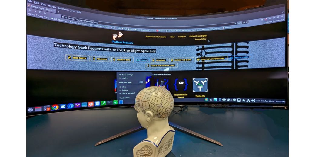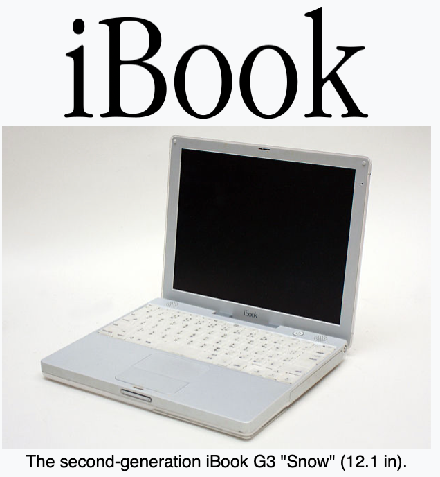
Hi, I’m George from Tulsa and I started this piece thinking it would be a simple report about my new monitor and how it answers Allison’s great framing question, “What’s the problem to be solved?” Answering that required context – I could have begun with the 5″ screen in my first computer, a 1981 Osborne 1, but decided to focus on my experiences beginning with OS X 10.0 which I bought on a 12″ iBook Snow in 2001.
While developing this segment I discovered some Mac viewability settings that were new to me. I’m talking about them right at the top so if you’re only here for Mac stuff and not my monitor discussion you could skip forward. In the interest of audio brevity, you’ll need to visit Allison’s shownotes for detailed instructions and links. I tested them on macOS 14 Sonoma. They may not all work on older versions.
Mac Viewability Settings
If you use two or more monitors, it’s easy and useful to display the Menu Bar and Dock on each screen. One nice feature is the Menu Bar’s brightness increases on the screen with an application in use and dims on the inactive screen. Which helps if you lose track of what you’re doing where!
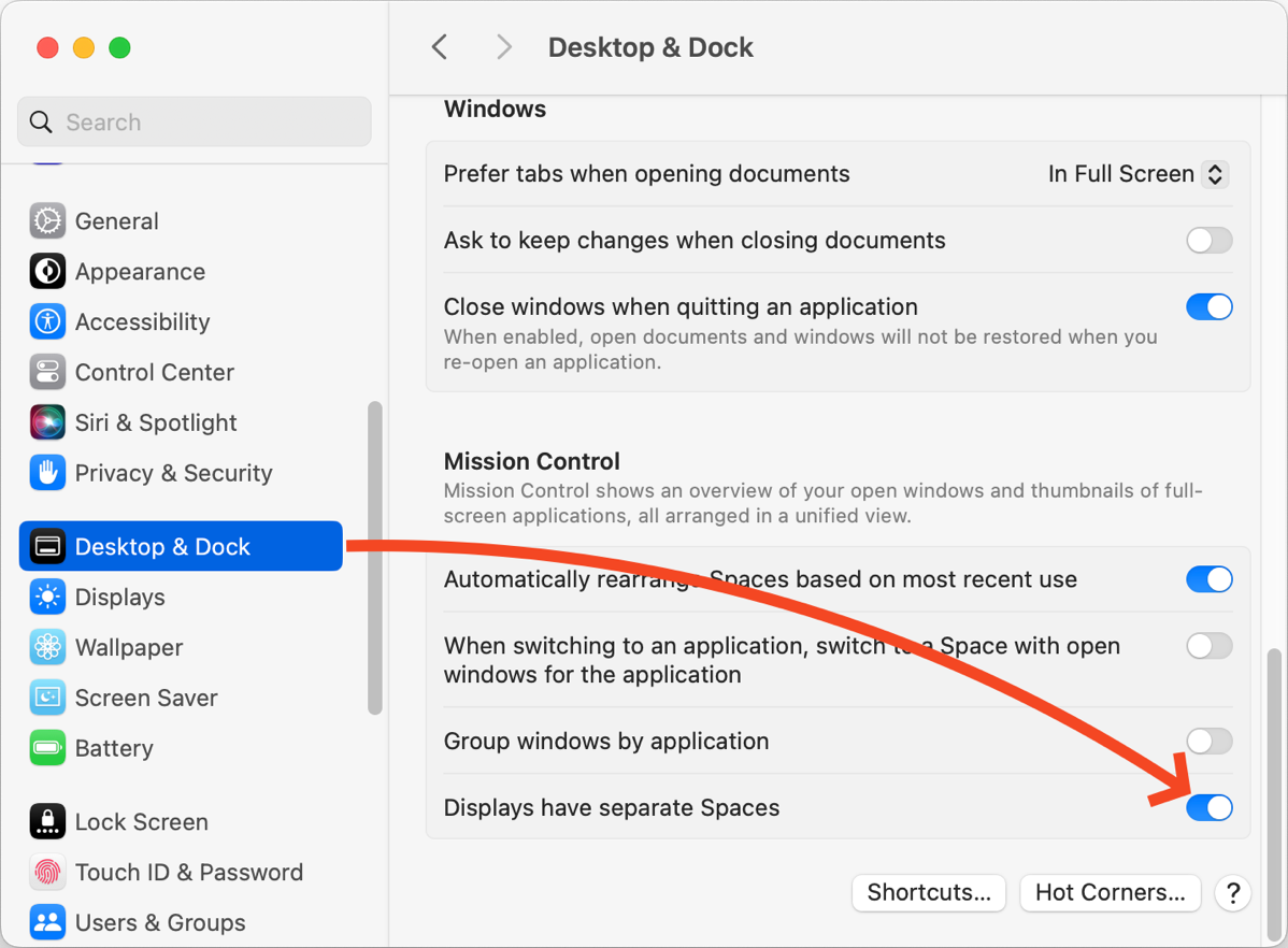
- Text Instructions: shmsinc.com/…
- Video Instructions: www.youtube.com/…
You can also VERY, VERY slightly increase the Menu Bar’s size.
- Text Instructions: How Do I Increase the Mac Menu Bar Size?
macmost.com/… - Video: How to Change Menu Bar Size on Mac – www.youtube.com/…
I don’t remember what version of OS X introduced the “full-screen mode”, the advantages of which are said to be a bit more working space and more focus, less distraction. I do remember my reaction the first time I unknowingly activated it was, “AAACCK!” What happened to my Menu Bar? How do I drive this careening car?
Beginning in Monterey it became possible to make full-screen slightly less all-consuming and keep the Menu Bar on screen. I’m putting in a link to how to do that in Ventura and Sonoma as they differ slightly.
Text Link: How to always show menu bar in full-screen mode in macOS Sonoma and Ventura – www.igeeksblog.com/…
Screen scaling can make everything onscreen either larger or smaller. It’s possible to set different resolutions on different monitors and to specify their relative locations.
Text Instructions: Change Monitor Resolution — support.apple.com/…
macOS also provides more granular settings:
- Make text and icons bigger across apps and system features
- Make text bigger for individual apps or system features
- Make icons bigger for individual apps or system features
All covered in one Apple Support Link: support.apple.com/…
The Monitor Story
Enough of those Public Service Announcements, on with the show!
Since acquiring my first computer in 1981 much of my work has involved creating, editing, and reviewing spreadsheets.
The ability to usefully display two, or more, spreadsheets simultaneously has long been something of a personal “Holy Grail.” By usefully, I mean in fonts large enough to read.
For most of my computing decades, even though Macs and Windows could display applications and open files in multiple on-screen windows, screens were just too small to display two readable files onscreen. Thinking over just the Macs I’ve owned or had at work, I count two 12″ “Snow” iBooks. Two 12″ Powerbooks. Two 11″ Airs. One 13″ Air. One 13″ MacBook Pro. Two 15″ MacBook Pros. A mid-90s Performa with 14″ CRT, two 17″ and one 20″ iMacs, a variety of Minis, and one 27″ 2010 iMac. Whew, no wonder Apple is a trillion-dollar business.
Only the 27″ iMac had a screen that could, in theory, have usefully displayed two spreadsheets simultaneously. Here’s an extract from my rant about that computer in 2010’s Nosillacast #287: “…it was a strain to read the system font when I pushed the computer far enough back on my desk to allow for keyboard and papers. Native resolution is 2560 x 1440. Meaningless in the abstract. In reality, it means “tiny font.” Apple Zombies call tiny fonts “crisp.” Pulled close enough to read, I was wiping nose grease from the screen.- Can it get worse? Oh, yes it can. The acre of shiny black glass reflected everything in my messy office, I gave it away…”
Following that experience, I went back to running my 15″ MacBook Pro, (one of the last with a non-reflective screen), on a laptop stand connected to a 24″ matte monitor. Then to a series of new and newer Mac minis connected to dual ASUS 27″ 2560×1440 Eye Care Monitors with an excellent anti-glare surface. No mirror effect, no eye strain, no headaches, but as they had the same native resolution as that iMac, they had the same “tiny font” problem and required scaling.
Dual 27″ screens, even with enlarged scale, will display two spreadsheets. Push two of the Asus 27s together and their combined edge bezels create an annoying 1 3/4″ break. Not good for spreadsheets that stretch onto both screens.
I certainly didn’t center myself at the annoying bezel but in front of the primary monitor on the left with the secondary stretching out to the right. The far right. Sure, they could display two readable spreadsheets, one on each monitor, but sitting centered in front of the left, the far right side is 38″ away, too distant for my reading glasses to bring into focus. To actually use a spreadsheet that takes up much of the right screen, I had to drag it onto the left one where it covered the one there. Poof! So much for two, usefully, at once.
I tried 4K TVs. My daughter, with LASIK perfect eyes, loves her 43″ 4K. She’s able to run it in its native 3840 x 2160 pixel resolution and fill its screen with active windows she can easily read and gets frustrated when she asks me to look at something and I have to confess I just can’t see it at that resolution.
I’ve become a juggler of reading glasses: one pair of reading glasses for working on a monitor that’s right in front of me and two more, each with increasing magnification, to read fine and finer print on paper.
Three weeks ago I decided to try LG’s 45GR95QE Ultra-Wide 45-inch OLED monitor with a 3440×1440 resolution. Note that it’s wide, but not tall.
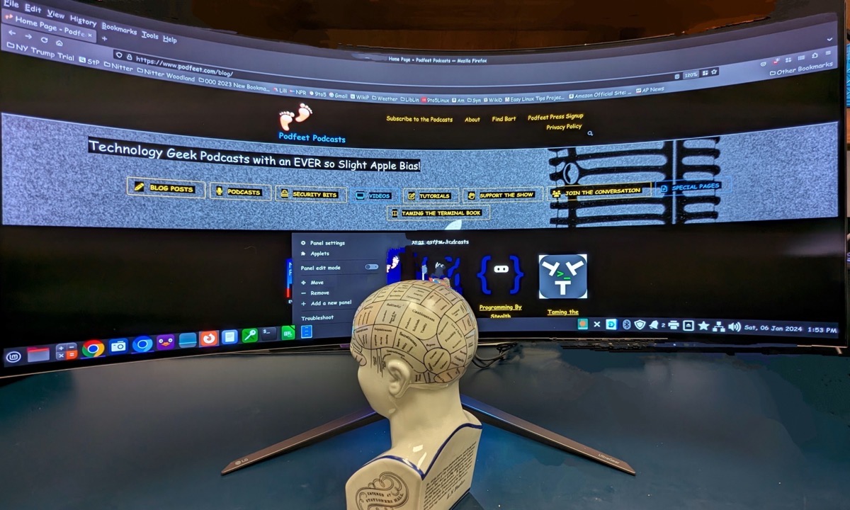
The non-reflective OLED screen is superb with deep, deep, blacks. LG claims 1000 nits of brightness. It’s “aggressively” curved and sold as a “gaming monitor.” The curve provides a Cinerama-like surround experience in the videos and game demos I’ve watched.
The “aggressive curve” lets me sit directly centered and the curve bends both the left and right sides close to my eyes. On my dual 27s the far right side was 38″ away. The curve brings it to a workable 21″.
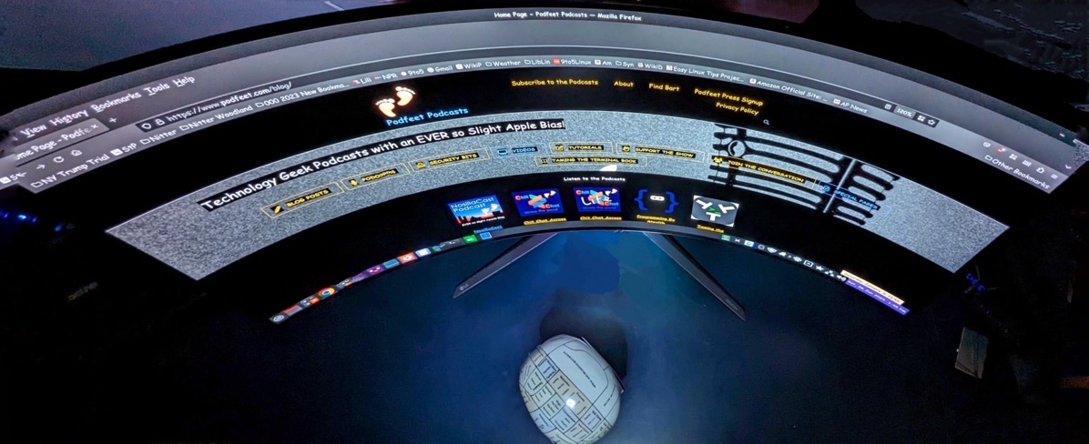
I am able to edit many, but not all, spreadsheets side by side. Plus it’s really great for those whoppers – complex sheets so wide they spread across two 27″ screens, though annoyingly divided by 1 3/4 inches of bezels.

