At the end of May this year, I decided to learn every single nuance of the podcasting app Overcast and write it up as a blog post. I’ve gotten a lot of traction on the post, especially from long-time users of Overcast who also found the interface a bit opaque and difficult to master. On July 16th, the 10th anniversary of the initial launch of Overcast, Marco Arment released a brand-new version of Overcast which dramatically changed the interface I’d just explained.
The changes address some of the opaqueness of the interface while still giving us nearly all of the functionality we had before. Marco also did a lot of work on the back end to modernize the code which he says makes Overcast even faster than it was before.
I decided leaving that 2-week old post up with entirely incorrect instructions and screenshots would be a bad thing, and so I’m going to do it again. I thought it would be a minor rewrite, but just about every element of Overcast has changed.
One important thing to keep in mind as you learn how to use this new version is that Marco’s architectural redesign allows him to make changes much more rapidly than before, which means functionality and appearance will change over time.
Since he really wanted this redesign to ship on the 10th anniversary, some functionality didn’t make the deadline but will be added soon. I’m hoping this walkthrough has value longer than 2 months though!
Accessibility
Before I get into the details of how to navigate the new (and improved) interface, I want to take a moment to address accessibility. The previous version was quite navigable via VoiceOver, and Marco made a point on the Accidental Tech Podcast of asking screen reader users to give him feedback on how he’s done in this area on the redesign.
As of the time of this writing, the ability to view chapters in a podcast has been missed for VoiceOver users but I’ve reported it as a bug that I’m sure he’ll fix. Marco fixed this already in version 2024.7.1 today.
Cost
Overcast is free with very unobtrusive ads. If you want to remove the ads and support the developer, it’s only $10/year. With the Premium subscription, you also get the option to upload audio to a feed you create.
If you were already a Premium user in the old version of Overcast, you might be surprised to see an ad in Overcast in the new version. You’ll have to open Settings and toggle off banner ads manually. Marco apologized on Mastodon for missing that flag – it should have been off after the migration.
Main Interface Overview
The main interface has dramatically changed in the new version of Overcast. You’ve got a set of tool buttons across the top that I’ll explain in a minute. Next, you’ve got a double row of cards for the most recent 10 podcast episodes that you’ve either listened to partially or are new from your podcast subscriptions.
The cards are very pretty, showing you a small version of the podcast artwork, the name of the episode, and how much time is left on the episode. There will always be 10 of these little cards (two rows of 5), so if you listen to a new episode, the 10th one will fall off on the right.
If you’re a VoiceOver user, you won’t hear these little cards from the main interface, you’ll hear one button called Recents. When selected, it gives you a much more accessible list of recent episodes.
Below Recents, you’ll find Playlists, and below that all of your subscribed-to podcasts. Across the very bottom, you’ll see the album artwork for your currently playing podcast, the podcast title, date, and time left, along with a play/pause button.
Top Row of Tools
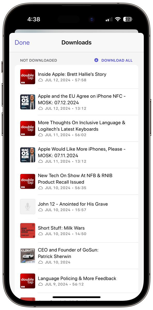
Let’s go through the top row of tools. You’ll find a gear on the left that takes you to Settings, but we’ll get into that a bit later. Next is a downward arrow that opens a window called Downloads.
Oddly, upon opening Downloads (at least for me) it says Not Downloaded and has a list of episodes of shows I follow with wee tiny album art which makes it a bit hard to tell which show is which. If you select one of the not downloaded shows, it will download, or you can tap the “Download All” button on the upper right. I’m wondering if this menu really means “waiting to download”?
Adding New Podcasts
There’s a magnifying glass in the upper right to search for new podcasts. In the previous version, this was a big plus button. It also lets you search your current downloads for a specific show. When the magnifying glass is selected, you’ll see a new screen ready to search by title in Podcasts or My Episodes.
When looking for a new podcast, you also get a list of podcast categories if you want to browse for something new to listen to. This is not an exhaustive list of available podcasts by any means, but rather a list of the most popular shows.
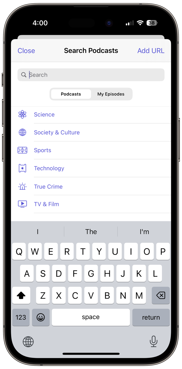
If you know the URL for the feed for the show you want to subscribe to, you can use the Add URL button in the upper right. You may not have used this feature before, but it’s common as a way to subscribe to a premium version of a podcast.
If you want to experiment with adding a podcast by URL, you can go to podfeet.com and click on the big blue button that says Subscribe. This will take you to a page where you’ll see all of the Podfeet Podcasts listed with links to subscribe in three different podcatchers but also a link to the RSS feed. If you right-click and copy that URL, you can use that URL to subscribe in Overcast.
Podcast Specific Interface
Understanding the Episode List Interface
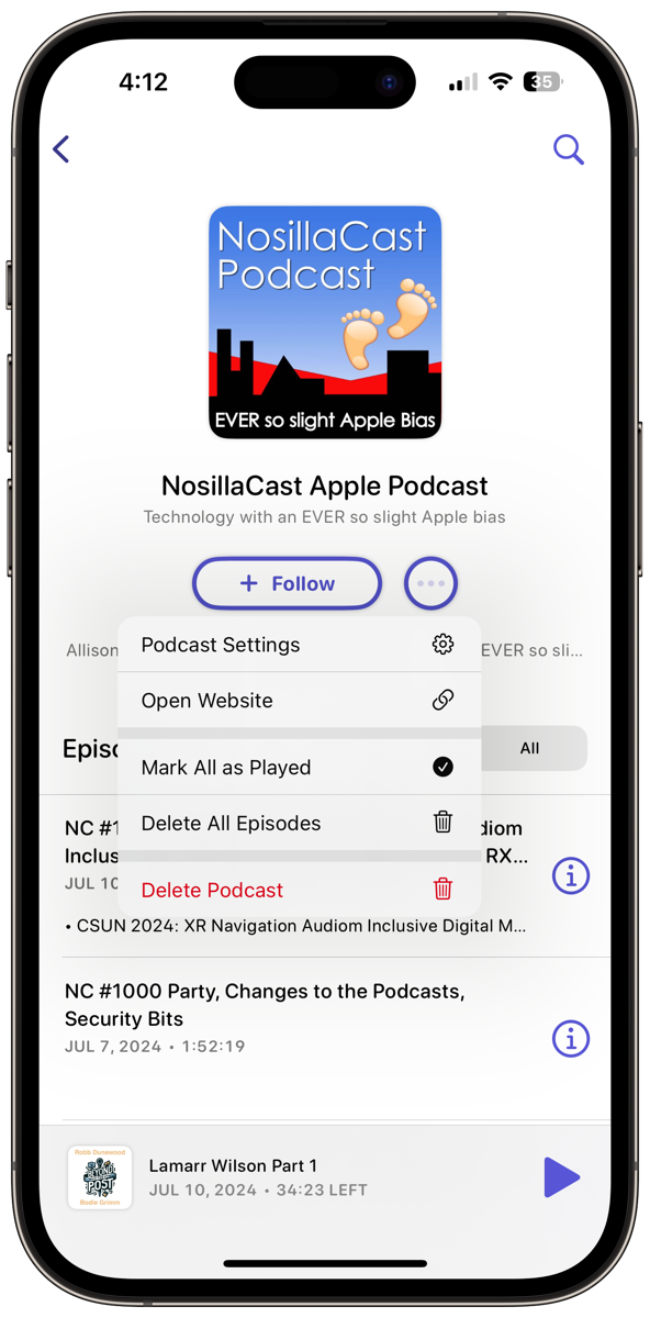
After you’ve subscribed to one show (obviously it will be the NosillaCast) and selected it, the design of the episode list is much cleaner and easier to understand than it was before. The new screen opens with a small version of the album art, a big button that says Following, and a prominent 3-dot menu. Below that is a quick summary of the Podcast and then the list of episodes.
Podcast Settings
The first option under the 3-dot menu on the podcast page takes you to settings for the podcast. You’ll get toggles to follow new episodes and pin the show to the top of your podcasts list. I use the pin feature to make sure I don’t miss my “must-listen” shows. You can set the sort order, and whether to download automatically vs. manually.
This setting is pretty important in the new version of Overcast because the one key feature Marco removed is the ability to stream episodes. He explains in the onboarding for the new version that dynamic ad insertion in podcasts causes bugs and problems for streaming playback. If you want to hear more about how streaming caused problems, listen to him explain in excruciating detail on the Accidental Tech Podcast episode 596.
Still in the podcast setting screen, you can delete when completed, manually, or 24 hours after completion. I like that you can set an episode limit for shows you like to follow but maybe don’t have your heart set on listening to every episode.
If you find that some of your shows have long intros that you always skip, you can set an automatic skip time at the front or even add a skip time on the outro.
Back on the 3-dot menu, you can go directly to the podcast website which is also handy.
In the old version of Overcast, you used to see the frequency of release for a podcast in the Settings menu but it appears to have been removed. It was pretty cool – for the NosillaCast, it said “Sunday Evenings”, and Let’s Talk Apple by Bart Busschots said “Monthly”. This may be a feature that just didn’t make the release date.
Privacy
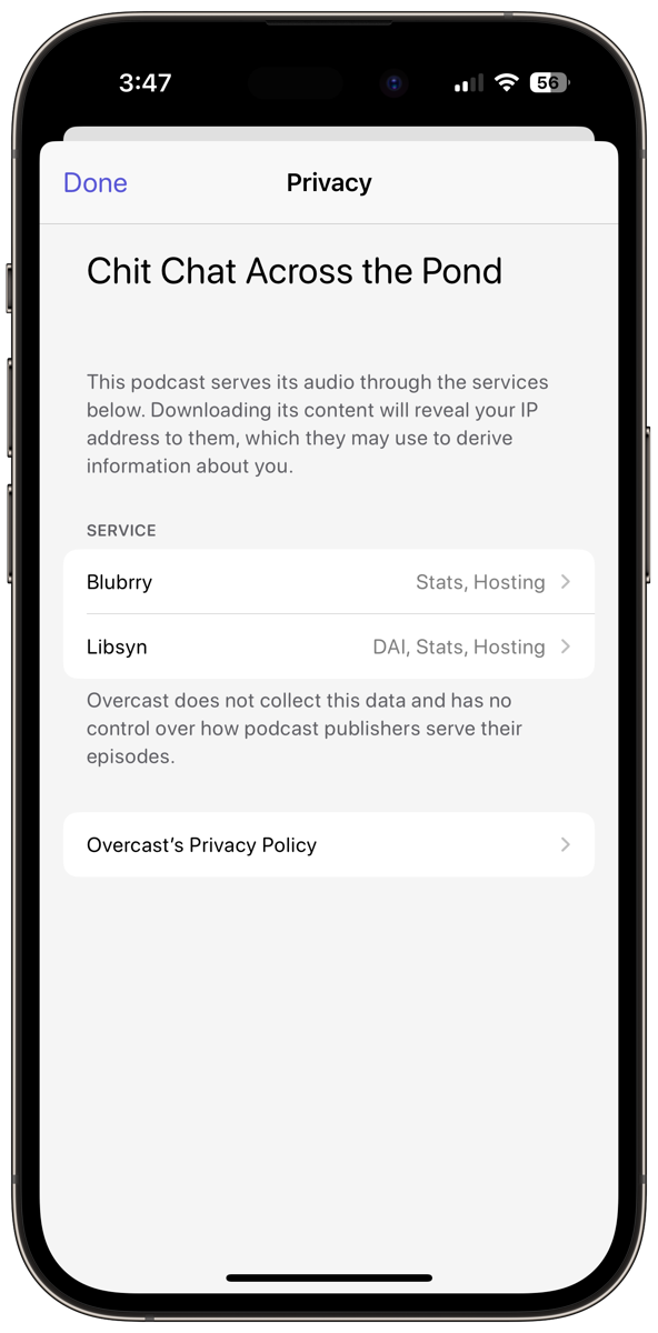
Marco also reveals how you may be being tracked through the podcasts to which you subscribe. For example, with my podcasts you’ll see blubrry.com. Overcast explains that the known capabilities for blubrry.com are stats and hosting. I only use it for stats.
It also shows Libsyn.com for my shows and explains that this service can do dynamic ad insertion, stats, and hosting. Libsyn is where I host the files for my shows, and I also get stats there, but as you know I don’t do any dynamic ad insertion. I think it’s pretty cool you can see what a podcaster might be doing, but it’s good to know it doesn’t mean they are using everything the service might provide.
Clean Up on Aisle 5
Perhaps my two favorite options under the 3-dot menu are Mark All as Played and Delete All Episodes for the selected podcast. I have a bad habit of listening to most of a show and leaving it sitting there in my podcatcher. Now when I notice I’ve left a mess on my hands, I can delete them all right from this button. If you’re tired of a show, you can delete the entire podcast as well.
Current vs. All
If we get out of the 3-dot menu, you can see the episodes listed, and a toggle between Current and All. The distinction there is that All is every episode in the feed, whether you’ve listened to it or not, and Current are the shows you’ve downloaded. I find I go into All more often than I would have thought, both to go back and look for old shows but also to double-check that I didn’t accidentally mark an episode as already played.
If you’re not new to Overcast, you’ll remember that there used to be a third option here called Archived. This section held podcasts you’re not following and have no added episodes or seem to be inactive. This feature is no longer there.
Search Within a Podcast
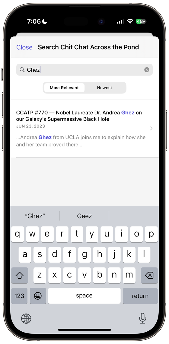
On this page showing the podcast episodes, you now have a magnifying glass that lets you search just this podcast. I love this new feature! With Chit Chat Across the Pond selected, I can type in Ghez and instantly find the episode where I interviewed the Nobel Prize-winning astrophysicist on Chit Chat Across the Pond. It even searches inside the shownotes for the podcast, not just the title.
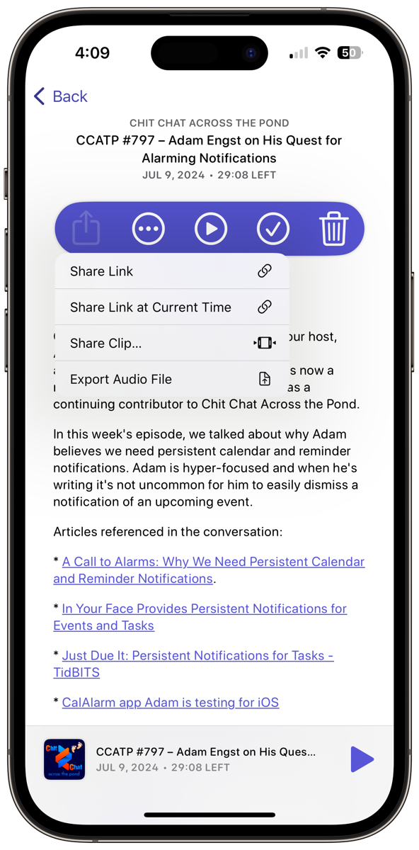
If you tap on an episode of a podcast, it will reveal a horizontal highlighted bar with five buttons: Share, 3-dot menu, play/pause, mark as played/unplayed, and delete. This same information was there before but it’s much prettier in a colored rounded rectangle.
Sharing is Nice
The first icon is all about sharing, and sharing is nice. You can share a link to the episode with a friend, but you can do even cooler things with sharing. Let’s say the podcaster just said something terribly clever at 22 minutes and 12 seconds into the show – perhaps they were explaining how gyroscopes work. If you pause the show, you can share a link at the current time. This is a killer feature of Overcast that I’ve never seen anywhere else.
You can also share a clip where you just isolate a short segment of the show. It’s a little bit tricky to edit just the little clip, but when you post it, the viewer will see the podcast’s album art with a little waveform of the audio as it plays. It’s very cool.
Finally, you can export the entire audio file. I’ve been known to use that function to export an audio file and then take a screenshot of the waveform to show the podcaster that they really need to level their audio.
Yet Another 3-Dot Menu – Organizing into Playlists
The episode-specific 3-dot menu has two options. One says Add To… and the other says Move To… and both options show all of your playlists. This is a quick way to manage specific episodes into playlists. Right now it appears a bit buggy. Yesterday I couldn’t get Add To… to work, but today it does work, but Move To… doesn’t seem to work. To be fair, I’m writing this up on the first week after a massive update so it will likely be resolved by the time you read or hear this.

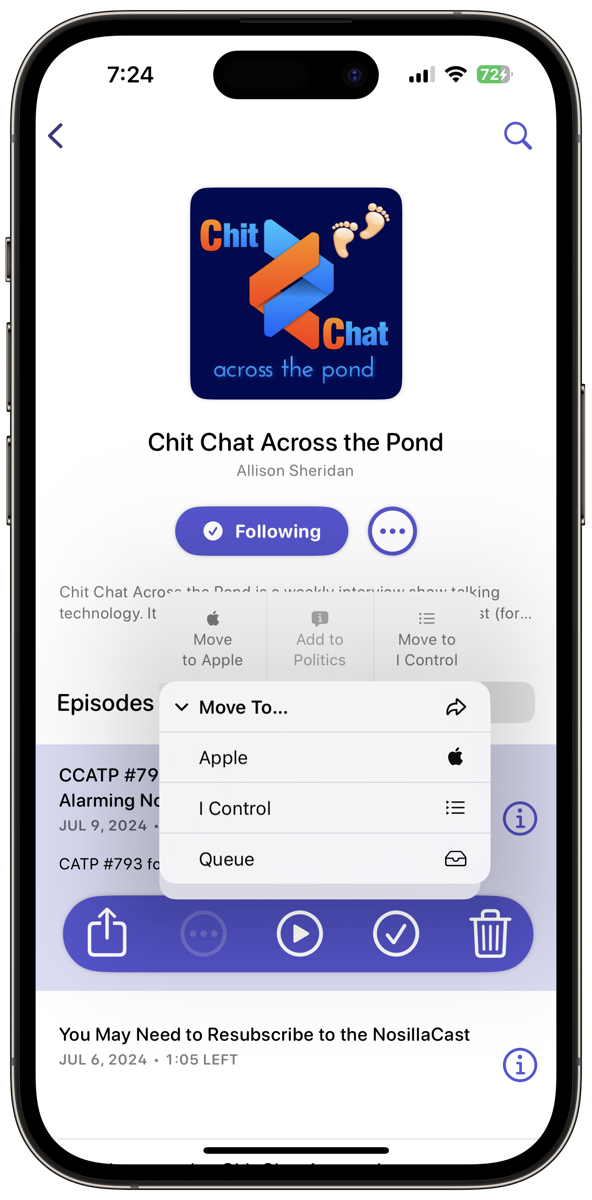
One of the things I found tedious in the previous version of Overcast was that it took so many steps to add a podcast to a playlist. When you choose a playlist from the list under Move To or Add To, that choice gets added to a little row of 3 playlists that don’t require that extra tap. This row of top playlists will stay there until you select a 4th and then the oldest one drops off. At least for me with just a very few playlists, this could speed up the process of adding to them.
You can star an episode which will cause it to show up in the built-in playlist called Starred.
Oddly you can delete the download from this three-dot menu – seems unnecessary since there’s a trash can right in this highlighted lozenge of tools.
Info on an Episode
With an episode selected, you also get a little Info button on the right. This opens up a new page that packs in a lot of information. It has the title, date, and length of the episode, and it has the bar with the same 5 buttons I just described. Oddly with VoiceOver, these 5 buttons aren’t revealed. Not a big deal since you have them on the previous screen but it is curious. Also fixed in version 2024.7.1
Below that you can see the summary if there is one, and the shownotes. It looks great for Jill from the Northwoods’s Buzz Blossom & Squeak podcast.
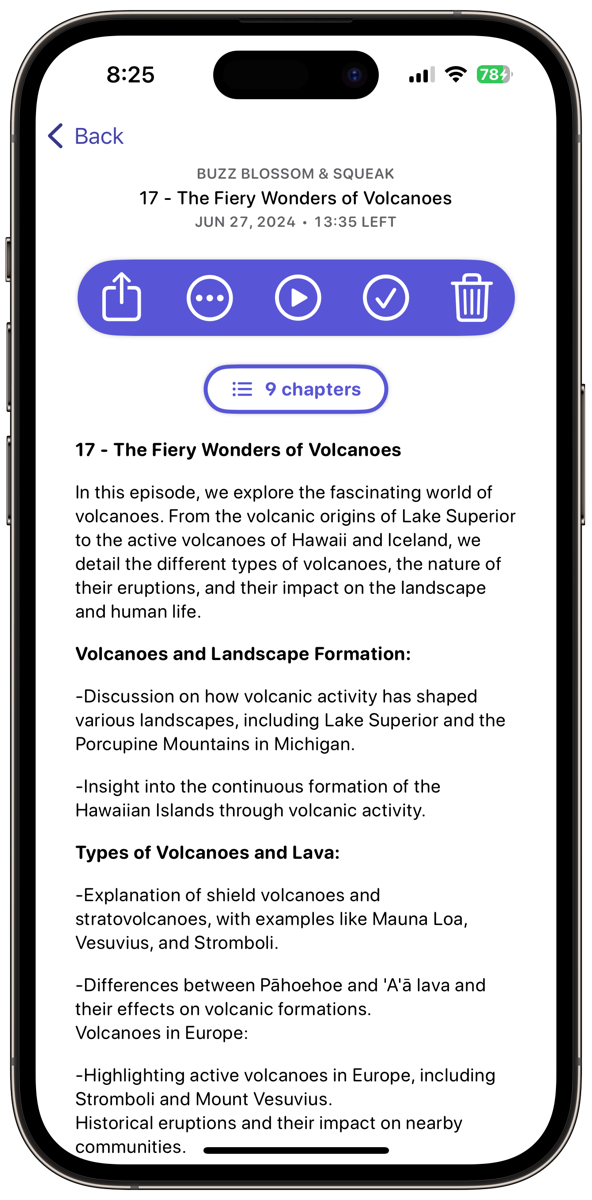
This layout revealed that I need to change something in the way I produce my shownotes. Somewhere along the line about a year ago, I was led to understand that Apple Podcasts couldn’t deal with HTML links in shownotes and the proposed solution was to put the same text that you see in the normal shownotes into the episode summary but with typed-out links. My bulleted list summary is rendered as a giant paragraph with no line feeds in the summary in Overcast. I made the decision to stop putting that second set of shownotes in the summary, but let me know if that causes problems for you in Apple Podcasts.
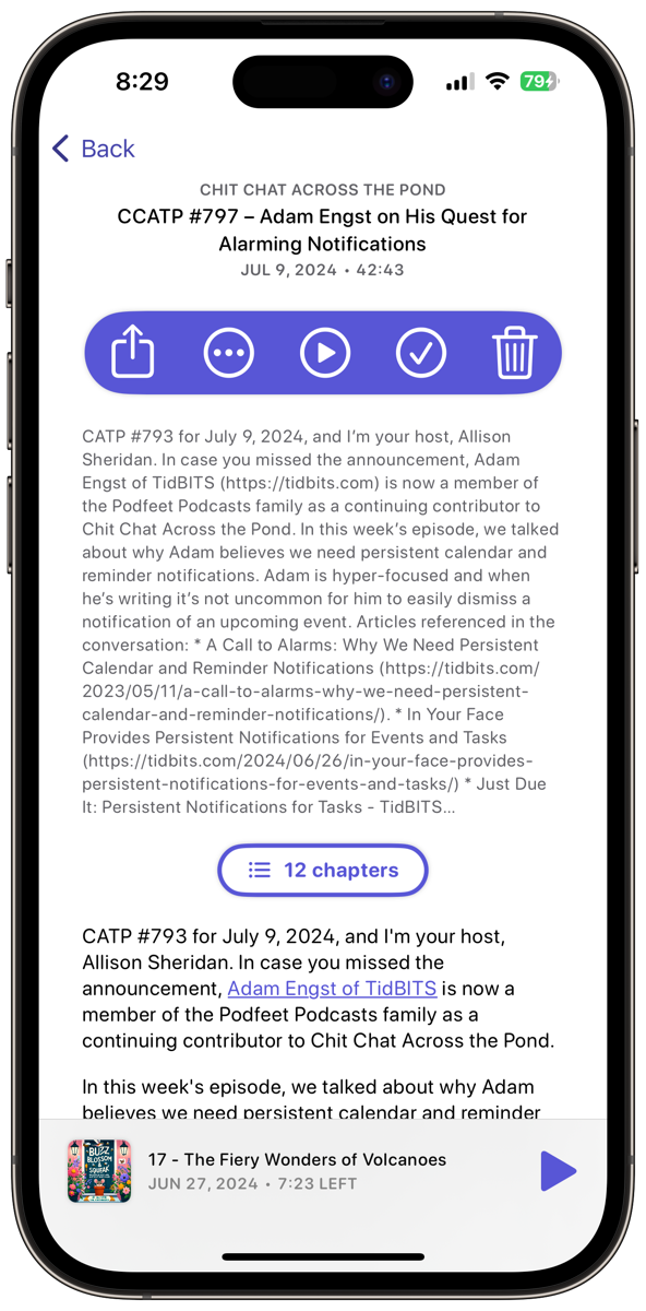
Below that, you’ll see the number of chapters in a little transparent pill button. I’ll come back to how to use the chapters in a moment.
When you are playing a podcast, there is also a chapter button but it’s not accessible via VoiceOver. I’ve sent a bug report to Marco on that one. Luckily the chapter button in this info window is accessible but it’s not as easy to get to when you’re actually playing an episode. Fixed in Version 2024.7.1.
Finally, on this episode-specific page, you can still see the currently playing show across the bottom.
Let’s Talk About Playlists
I find that Playlists are a lot easier to understand (at least for me) in the new version of Overcast. Playlists are cute little round icons in a horizontal sliding row below Recents. If you haven’t added any Playlists you should see the default one named simply Queue, which I use all the time. It’s just a simple list where you drop episodes in and order them to your own desires.
To the right on this sliding row of icons are three more automatic playlists: Downloaded, In Progress, and Starred which I mentioned earlier. I think all of these are brilliant and useful.
Finally, you have a nice big plus button inviting you to create a new playlist.
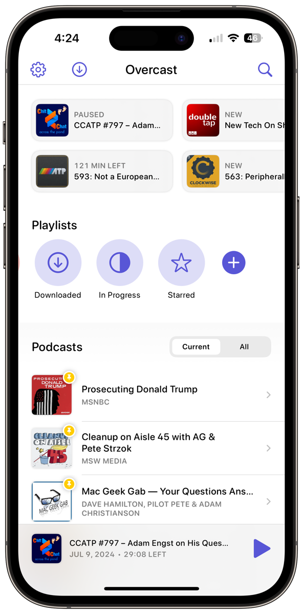
To create a new playlist, tap the plus button with the lines next to it at the top of the main screen. Your choices will be Custom Playlist, All Episodes, or Most Recent. I think it’s weird to have a playlist that’s all episodes, but that must be the way someone likes it. Depending on the breadth of topics you like, Most Recent could be quite an eclectic playlist.
Custom Playlist
I think Custom Playlists are where the action is.
We can name our Custom Playlist, give it an icon, and change the color. The icons are the SF Symbols library if you know what that is, so not terribly interesting in my opinion, but there is one that looks like John Travolta in his “Stayin’ Alive” pose from the movie Saturday Night Fever in 1977, so that’s fun.
Sort order is rarely an interesting topic, but in Overcast you sort by oldest to newest, and newest to oldest, but also oldest/newest but by podcast.
Selecting which podcasts will be included in this playlist is interesting. You’ll see two dropdowns: one says Include and is defaulted to All Matching Episodes, and the second one says From and is defaulted to All Podcasts. I’m pretty sure this would be all episodes.
If we change Include to Only Selected Episodes, the From dropdown disappears and we’re left with a button to choose Included Episodes.
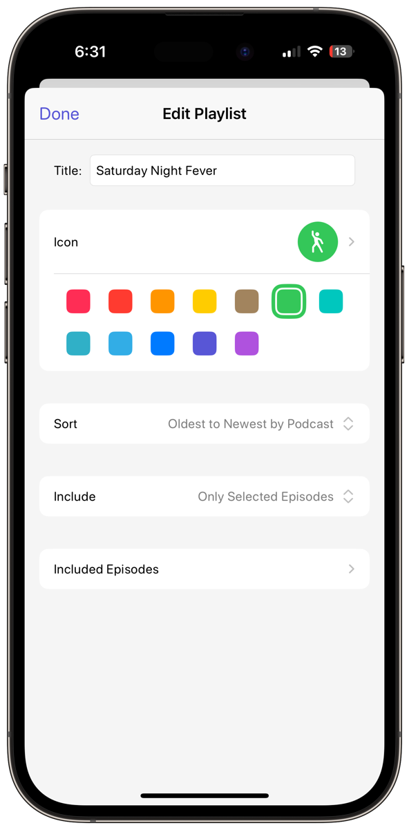
Included episodes shows you a list of all the shows you’re subscribed to and you can go into each one and pick and choose episodes to add. While this path makes sense, I think I’d just start at the podcast listing on the main screen, peruse episodes from there, and use the little Add To button we talked about earlier to add to a Playlist.
If we go back to Include and choose All Matching Episodes, and From to Only Selected Podcasts, then we can choose entire podcasts to add to the playlist.
Now let’s all be honest with ourselves, we have high-priority podcasts and low-priority podcasts. Even though you’re hand-picking the podcasts to be included, Overcast allows you to set podcasts as high or low-priority, and then set the priority mode to Ranked or Grouped. I was a bit confused by this, but Mike Milzz on Mastodon suggested:
Sounds to me like ranked lets you pick the order of podcasts in the high and low groups (think array) where “grouped” is a set of high (unordered) and low podcasts
An array makes sense to me!
As if that wasn’t enough flexibility in custom playlists you can add additional episodes and excluded episodes.
As an experiment, I set up a playlist for Apple Podcasts and dropped in my favorite shows. When I did, it illustrated one of the pain points for me with Overcast. I’m not entirely sure it’s Overcast’s fault and it probably isn’t but let me elaborate and you can decide.
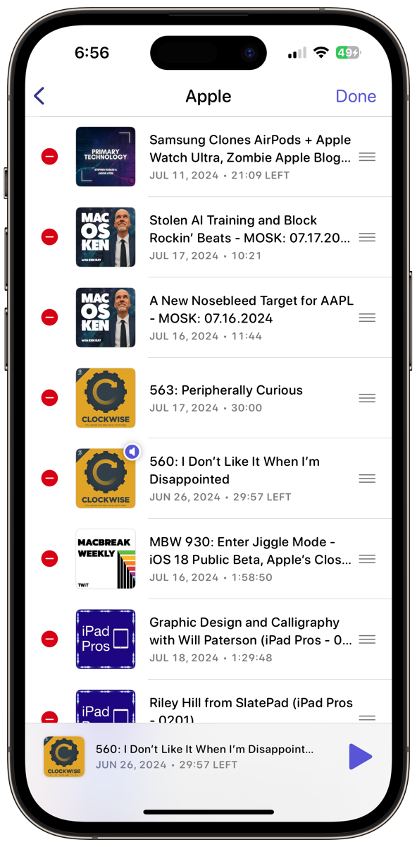
When I created this playlist of Apple podcasts, one of them was Mac OS Ken, and it showed 23 episodes of Ken Ray’s show!
Remember I explained how you can change how many episodes to keep? I have Mac OS Ken set to save only 2. But if you listened closely, the setting is for the number of unplayed episodes. If I go back to my Apple playlist, I can see that shows have 4 min left, 1:50 left, and 7:40 left. It means I started them but didn’t finish them … so they sit there forever!
In the previous version of Overcast, one of my complaints was that it was harder than it should be to convince Overcast that you’re done with an episode. Hitting fast-forward a bunch of times to get to the end would always leave a few seconds unplayed. But in the new version of Overcast, if you hit fast-forward enough times, it goes all the way to zero.
But that doesn’t solve the problem of me stopping partway through a show and thinking I’ll get back to it someday.
In the old version of Overcast, from within a Playlist, you could use the 3-dot menu in the upper right to choose Edit Episodes and it would give you little selection circles next to them. This allowed you to tap tap tap to select and hit delete just one time. Better yet, you could use the trick that works in lots of iOS apps: use two fingers to drag along the list and it would select every episode you drag across. I was very happy about that.
Sadly, in the new version, the selection circles have turned into red circles with a minus sign on them. This means you have to tap the red circle and then tap the red trash can. Two taps for every single episode you want to delete. Sad face emoji.
Delete v.s. Checkmark
I mentioned that there is a way to clear partially listened-to episodes (or even not listened-to-at-all episodes), but it’s another confusing one. We have a check mark, and a trashcan to delete, and hitting the check mark makes an episode disappear so what is it doing?
Steven Goetz is a heavy Overcast user, so I asked him what the difference was between delete and the checkmark. He explained the checkmark simply means it’s completed. Ok … what happens to a completed episode? Steven pointed out that in the global settings, you can decide what happens to completed episodes. The default behavior appears to delete completed episodes. So it’s literally the same thing as deleting if you don’t change that default.
Your other options for the checkmark include making you manually delete completed episodes, or have them deleted after 24 hours.
Can We Finally Play an Episode?
One of my biggest complaints about the previous version of Overcast was the secret hidden cards to the left and right of the main screen when you were playing a podcast episode. Once you realized they were there(probably after someone told you), it worked well but I didn’t know they were there for a very long time.
The new version of Overcast completely removes the hidden cards and instead, you have buttons to bring up the same information.
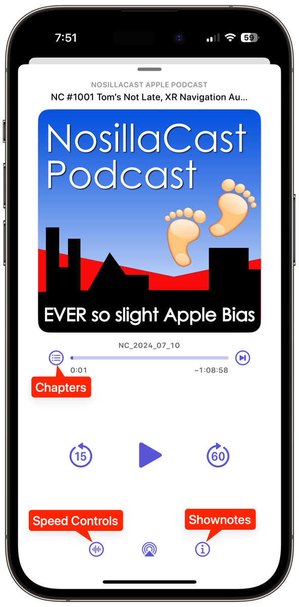
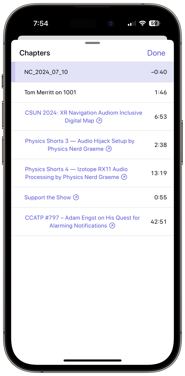
To the left of the progress bar in the old and the new version of Overcast, if the podcast you’re listening to has chapters, you’ll see a circle with a bulleted list inside that will bring them up. If you don’t see the chapter button, the podcast has no chapters.
As you’re playing the podcast you can see a progress bar within the playing chapter. To jump to a chapter, tap on the time on the right. If you tap on the chapter name and it’s a link, it will open the link in your browser. Very cool to have both options right there, but you do have to pay attention to where you tap.
The bottom of the playback screen used to have five buttons, but that’s been narrowed down to only three. You’ll still have the AirPlay symbol in the center, and you still have the little “i” in a circle that brings up the shownotes. But the left symbol looks like a waveform inside a circle and that button brings up controls that many people hail as the reason they use Overcast as their podcatcher of choice.
You’ll see a toggle for Smart Speed which shortens silences. This is a terrific way to tighten up a podcast that has long pauses. I have a show where one of the hosts would leave these frustratingly long pauses, and Smart Speed was why I still liked the show. I’ll give you a warning though, some speakers use pauses for a reason.
A while back I was listening to Bart’s Let’s Talk Photography podcast and he was explaining something really complex. I was having a really hard time following him because he wasn’t giving the listener any time to absorb what he was saying. I was halfway through writing an email to him about it when it occurred to me to check my settings and that’s when discovered Smart Speed had been enabled! I disabled it and there was that perfect explainer back in my ears.
One of the reasons that happened is that I never remember to use the very obvious “Custom for this Podcast” toggle. I’ll turn Smart Speed on for a different podcast and not toggle the Custom option beforehand and suddenly all of my podcasts have this enabled. So be smarter than me and pay attention to that toggle!
Another custom (or global) option is to turn on Voice Boost. This is a great feature to add to podcasts that don’t level their audio properly or the overall volume is too low.
You can also set the speed of the podcast playback but watch that custom toggle! You don’t want to hear Jill from the Northwoods at 2x when you just meant to set it to 2x for MacBreak Weekly.
You know how with YouTube you can change the playback speed and as you bump it up a notch it says 1.25x, 1.5x, 1.75x, and 2x? It also has numbers for slowing down, .75x, .5x, and .25x. But with Overcast, Marco made it way harder.
While there are big tick marks for 1x, 2x, and 3x in Overcast, it’s harder to tell what speed you’re picking between those values. Between 1x and 2x, there are 5 small tick marks, which means 6 increments. I guess those values are 1.17, 1.34, 1.51 and up? Also, there’s only one tick mark between 2x and 3x – at least I can assume that’s 2.5x. The best one though is the small tick mark below 1x. Is that .5x? .1x? .05x?
Steven Goetz pointed out that if you have Smart Speed enabled, Overcast shows you how fast you’re listening. If you haven’t changed the speed from 1x, as the show progresses you’ll see the speed above Smart Speed changing to more than 1x. If you slide up on these smaller tick marks between 1x and 2x the number above Smart Speed gets even bigger.
I realize it doesn’t make a darn bit of difference what those tick marks represent – we all just adjust till it sounds right for a particular show, but it still bugs me that they’re in 1/6 increments!
If you use podcasts to go to sleep, there’s a timer to let the player stop at an elapsed time, at the end of the episode, or the end of the current chapter.
Settings
Before I close out here, let’s take a look at Settings, which you get to from the main screen using the gear icon in the upper left. If you like to listen to podcasts on more than one device, you can create a login to sync your playlists and even progress through shows across devices. Overcast runs on not only iOS but iPadOS. If you have an Apple Silicon Mac, you can run the iPad version of Overcast.
Premium Settings
Next, you’ll see Premium Settings, if you’ve chosen to support the developer by coughing up the princely sum of $10/year. This is where you can disable banner ads for podcasts.
Also in Premium Settings, you can enable File Uploads. This is a feature that allows you to download a recording to your Mac, and then through the web interface at overcast.fm you can upload the file and you’ll be able to play this audio like a normal podcast episode on your iPhone or the web.
Finally, in Premium settings, you can choose between a grand total of two app icons.
Overcast used to show you how much total storage your podcasts are taking up, and if you tapped into that menu you could see all of your podcasts sorted by storage. I don’t see that feature in Settings now. You could even see how much cellular data you had used by downloading and streaming podcasts, but that’s also no longer available. Again, this feature might just not have made the deadline Marco set for himself and could be added back in later.
Download Settings
Under download settings, you do get a toggle for whether to globally allow cellular data for downloads.
Since streaming is no longer an option, an important section switch is whether to download new episodes automatically or manually. Keeping this set to manual globally would mean you can always be in control of how your cellular data is used.
Additionally, for every podcast, you can override that main setting and change it to download automatically or manually. Hopefully these changes, along with the work Marco did on the back end to completely redesign his database and how data is accessed will make downloading almost as good as streaming used to be for quick startup.
Delete Played Episodes
You’d think that delete would be a pretty obvious thing, but even here Marco gives us some options. You can keep delete as a manual operation where you have to hit the delete button to make an episode go away, but you can also set episodes to delete when they’re completed. If you don’t feel right having them go away that quickly, you can set them to delete 24 hours after they’re completed.
I’m fascinated that this 24-hour delay exists because I never think of podcast episodes as precious (unless it’s one I created myself of course), but people must like this feature or he wouldn’t have designed it in. As if this wasn’t enough control, you can set the method of deletion on a per-podcast basis.
Seek
Every podcatcher has a seek back and seek forward button, and with Overcast you can change how many seconds it goes. I very often want to go back to hear what someone said, so I set my seek back to 15 seconds. But I also like to skip ads, so I set my seek forward to 60 seconds. By making one a multiple of the other, I can go forward 60 seconds once, and if I hear the show has resumed, I can jump back by 15 seconds and know that if I hit it 4 times I’ll be back where I started.
Speaking of seek, Marco added a wicked cool feature to Overcast: Undo Seek! The feature is most useful if you accidentally hit the progress bar and the podcast jumps to an unknown location. For a few seconds, you’ll see a “Go Back” button on the screen. I guarantee I’ll be using this one. Go Back is available when you jump chapters too.
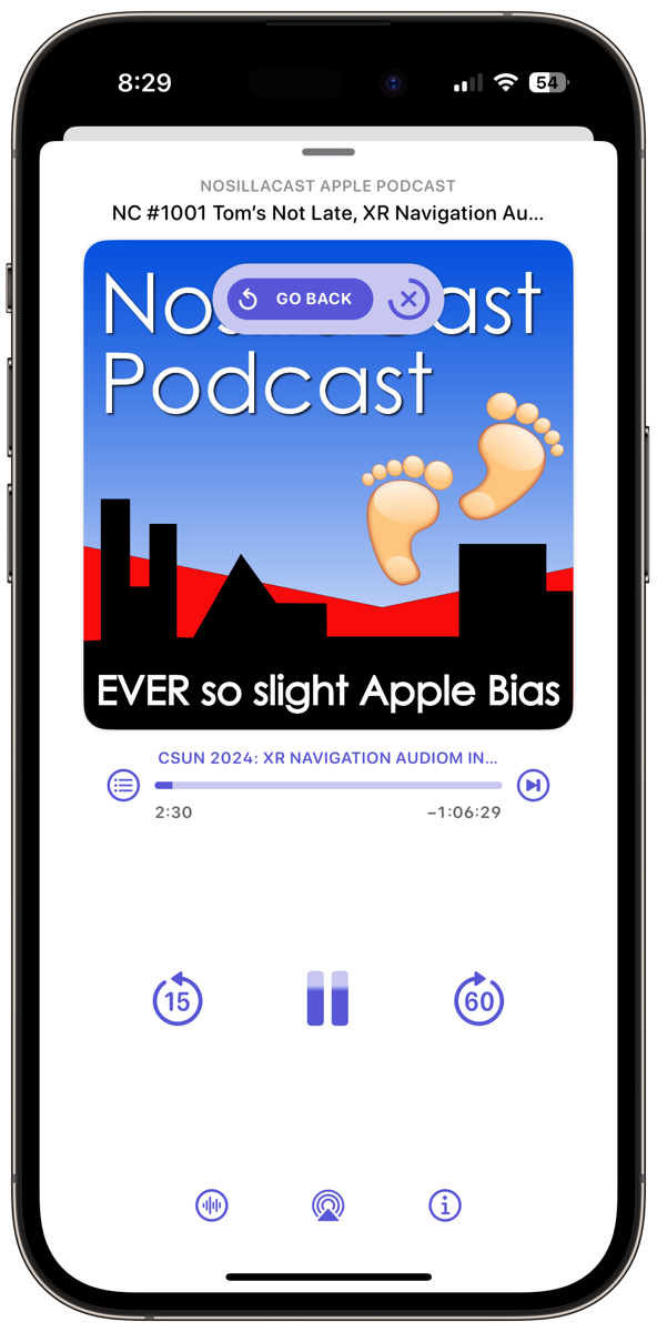
Theme
You can change the theme to always be dark, or choose from 15 different colors for light and dark themes. I chose a nice purple as you can see in my screenshots, but you do you.
Customize Home Screen
I talked at the beginning about how you have little cards for recent episodes, but if you don’t find that useful you can toggle them off under Customize Home Screen. If you don’t use Playlists you can toggle those off too.
Nitpicky Details in Settings
One of the useful but oddly named sections of Settings is called Nitpicky Details. By default, Overcast will auto-play the next episode in a playlist or in a podcast with more than one episode, but you set it to stop after each episode.
Overcast has a Smart Resume feature that rewinds slightly after pausing and even slightly adjusts seeks to fall between words. I love this feature with Apple navigation because she keeps stopping my podcasts to tell me where to go, and with Smart Resume I don’t miss anything. If you don’t favor Smart Resume though, you can toggle it off.
We talked about the seek settings a moment ago where I recommended you set your seek forward to be a multiple of your seek forward time, so you could get back to exactly where you were. A while back I noticed that it wasn’t always going back to where I started. That’s because of a feature called Seek Acceleration. When this is turned on, it will “Increase the interval when repeatedly seeking to skip time more quickly.” Cool feature now that I know what was causing it, and you can toggle it off if you don’t favor it. My engineering brain can’t live with it on.
Imagine you have a playlist that has specific podcasts at the top that you want to listen to first. Now you’ve gone down to a lower-priority show. When that one is done, Overcast will move on to the next one down, but you can override that in Nitpicky Details with the Play Top Episodes Next toggle. I guess some of these really are nitpicky!
Overcast has its own built-in browser for opening links from podcasts, but you can change the behavior to have them open in your system browser. This control used to be labeled Open in Safari so it’s cool he recognizes people may have changed their default browser.
I’ve never noticed Overcast using haptics, but evidently, they’re there because you can reduce them.
There’s a toggle for Icon Badge Number and in delightful snark, Marco says “Show the number of unfinished episodes on Overcast’s icon to add stress to your life”. I love that. This toggle won’t do anything unless you go into your device’s Settings > Notifications, find Overcast, and then toggle on Badges. Yikes! I have 85 unfinished episodes. I’m definitely turning that back off.
At the very bottom of Nitpicky Details, there’s an interesting graphic explaining the Remote Episode Skip toggle. It shows almost a Morse Code level explanation of how on your headphones you can click once to play/pause, twice to fast forward by your chosen amount, triple-click to seek back, but there’s a click and hold for next podcast, and a double-click and hold to go to the previous podcast. I find using my Beats Fit Pro headphones to click and double-click is pretty easy, but triple-click to go back is pretty hard. I don’t go to next or previous podcast often enough to remember the sequence but if you’re that good you’ll be glad it’s there.
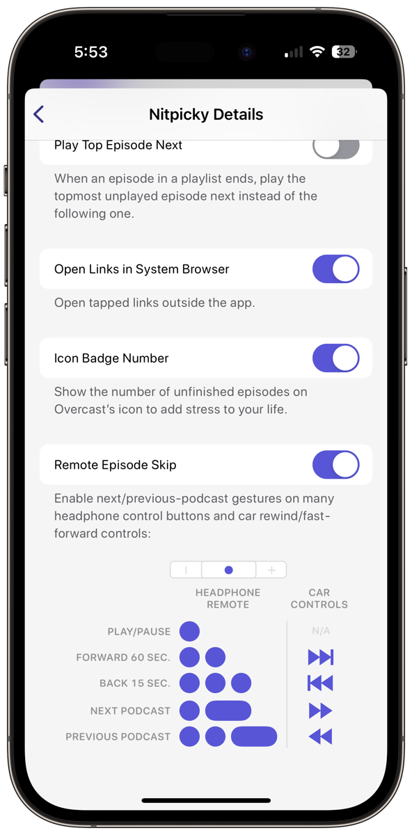
This graphic is unlabeled for VoiceOver users (and was unlabeled in the previous version).
I promise we’re in the home stretch here, folks, but there are just a few more things in the main Settings area to go through.
You can send feedback from right within the app settings and there is a link to head straight to rating Overcast in the App Store.
In the previous version of Overcast, you could import an OPML file of podcasts exported from another podcatcher. As of the time of this writing, he hasn’t yet implemented this feature so if you’re looking to switch from another app, it’s not quite time for you. I suppose you could declare podcast bankruptcy and start over…
The final thing you’ll see in Settings is how much time Smart Speed has saved you beyond speed adjustments alone. I’ve saved 95 hours so far. I was really proud of that number until other NosillaCastaways started piping up with numbers 5 times or more time saved!
iPad App
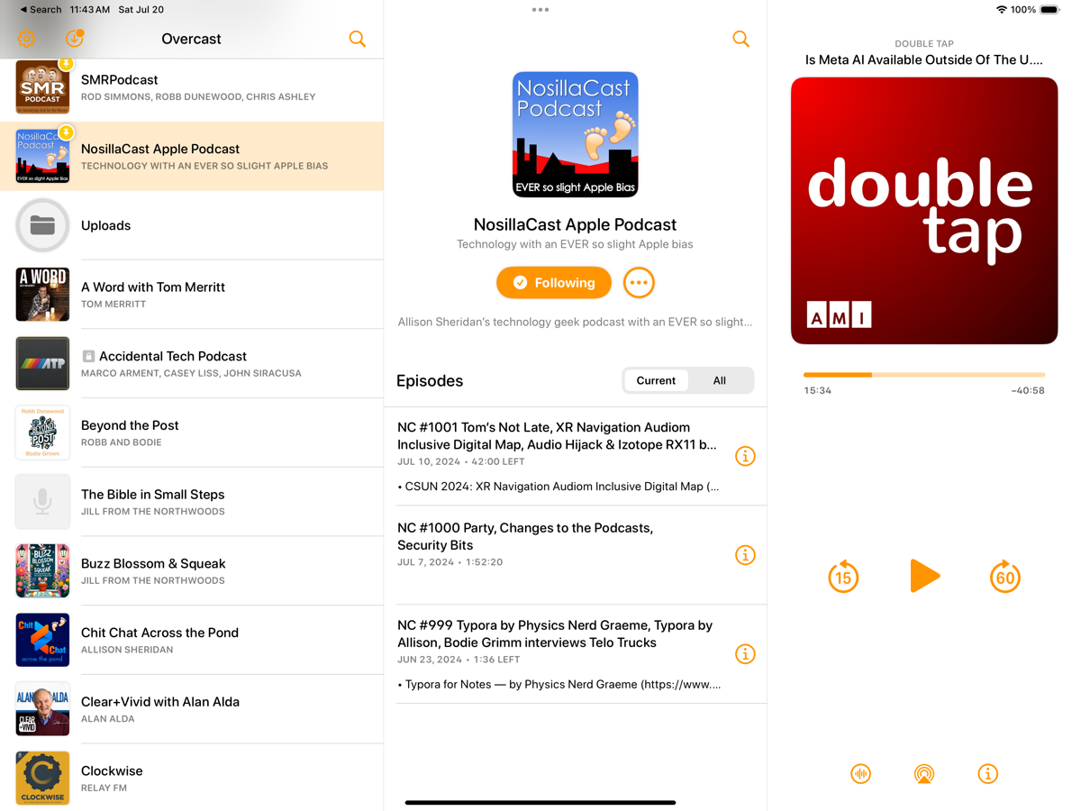
If you’re an iPad user, you’ll be delighted with the layout and design you now have with the new version of Overcast. I don’t want to go through the layout and how it’s different from the iPhone but I did want to mention that it’s much more iPad-like now. Additionally, remember that the iPad app will run on your Apple Silicon Mac. I should mention that on my Mac, I had to delete Overcast and redownload from the App Store to get the new version.
Bottom Line
The bottom line is that Overcast is a terrific podcatcher even if you have simple needs to subscribe and play back shows but really shines for the power podcast listener. If you want to listen more efficiently and with better audio, Smart Speed and Voice Boost are great features.
The redesign addressed a lot of the confusion and I think makes it much more intuitive now. If you want to customize your experience, Overcast is there for you, but if you want to use it as it comes out of the box, it’s great too.
You can use it for free with ads or throw the developer a measly $10/year.
One more thing I like about Overcast and which you might appreciate. When I’m ready to post my shows, I hit Publish in Feeder which pushes the new RSS file to my server. I immediately pick up my iPhone, open Overcast, open my show’s feed, and pull down to refresh. If I’ve done my job correctly, the show instantly begins to download. I do not know how Overcast can do it so quickly.
In contrast, Apple Podcasts can take tens of minutes to be ready to download and that was before they started adding automatic transcripts. One more reason I love Overcast.

There is one thing that was not addressed in the bugfix release that is driving me crazy:
Overcast does not delete completed episodes.
They are all piling up on the device, just have a look into the “Downloaded” playlist. No matter if the “Delete Played Episodes” setting is set to “When Completed” or “24 Hours After Completion”: they won’t be deleted. They vanish from their playlists after completion (which is how it is supposed to work), but they are not deleted from the device.
Christian – If you go into Settings –> Delete does it by any chance say “24 hours after completion”?
@Allison: Thank you for following up!
No, it is set to “Delete When Completed”. It seems to be a bug:
https://talk.macpowerusers.com/t/new-overcast-app/37874/70?u=christian
https://mastodon.social/@themightyplanet/112802461307850180
What I have tried is to also change the setting for a few days to “24 hours after completion”. It does not change anything: nothing is deleted on my devices.
Do you have stuff sitting in your “Downloaded” playlist that should have been deleted? I have the impression that basically nothing is deleted at all.
Interesting. I’m definitely not experiencing the bug. I deleted an episode and immediately went to Downloads and it’s not there. I’m curious – do the deleted episodes show a cloud next to them in Downloads? Might be an indicator…
No, they don’t show a cloud. I have just sent you an email with a little Folge documentation. Feel free to ignore it if you do not have the time to follow up. Thank you!
Thank you so much … your suggestion to set the forwarding default to 60 seconds has changed my life!!
Ha! That’s awesome Tim!
Christian and I chatted in email and we’ve now learned that the problem he described that delete when marked as played is a bug that Marco has acknowledged and has in his plan to fix. (I also was able to reproduce the bug when Christian showed me his documentation he created with https://Folge.me.
I loved the hidden cards in the previous version! Nothing was faster to change settings or jump to a specific chapter.
Please bring these cards and gestures back, maybe as a user setting.
Thank you.
Hi. Thanks for the run through. Can no longer select ‘allow cellular’ on individual episodes. – seems like it’s allow all or none. Liked this feature as could control data usage.
Can the new version only show active podcasts? For example I have several podcasts which are recaps of Netflix or HBO series episodes. There can be a year or two between seasons, and previously those podcasts would not be shown on my list of podcasts. Is there a setting to hide inactive podcasts? I am a premium user.
So one thing i’ve not seen mentioned by anyone is with the new update it seems i’m unable to add a podcast that’s an HTML password protected rss feed. At first the one podcast I use that’s like that would only allow me to download an episode when i was on wifi, and refused to do the download if i was on cellular data. deleted the podcast to try and refresh it and now every episode just gives me a “not authorized” notice and won’t play. When i try to add the RSS feed from URL it never gives me the opportunity to add a username and password for the feed. Don’t know if that’s a bug or a feature that just hasn’t moved over yet but it’s definitely frustrating
Patrick – I’d definitely send that to Marco as a bug. It sure doesn’t sound like a feature to me.
Rosemary – You definitely should be able to see podcasts that aren’t actively being updated. My husband has been listening to The West Wing Weekly podcast that was completed years ago and it’s been no problem for him. I didn’t find any particular setting for this when I poked every button so I’m not sure why it’s not working for you.
I do see inactive podcasts—that’s the issue. I don’t want to see them until there is an episode. The older version worked that way.
Rosemary – are you saying that if you select the tab that says “current” (not “all”) to the right of the title “Podcasts”, you still see inactive shows?
There used to be an archive tab but that’s no longer there.
Ohhh – that’s the problem! Thank you. Always helps to talk these out!
Sweet!
How about allowing Current and All lists under each podcast to be sorted in different ways? I want Current to be sorted in chronological order but All to be sorted in reverse chronological order (as some of my podcasts have weekly episodes that go back YEARS that I don’t want to have to scroll through).
This is a great article, thank you! The one thing I don’t see that I’m stumped on, is how to change the playback speed. Previously, there was a way to adjust the speed, but I’m not seeing it anywhere on the app anymore. Thanks!
Thanks, Kristin. When the episode is up full screen, there are 3 buttons across the bottom. The left one is a tiny button with a little wave form on it. That brings up the speed controls.
I’ve been using Overcast for a couple years but hadn’t explored most of the tools. Thanks for holding my hand while I finally did so! This was so helpful.
One question, is there an episode-specific “play next” button in the new version? I miss the simplicity of that tool. I never take the time to make playlists so “play next” was my most-used feature.
I’m glad it’s been helpful, AJ. When you say episode-specific, do you mean podcast specific to play the next episode? (I don’t know the answer either way but maybe with some more clues I could find it.)
Hi! Thanks. No, I want to play a specific episode of a podcast once whatever I’m currently listening to ends.
This post is a boon to humanity. I’ve been trying to puzzle out many of these things in new Overcast (and old)
What a lovely thing to post, Anonymous! I knew the only way to learn it was to teach it. Right now I’m working on a ScreenCastsONLINE tutorial on Overcast, and it’s already gone through even more fairly major changes! For example, if a podcast episode has notes AND chapters, you get the bulleted list icon next to the player. You tap it and see first chapters and scroll to see notes. However, if the episode ONLY has notes, there’s no bulleted list icon. Instead you get two dots under the album artwork inviting you to swipe right/left to reveal the notes. These two different ways to see the notes if far more confusing than necessary in my opinion.
Also, I still don’t understand priority podcasts – I fear that section will always be a mystery to me.
I have iOS18 and Overcast 2024.11.2 – 15.8MB. The usual sequence of events is that a bunch of podcasts that I follow get downloaded into the All Episodes playlist where, if I begin playing the top episode in the lineup, it will finish, and then the next one starts automatically until the entire lineup has been played. Now, out of nowhere, and for no good discernible reason, the top one plays and then – that’s it! No more automatic beginning of the next one. Now you have to take your phone out and manually start each one. A major pain to be sure and all the more so since I live in the Yukon Territory where it can be dangerous to take your mitts off to fiddle with the phone. Is there a fix for my dilemma? Thanks
Well that’s a drag, John! Hopefully someone following here has an answer for you. Does this happen also with manually created playlists? Do the podcast episode download but it just doesn’t advance to the next episode?
I suggest you post this question also directly to Marco. He’s not super responsive but he might get back to you. Stay warm!
I wonder whether I’m missing something, but it seems Overcast is now holding on to all “in progress” episodes forever, with the only way to remove them being to start playing and jump to the end or to manually remove them, slowly, one at a time. (Even the swipe gesture takes several seconds per episode.)
I noticed that in a lot of podcasts, it seemed only the most recent episode was making it into my automated chronological playlist. I was very surprised to see this was because I had literally dozens of episodes still stored in the affected podcasts, most with only 30 seconds or so left to go. And I can’t find any setting to change this behavior.
This seems like a massive and extremely unfortunate oversight in what’s otherwise probably the best podcast app there. Unfortunately, this oversight makes it close to unusable unless you spend a bunch of time manually culling old episodes.