You may have caught on that I’m a bit of a tech nerd, but I also like to do some craft-type stuff. Who can forget one of my favorite articles entitled, Knit Like a Programmer? Today I’d like to tell a story of combining nerdery, tech gadgets, crafts, and even photography. You may learn something that will help you one day, or you may end up shaking your head thinking I make things too complicated.
Cross Stitch is Like 8-Bit Graphics
This story is about a different craft, cross stitching. Before we dig in, I’m going to assume that while most of you may have heard of cross stitching, at least 82.7% of you have no idea what it is or how it works.
The best way for me to describe cross stitching to nerds is that it’s like 8-bit graphics. You create a picture using different colored threads, where each cross stitch is a little block. Making a diagonal line of these little blocks would be a jagged line just like in 8-bit graphics.

It’s also like a paint-by-number kit because you stitch the color in each little box by following a key that has numbers associated with the colors. In a premade kit, 1 might be white, 2 red, and 3 green. If you’re fancy and buy your own thread, the numbers are predefined. For example, the official number for Blue Violet is 341 while Teal Green is 3847. The numbers don’t matter to this story but it matters that there are numbers for each color in a pattern.
The last thing you need to know about cross stitching before I launch into the nerdy solution is that each of these 8-bit blocks I’ve described is created by a crossed stitch. In other words, one stitch from bottom left to upper right of a square, and then a second stitch from top left to bottom right of the square. Hence the name cross stitch.
Notability for Cross Stitch Lettering
Back in 2020, I told you about one nerdy solution for cross stitching. In addition to these little squares, sometimes you use stitching in a line (not a cross) to create lettering on a project. Think of it as being like drawing lines from corner to corner of different boxes in a spreadsheet.
My article in 2020 was about how I use the app Notability to create lettering diagrams for cross stitch projects. The example I used in the article was a pillow honoring the birth of my granddaughter Siena Mae with her birth date and name. I also like to put my initials and the year I created a project in a small area down in the corner. Just in case these become precious heirlooms for my family, it seems fun for them to know when I put the love into them.
In my article, I showed how the grid patterns in Notability (especially for iPad with Pencil) is helpful for designing the lettering that you might create for a pattern like Siena’s pillow.

I could create this lettering using graph paper and a pencil, and that’s how I did it for literally decades, but Notability makes it easier, and faster, and I can keep these little patterns for reuse all on my iPad and iPhone and Mac.
This year I figured out an even cooler thing I could do with Notability to help me cross stitch and that’s where my photography skills come into play.
Cross Stitch Patterns – the Good and Bad
At the most basic level, a cross stitch pattern’s job is to provide a grid that shows you which little boxes should be what color. Cross stitch patterns can be good, great, or bad, and I’ll explain what differentiates one from great to bad.
When you first start on a project, the pattern will be printed very neatly on crisp, clean, white paper. That’s great until you start folding and unfolding it over months while you work on the project. The design on those folds simply disappears and you have to guess what is behind the folds. It can also get raggedy edges as you repeatedly drag it in and out of your carrier for the project.

My first advice is that as soon as you start a new project, make a photocopy of the pattern just in case it gets worn to the point you can’t read it anymore.
You also have the challenge of how to keep track of where you’ve completed the pattern so you don’t lose your place. My daughter Lindsay and I have always used highlighters to mark off what we’ve completed. This works ok but if you make a mistake, there’s no way to erase your marking. Lindsay gets fancy and uses several different highlighter colors, but it does mean carrying around a lot more stuff.
In that context, let’s talk about good, great, and bad patterns.
A good pattern is in black and white and uses symbols for each color, and then assigns a number to each color symbol. The numbers will go on little baggies with the colors on them (or on little cards on which you wind the threads). Maybe a cross means light blue 3, a dot means dark red 7, and a circle means medium green 12. These patterns are relatively easy to follow because you can see the distinct difference between the colors in the key because of the symbols. You can imagine though that if there are a lot of colors in a pattern, the symbols might start to get hard to tell apart. You might have a tiny star, a tiny triangle, and a tiny cross which could be hard to easily tell apart.

A great pattern uses all of the symbols for the colors like the good patterns, but it is also printed in color to simulate the finished product. If you see a red square with a dot in it, you can quickly scan the reds in the key to find out which red they mean. With black and white patterns you have to scan the entire key looking for that dot because you don’t yet know it will be red. While I like the color/symbol patterns the best, they do make it harder to use a highlighter to mark off where you’ve been.
Finally, there are bad patterns. I’m working on a bad pattern that was the reason I needed to bring tech in to save the day.
A year ago, I started a project kit from a company called Herrschners that creates four adorable holiday gnome pillows. There’s one for each season and they’re so cute you can’t stand it.

The problem is the pattern. While this gnome seasonal pattern does use colors for the little squares, only a very few of the colors have a symbol on them. There are three different browns on one of the Christmas reindeer that are very close together and the colors in the pattern don’t even come close to giving you a clue as to which one is which. Without symbols, you don’t have a chance.

It took me hours to sort the colors into the little baggies with the numbers on them, and only succeeded with Steve’s help. We sat there judging the colors under a very bright light until we were pretty sure we got them correctly sorted. He’s had to help me with all four of the patterns for the pillows because of this problem.
Another problem you may encounter is that sometimes the magic decoder ring key itself is often inconveniently located. Listener and friend Lynn was just complaining that the key for a pattern she’s working on is on the back of the pattern itself. How mean is that?
Patterns are also often printed wee tiny which can be a tough problem for those with eyes that aren’t perfect. Lots of people have to use a magnifier to see what they’re doing on the fabric, but having to swap the fabric back and forth with the pattern to the magnifier makes it even harder.
In order to deal with all of these problems, I came up with an entirely new solution to working with cross stitch patterns.
Take Photos of the Pattern
The first thing I did was take photos of the pattern with my iPhone. I took them with the phone directly above the pattern so it was as perpendicular to it as possible. If you’re not careful, it’s easy to get keystoning so the pattern is more of a trapezoid. I also took close-up photos of different sections of the pattern. My goal was to be able to have these sections as big as possible.
I then cropped each photo to be just the pattern with nothing else around it. I also cropped one photo to be just the key.
Then I pasted each of these photos into a new Notability document. Since the key is a separate photo, I can drag it around to each of the pattern photos as a separate layer. This means I always have it right near where I’m stitching. No scrolling up and down in the document trying to find it. This also solves Lynn’s problem where the key was infuriatingly on the back of the pattern.
I thought my solution was really slick until I started working on the project. I still couldn’t tell the darn colors apart. I was at Lindsay’s house and made that complaint to her and she made a very intelligent observation. She pointed out that the color cast of the photo was much different than the original pattern. I hadn’t done anything to get the white balance correct, so I was doomed if I stuck with these images.
Use a Grey Card
Now it’s time to use something I’d heard about before but only really grokked after Bart explained it in his wonderful Let’s Talk Photography podcast. What we need to get a color-accurate photo is called a grey card.
A grey card is a piece of plastic that is exactly 18% grey. You can buy these from photography shops or for a pittance on sites like Amazon ($6). The purpose of a grey card is to help you teach your photo software what grey is supposed to look like in a photo you’ve taken.
Rather than stay theoretical, let me describe exactly how it works with the example at hand.
I took the original set of photos on the floor in a bedroom with very golden lighting. I took the same photos again with the same golden lighting. But in each photo, I included my grey card next to or on top of the pattern. This will give me a good reference to fix the white balance. You can adjust white balance in most image editing applications. I use Apple Photos for the task.
On the Mac (frustratingly not available on iOS), if you go into edit mode, you’ll see the image adjustment options in the right sidebar. Some of them may be folded up with the little disclosure triangles. The one you’re looking for is called White Balance. When you flip it open, you’ll see a slider that says “warmth” under it. Above that is a dropdown menu that you want to set to Neutral Gray. To the left of that is an eye dropper.

Select the eye dropper and then simply tap it somewhere on the grey card and you’ll see the color shift in the image. This process isn’t flawless. Even with a grey card if the lighting is poor, the image might shift into more of a green, red, or blue tinge. I simply undo and keep clicking with the eye dropper until the colors look right.


I should mention that if you don’t have a grey card, you can often fix the white balance using something that should be grey or white in an image.
How I Cross Stitch with Notability
Now that I have relatively color-accurate photos of the various parts of my pattern, I can finally start cross stitching with Notability. It is quite joyful to be able to pinch to zoom way in on an image in Notability and see exactly what the pattern wants you to do, even glancing from a distance. This also solves the problem of a creased pattern over time – it will always look as good as the day you brought it into Notability
The best part is how it lets me keep track of where I am in the pattern. Notability has a palette of colors to choose from to draw with Pencil, and you can change the thickness of the line as well.
Armed with this palette, I can make little dots on the squares of the pattern when I’ve finished an area. I can make them different colors so I can tell the various areas apart. It’s kind of like the highlighter method that Lindsay and I used, but I can switch colors quickly and easily, and if I make a mistake and back up in the pattern, Notability also lets me erase the dots so I can start again. Not that I would ever make a mistake…
I explained in detail how cross stitch is these little Xs to form boxes of color. When you’re done filling in all the little boxes, you next do the outlining. This is where with a single thread, you stitch around the pattern to show the detail in the subject. I like patterns with primary colors which makes outlining relatively easy, but there are often areas where it can still get tricky to keep track of what outlining has been completed.. Lindsay favors complex patterns with intricate shading and which makes the outlining very tough to follow.

With Notability, Lindsay and I can choose say a thin yellow in Notability and draw on the pattern over the outlining we’ve already done. On the spring gnome pillow for example, the gnomes have long golden braids of nearly indistinguishable color changes, and the outlining was giving me fits till I used Notability to keep track of it. Now it’s super easy and actually fun.

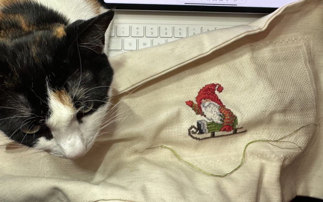
My general method of cross stitching is sitting in my recliner chair with my iPad Pro in the Magic Keyboard so it’s floating right in front of me. Then I have my cross stitch in my hands with a standing magnifier light handy to pull over the fabric when I need it. The one problem this doesn’t solve is that our cat Ada Lovelace seems to love lying on my chest while I’m trying to cross stitch but that’s a whole ‘nother problem.

Even on iPhone
The last advantage of this technical solution is that since the pattern is in Notability, I can access it even from my iPhone if my iPad isn’t nearby. I’ve worked this way while cross stitching as a passenger in the car where it’s a little harder to hold the iPad. It’s not ideal since I don’t have a Pencil to make precise dots on the pattern. Instead, I use my big fat finger to try to find the center of the squares. I get close enough probably 60% of the time and have to hit the undo button the other 40% of the time and try again. It’s not great but I still like it way better than using the paper method.
Bottom Line
The bottom line is that by combining the technology of a good camera in the iPhone, image editing for white balance and cropping with Apple Photos, and an iPad with Apple Pencil, I can now relax and cross stitch even with a bad pattern.