Jump to Tips
I’m back with Part 9 of Tiny Mac Tips. This is an ongoing series I started in order to teach Jill from the Northwoods how to move from an adequate Mac user to a proficient one. In case you missed the earlier installments, I’ve included links to the first 8 installments:
- Link to Tiny Mac Tips Part 1
- Link to Tiny Mac Tips Part 2
- Link to Tiny Mac Tips Part 3
- Link to Tiny Mac Tips Part 4
- Link to Tiny Mac Tips Part 5
- Link to Tiny Mac Tips Part 6
- Link to Tiny Mac Tips Part 7
- Link to Tiny Mac Tips Part 8
I want to ask you a question before I start. If the tips I’m going to give you truly are tiny, but because I want to be thorough they take me a long time to explain, do they still count as Tiny Mac Tips? And while we’re asking philosophical questions, why do I call this Tiny Mac Tips? Is the Mac Tiny? Maybe this should have been called Mac Tiny Tips. Oh well, here we are. I only have three tiny tips in this segment but two of them were fun to dig into.
Scan from iPhone or iPad
If you need to do a lot of scanning, you probably have a flatbed scanner or better yet one of those fancy multi-sheet scanners. But what if you don’t have room for one of those devices, or you’re mostly paperless, and only occasionally need to scan in a receipt or some random piece of paper? If you’re a macOS and iOS user, you can use your iOS device to scan right into your Mac.
Apple uses the word Continuity to describe a whole slew of services that let you use your Apple devices in concert with each other. One of those features is called Continuity Camera and that’s what we’re going to talk about today. You may have heard of Continuity Camera in the context of using an iPhone as a webcam, but Continuity Camera also lets you use your iOS device’s camera as a scanner.
Before I explain how easy this is, let’s quickly walk through the requirements. Both your Mac and your iOS device must have WiFi turned on, but they don’t have to be connected to a WiFi network. They must both have Bluetooth turned on, and you must be signed into the same Apple Account on both devices using two-factor authentication.
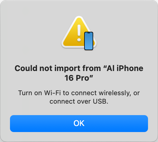
It might sound obvious but you also need to have the iOS device near the Mac.
Let’s start with my favorite way to scan into my Mac, and that’s straight into the Finder. Let’s say you have a folder for receipts. Open it up in any view where you can see some empty space (where you will not be clicking on any existing files). Right-click in the empty space to see the contextual menu.
You’ll see the usual suspects such as New Folder, Get Info, and more, but at the bottom, you should see Import from iPhone (or iPad) with a chevron to the right. Move over the chevron and you’ll see the name of your device and below that, three options: Take Photo, Scan Documents, and Add Sketch. You can play around with Take Photo and Add Sketch on your own time – we’re doing serious business here so we’re going to select Scan Documents. I’m going to just say “iPhone” from here on out, but you understand this applies to all iOS devices.
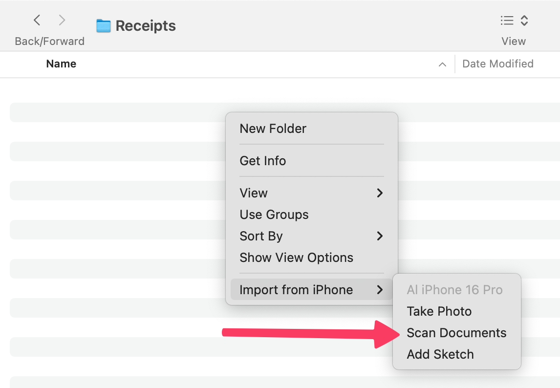
As soon as you choose Scan Documents, even if your iPhone was locked at the time its camera will turn on. You’ll see the camera shutter button and above that, it will say “Position the document in view”.
Now hover your phone over the document you want to scan. As soon as the camera recognizes there’s a rectangular area to scan, it will highlight it in blue and automatically scan the document.
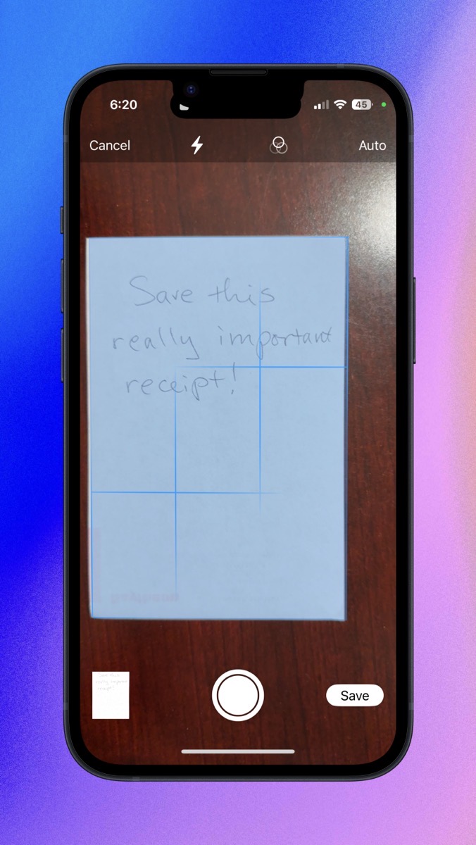
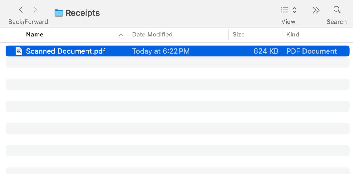
If you only need to scan that one page, simply hit Save. The camera will shut off, your phone will go back to the lock screen, and in Finder, you’ll see a new document called “Scanned Document.pdf”. That’s literally it. In what, 4.7 seconds you have scanned a document into your Mac.
But wait! What if you have a multi-page document? No problem. After you scan the first page, instead of hitting save, simply move your camera so it can’t see anything to scan, flip the page over, bring the camera back, and hover over the second page. The scanner function will add that second page to the PDF and you can keep going until your entire document is scanned, and then hit the Save button.
But what if you make a mistake on a page? Tap on it right after you take it, and you’ll get the option to Retake the shot. Along the bottom you’ll also see controls to rotate the scan or crop it before moving on. There’s also a three-circle icon that will let you adjust the color to grayscale, black & white, or photo. Finally, you get a trash can if you just want to delete that one page.
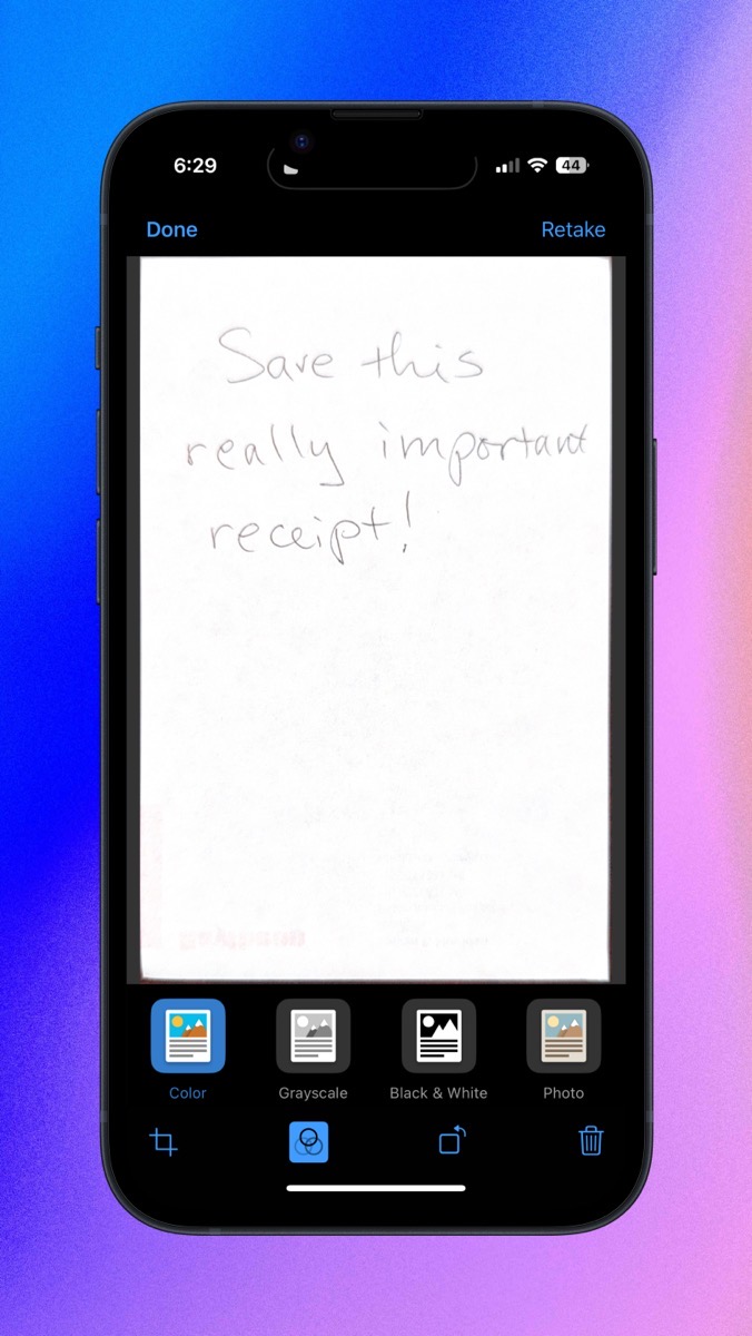
I’ve explained how the camera automatically scans a document when it finds anything that looks like a candidate to be scanned, and how you have to move your camera away while you’re flipping the pages so it doesn’t scan by mistake. This might sound stressful or perhaps you’d like a little more control. If that’s the case, when the camera comes up to scan, in the upper right, tap the word Auto and it will switch to Manual.
In the manual mode, when the camera recognizes the document by showing you the blue rectangle over it, the shutter button won’t automatically be activated, you have to tap it to take the scan. After you scan each page, you’ll get the opportunity to adjust the corners of the scan, retake, or keep the scan before moving on. Now that I think about it, this does sound less stressful! It might take me a little longer but I’m always wildly swinging my arm around behind my back to hide the documents from my phone while I turn the page!
Also at the top, when the scanner is active, you’ll see the same three-circle icon I mentioned earlier, which lets you change the mode to grayscale, black & white, or photo for all subsequent scans. If you don’t have good lighting for your scanning, there’s a lightning bolt at the top of the screen that will let you control the flash.
I use scan from iPhone all the time on my Mac, even though we have a flatbed scanner and a fancy sheet-feeder scanner. For the few documents I need to scan, it’s far easier.
While I scan primarily into Finder, you can also use this technique to scan directly into Mail or Messages. This means you can send a document to someone without saving it locally first. You can also scan directly into Keynote, Numbers, Pages, Notes, or TextEdit.
You may think your hardware is too old for Continuity Camera, but there’s a good chance you’re in luck. According to Apple’s support article about scanning with Continuity Camera, all iPhones, iPads, and even iPod Touches running iOS 12 or later can be used as scanners. Running macOS Mojave or later, Macs as old as 2012 MacBook Pros, Airs, minis, and iMacs can run Continuity Camera for scanning. Even the MacBook introduced in 2015 can play. The Mac Pro from 2013, and the Mac Studio enjoy all the fun too.
Every time I use the scan function with my iPhone I appreciate even more the connective tissue between all of my Apple Devices.
Quicklook
On your Mac, have you ever been looking at some files and you’re not sure which is the right one? You could double-click each file and have it open in its default application to see if it’s the one you want, close it, and double-click the next candidate, rinse and repeat. This process is tedious, and there’s an easier way.
One of the hidden gems of macOS is called QuickLook. If you simply select a file in Finder and hit the space bar, it will pop open in a little viewer in front of you. If the selected file is an image file, you’ll see the image. If it’s an audio file, the popup window will have an audio player button so you can listen to it. If it’s a PDF, the popup window will not only show you the first page, it will have a little sidebar of thumbnails so you can flip between pages. Word, Pages, and plain text format files opened with QuickLook allow you to read them. Even video files will play inside QuickLook. Whatever file you investigate with QuickLook, in the upper right, you’ll see an option to “open in” which will open the document in your default application for that format.
I’ve been using QuickLook pretty much since its inception 17 years ago, I have a bonus tip I only learned about QuickLook this week from Adam Christianson during a recent Mac Geek Gab. He explained that QuickLook works in the open dialog box too. Let’s say you open TextEdit and you’re offered the Open dialog box to choose a file to open from the Finder. Hit the space bar on each file from the open dialog box to check the contents before opening. I guess it makes sense, but it absolutely never occurred to me to try it. Anywhere you can see the Finder view, QuickLook is there to help you see inside files without opening them.
Control the Dock
As you’ve undoubtedly noticed, macOS provides us with a Dock across the bottom of our screens to allow us quick access to our applications. For seasoned Mac users, this might be a bit rudimentary of a starting point but I don’t want to leave anyone behind. I’m going to dive deep into the Dock so there may even be a nugget in here you didn’t know. Spoiler, I learned a few things researching how to explain the Dock.
The first thing to know about the Dock is you don’t have to keep any application in your Dock you don’t care about. It’s simple to remove applications – click and drag them out of the Dock until you see the word Remove above the icon, and then let go. In the old days, we used to get a cute puff of smoke when we removed an app but they took the joy out of it and now it just makes a sound.

If you want to rearrange applications in your Dock, click and drag them left and right to change the order. If you accidentally drag an application out of the Dock, they’re easy to add too.
To add applications to the Dock for quick access, simply drag them from the Applications folder into the Dock. As you approach the Dock, the existing applications will slide apart to make room for their new friend.
On the far right side of the Dock, there’s a vertical splitter, and it has magical powers. Ok, maybe not magical but it has some cool features.
I’ve been saying all through this that we can put Applications in the Dock, but we can also put folders and files in the Dock, but only if you put them on the right side of the splitter. Since it’s so easy to drag things in and out of the Dock, you can feel free to drag folders down into it that you want quick access to this week but maybe not next week. It can be a real timesaver for accessing files.
Did you know that if you click and drag up and down on the vertical splitter, the Dock embiggens and shrinks the icons?
If you have multiple displays, have you ever had the problem where applications are opening on the wrong screen? If you click and drag up/down on the vertical splitter on the display where you want applications to open, that will actually fix it. I wish I knew why it goes wrong like that, but I’m glad to know this quick fix.
If you right-click on the splitter, you get a small menu of options to modify the Dock. From this little contextual menu, you can turn on hiding so it disappears and reappears when you move your cursor away from the bottom of the screen and back down. You can also toggle hiding off.
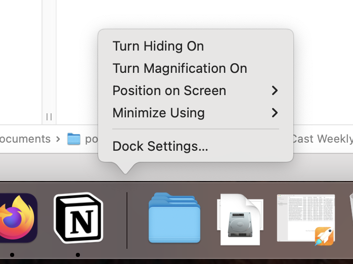
If you have a lot of applications and folders and files in your Dock, the icons start to get really tiny, especially if you have a smaller screen. From this contextual menu, you can turn on magnification so that as you drag your cursor across the icons they get larger and much easier to see.
I’ve been talking about the Dock being on the bottom of your screen, but from the contextual menu, you can change it to the left or right side of the screen. I think it’s much more logical to take up some width on the screen by putting it on one of the sides (since our screens are wider than they are tall), but every time I try it that way I end up putting it back on the bottom because it seems to not work as well there for me.
On the Mac, you can hide applications in several ways. You can use the yellow button in the upper left of the window, you can click on the running application’s name, and select Hide from the dropdown menu, or you can use the keystroke ⌘-H. If you’re not using Stage Manager, all of these methods will cause the application to swhoosh down into the Dock.
With our little contextual menu from right-clicking on the divider in the Dock, we can change the animation you see during that swoosh. If you don’t like a lot of falderol, choose scale and the app will very quickly scale down to disappear into the Dock. But if you like a bit of whimsy in your life, you might enjoy the genie effect for hiding. With the genie effect, your applications will squish down like the cartoon genie Robin Williams played in Aladdin going back into the lamp.
My main goal in bringing up the Dock for a “tiny tip” was to make sure you knew that you have a lot of control over the functionality, look, and feel right from the Dock. If you want even more control, in that same right-click on the divider contextual menu, you’ll see you can get to even more options with Dock Settings. This opens System Settings → Desktop & Dock, where the top third of the panel is all about changes you can make to the Dock. There’s not a lot more than you can do right from the Dock but there are a few extras.
I promise this is the last Dock-related tip. Unless I change my mind and think of another one. If you do add folders to your Dock, you’ve got quite a few controls at your fingertips.
As you’ve probably noticed, a single click on the folder will show you the items in the folder. But did you know you can immediately open the folder in Finder by Option-Command-clicking on the folder? Credit to John Siracusa for talking about this on a recent episode of the Accidental Tech Podcast. Another one I just learned this week!
Right-clicking on the folder gives you an altogether new contextual menu with tons of options. You can change the “sort by” criteria in the folder contents that pop up on a single click. You can choose whether to display the folder as a single folder icon, or as a stack of folders and files in the Dock.
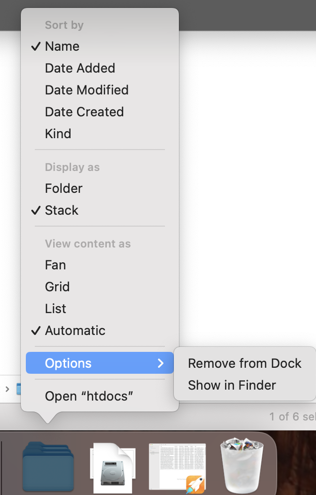
You get to decide how the items inside the folder are displayed when you click on the icon. Fan will pop up the list of items in a curve to the right as though you’ve fanned a pile of folders and files out on a desk. Grid will give you a view much like icon view in the Finder, while List will give you essentially the Finder List view with little chevrons to the right on any folders allowing you to navigate into them and open any files within with a single click. I have to admit that I never use the Dock to access files and folders, but now that I found List view, I think I might use it!
There’s also an option of “Automatic” under View Contents As, and I was too lazy to go through and run a bunch of tests to see what kind of contents will cause Automatic to change from Fan to Grid to List. I’ll leave that as an exercise for the student.
For files and folders and even Applications, right-clicking gives you an options menu that includes Remove from Dock (in case you didn’t know you could simply drag it out), and Show in Finder. On applications Show in Finder won’t be all that exciting, but for files and folders, it could be valuable.
Remember when I said I promised I was done with the Dock unless I thought of something else? Well, I forgot all about the fun you can have with Finder in the Dock. With a right-click, you can open a new Finder Window, create a New Smart Folder, or with the Find… option, open a Finder window with the cursor in the search box and Kind set to Any ready for a detailed search of your drive.
In the contextual menu on Finder in the Dock, you can choose Go to Folder. This lets you type in the path to a folder. This is the same functionality as using the Go menu in Finder or using Command-Shift-G to navigate to a Folder. It seems to me if you’re a type-in-a-path type of person, you’re unlikely to also be a two-finger-tap on the Finder icon in the Dock type of person, but it’s there if you want it.
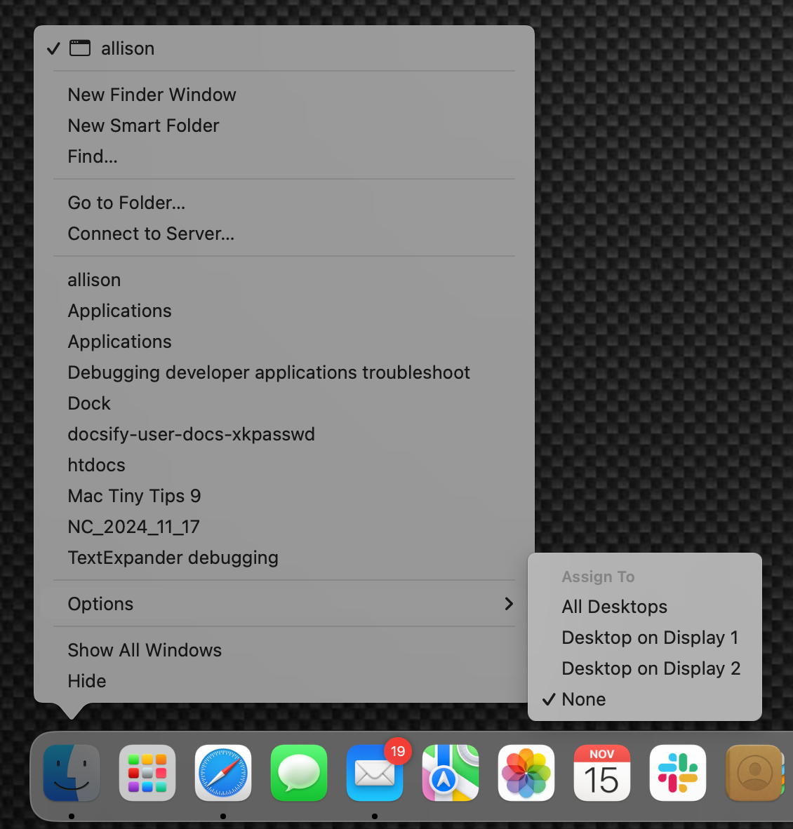
I honestly never noticed it before, but you can also see your most recently accessed folders in a list in that same contextual menu on the Finder icon in the Dock. That might be handy.
Whether you’re looking at the contextual menu for files, folders, applications, or the Finder, you always see the option to decide which Desktop the item will open in. This is relevant for Spaces users, and I’m assuming they’ll understand the options shown.
Have you ever been working on your Mac and the Finder gets its panties in a bunch? This happened to me today. I was trying to move a 44KB screenshot file and I got the spinning pizza wheel of death. I used the X to stop the transfer, tried it again, and Finder locked up again.
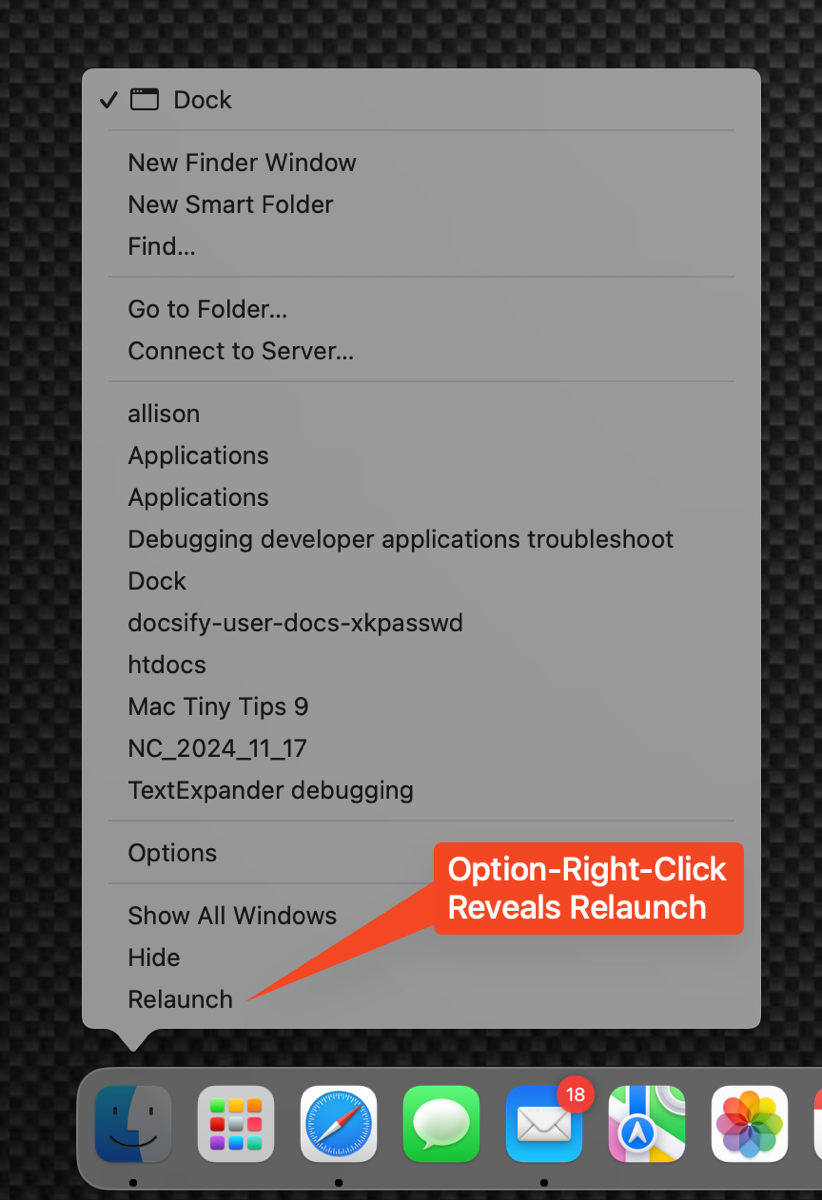
The solution to a jammed-up Finder is to relaunch it, and you can do this right from the Dock. Instead of right-clicking on the Finder icon, hold down the Option key and then right-click on Finder. This will add Relaunch to the contextual popup window. When Finder couldn’t seem to move that tiny PNG, I chose Relaunch, Finder disappeared, and came back in a split second. I tried to move that itty bitty file and it moved without issue. Saved myself a reboot right there.
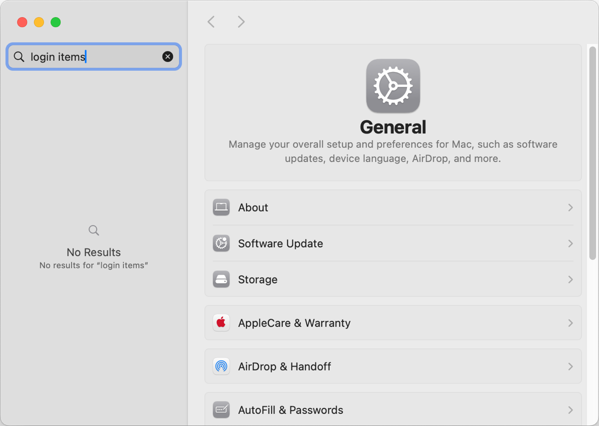
In System Settings, we can define which Applications launch at login, but I find System Settings a tedious place to go hunting for things nowadays. They keep moving things and adding things and search is at best 72% successful at finding things. Case in point, search in System Settings doesn’t find login items.
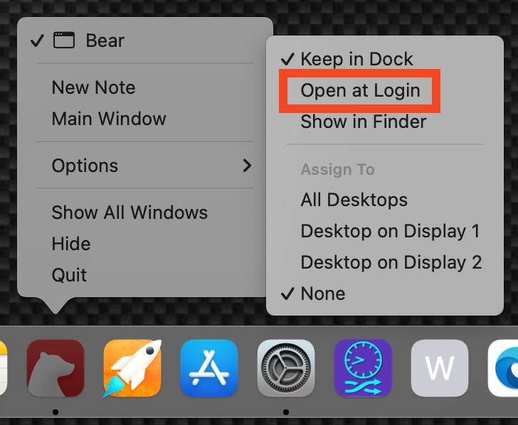
If you have an app in your Dock, you can change whether it launches at login right from the Dock. Right-click on its icon and choose Options → Open at Login and you’re done! Better yet, it’s a toggle, so if an app is opening at login but you want it to stop, simply uncheck Open at Login and it will stop. I think that sub sub sub tiny tip was worth the price at admission.
Bottom Line
I know this Tiny Mac Tips session was really more of a deep dive, but in reality, the three tips are: you can use your iPhone or iPad or even iPod Touch as a scanner for your Mac, QuickLook will let you peek inside files without opening them, and the Dock is highly customizable and has functionality built into it that you might not have known about.


Thank you for reminding me of the scan feature, I knew it was there, but never really use it 🙂 As I have to hand in my passport on Monday – I’ll get a shiny new one – I decided to quickly take a picture of all the fun stamps I got in the last ten years 🙂