On last week’s NosillaCast, I told you about how Paul Nielan made a very generous donation to support the show using PayPal. I also read you his letter in which he explained that he would have done it sooner but he had trouble getting over the hump of creating a PayPal account. He also said if I just had an Apple Pay button that would have made it easier for him. This had literally never occurred to me before he suggested it.
I did a bit of hunting around and found that the service Stripe could give me a way to take donations without the user having to open an account. Here’s a fun fact. Stripe is an Irish-American multinational company dual-headquartered in Dublin and California. Completely in alignment with Bart and me.
I try to keep the dirty money bits away from the podcast but I think this is an interesting point in time to talk about how these systems work from my end and then get into the technical aspects of making this change. PayPal charges me a 2.99% payment processing fee so if you donate $25, they take 75¢ leaving me with $24.25.
Stripe also charges a fee and it’s a smidge less at 2.9%, but they also charge a $0.30 fee on top of that. So the same $25 donated using Stripe would leave me with $23.98 vs. the $24.25 through PayPal. As the donation amount gets bigger, that tiny difference in the fee percentage outweighs the 30¢ fixed fee, but overall they’re close enough for me to consider them equivalent.
The main thing from my perspective is that if I make it easier for you, you’re more likely to push the button and that beats 30¢ every time.
Setting Up Stripe
The first step was to create a Stripe account, which was unsettling. Since they’ll be doing financial transactions on my behalf, depositing money into my accounts, and I presume reporting my income somewhere, they need to know pretty much every bit of personally identifiable information. This included my address, phone number, bank account number, and social security number. Yikes. I did all of this with PayPal and Patreon of course, but I haven’t done it recently.
I wasn’t comfortable with having my phone number and home address in the system because the way they described it, my phone number and address would appear on invoices you’d be sent after you’d donated. I love you all but that’s a smidge more exposure than I was interested in. Luckily I did some online sleuthing about it and found a toggle where I could turn it off and it turned out to be off by default.
Stripe is designed for people selling things so there are a lot of features I don’t need. There wasn’t any upsell though, and I was able to create a simple form fairly quickly with the relevant information.
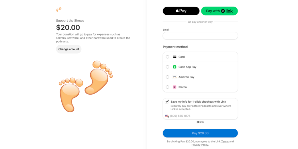
I was able to add my Podfeet logo to the form. Oddly it put a cute little Podfeet in the upper left and a GIANT pair of Podfeet in the middle too. Not sure how to control that. They had some branding options to match my color pallette but it seemed a bit extreme. The defaults I think will be more familiar to people which gives a feeling of confidence. You’ve seen this screen before.
It was suggested that I put in a default dollar amount so I chose $20, but you can change it. It’s not as obvious as I would have liked – it’s a light grey pill button that says Change Amount and then the $20 becomes editable. Hey, maybe I should have made it $1000 so you’d be motivated to find the button! I did poke around a bit to see if I could let you change to a currency of your choosing but I didn’t find a way to do that yet.
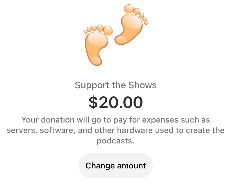
Right below the suggested amount, they gave me a description field. This way you can see that, “Your donation will go to pay for expenses such as servers, software, and other hardware used to create the podcasts.”
The best part is that prominently displayed at the top is the black button with Pay in white. You can’t miss it! While that was my main goal, Stripe also allows a whole slew of options. You’ll be able to use any credit card (not just Apple Pay), you can use the Cash App, Amazon Pay, something called Klarna and another one called Link. I’ve noticed that while the ApplePay logo is prominently on top, the other services cycle through a number two spot next to it.
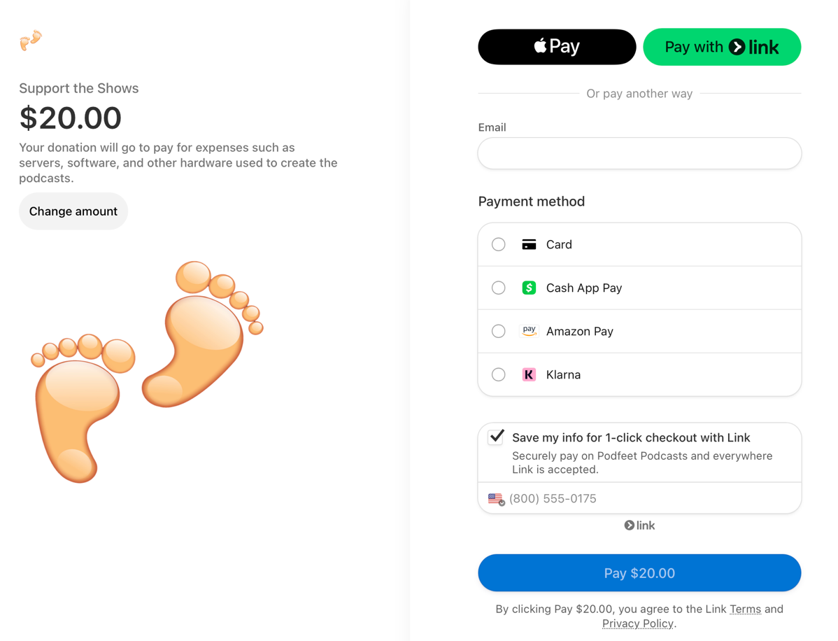
I was talking to Pat Dengler about Stripe as she’s been using it for ages, and she asked why I didn’t have Google Pay. I went back to where I added Link and other services, and sure enough, I was able to put in Google Pay. Oddly Google Pay doesn’t show up though on the payment page and I haven’t been able to figure out why.
And if you don’t use Safari but instead use a Chromium browser like Microsoft Edge, Arc, or even Google Chrome, you don’t get Apple Pay. I looked up why and it had something to do with Apple’s security requirements.
I haven’t dug into it too much yet, but there’s an option to set up subscriptions in Stripe, which might be interesting. What if you wanted to do regular monthly donations but you didn’t want to have a Patreon account? I’m not sure how it works though – I think I might have to assign you a price which isn’t quite the right way. That’s just a thought for the future.
Redirect from Gloppy URL to Memorable
Once I had the form set up and gave away my first-born child to Stripe, the service gave me a long gobblygook URL. It starts with buy.stripe.com with the glop after that. But you know I won’t make you remember that address.
In the vein of “everything good starts with podfeet.com” I needed to come up with a memorable name to send you to. I could have used podfeet.com/stripe but then you’d have to remember what service I chose. Also if I ever changed from Stripe, then that would stop working and you’d have to learn a new URL.
Just like how podfeet.com/chat takes you to Discord in case we move how we chat, this fancy new link to Stripe is at podfeet.com/donate. I know, I know, Patreon is at podfeet.com/patreon and PayPal is at podfeet.com/paypal but I’m future proofing, ok?
In order to create these redirects so you don’t have to remember hard URLs, I have to do some interesting work. My server is hosted by DigitalOcean, and if Iog into their web service, I get a button to open Console which logs me into my server at the command line with root privileges. I know this is possible using GUI tools like Core Shell (available in Setapp) but it seems kind of fragile to me. I keep having to ask Bart or Bill to help me get it working again. The Console button on DigitalOcean’s site is 100% reliable which is why I choose it instead.
Now that I’m logged into my server with root privileges, I have to remember the structure of how my web server is set up. As you’ll probably remember, awesome NosillaCastaway Bill helped me do some major surgery on my server including moving it from the webserver Apache to NGINX. The good news is that I took copious notes as told me what to do. I keep those notes in Keep It by Reinvented Software.
I’m glad I have these notes because he created a structure that has more than one directory that looks like it’s my webserver. There are sites-available and sites-enabled. In my (copious) notes I quoted Bill:
Only make changes to the files in the sites-available directory, the symlinked files in sites-enabled will automagically change
And I recorded that all this is in /etc/nginx/sites-available.
Ok, so we’ve logged into the console as root, and I know to change directory to sites-available. I also recorded that the file to be edited to add redirects is called podfeet.conf. I didn’t write it down, but I know that every time we messed with this file, Bill made a copy of it first with the current date, just in case we borked it up.
This podfeet.conf file has a lot of stuff in it, but the section we’re interested in is the redirects.

I usually duplicate and then edit one of the existing redirects because it’s pretty arcane. The line says location = and then forward slash and the word I want you to use in the URL so I put in /donate. Next, we have to tell the web that this is a redirect, and you do that with the term return 302 followed by where you want it to redirect to – in our case the Stripe URL. All put together it reads:
`location = /donate {return 302 https://buy.stripe.com/14k5lve7fcEn3nyfYY;}`
Once the file is safely saved, I need to tell the webserver NGINX to reload so it sees the new config file. That’s done with a system management command called systemctl.
systemctl reload nginx
At that point, I was able to type in podfeet.com/donate and verify that it redirects to our fancy new Stripe page offering Apple Pay and other payment methods.
Support the Show
On Podfeet.com, one of the red buttons says “Support the Show”. That button takes you farther down the home page to a row of linked images for the different ways you can help out. We’ve got Patreon, PayPal, a link to all of my referral links, and finally a suggestion to support the show by recording a review. I wanted to add an icon that would take you to our fancy new donate page over on Stripe.
I use a theme called SiteOrigin North which gives me kind of a little building block method to create the custom home page you see. I had 4 icons for supporting the show so I had to squeeze another one in for the Stripe link, but I didn’t want to use Stripe’s logo.
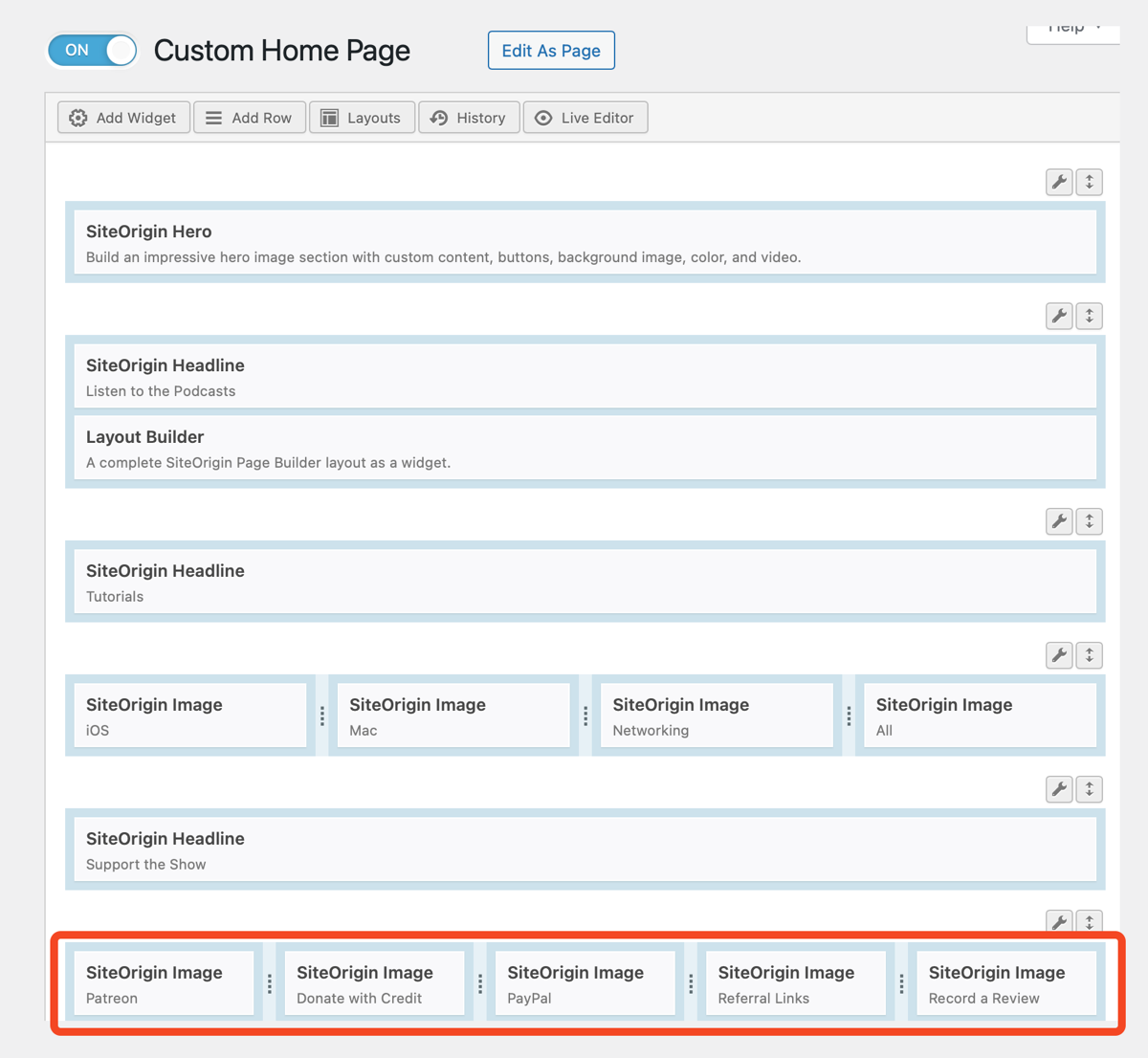
Instead, I used The Noun Project which is the worst name for an awesome service to find icons. I pay for this service because it’s so great but it has the most unmemorable name! I found one that looks like a Mastercard with the little magnetic stripe and the icon has a dollar bill symbol on it. In The Noun Project, you can change the color before you download the icon so I made it the same flashy red as my buttons.
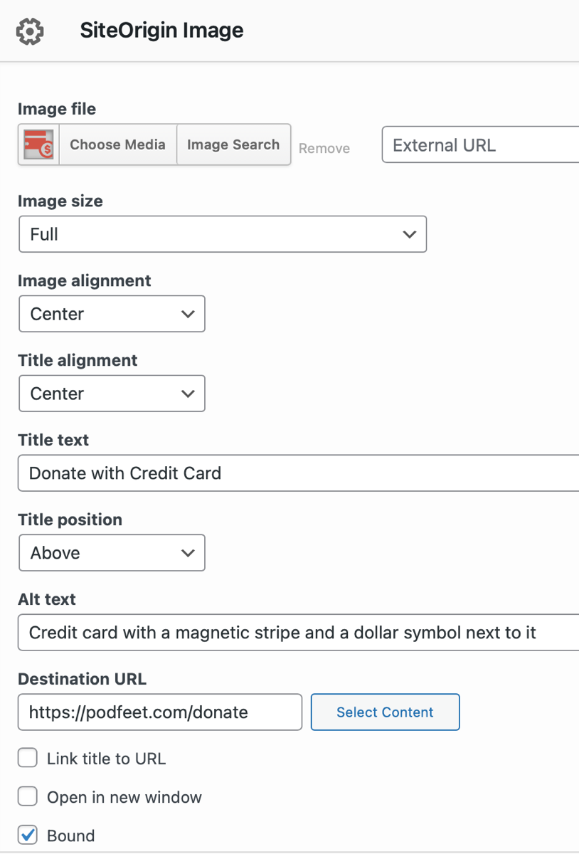
I uploaded my fancy new icon and resized it to mostly match the other ones, and now we have a link to Stripe that says, “Donate with Credit Card”.

While I was there messing around with the home page, I realized that the row of icons above the ways to support the show was for tutorials and I don’t really do that many tutorials per se anymore. I deleted that entire row so the page is a lot shorter. Then I noticed that I still had a Twitter icon as a way to be in the conversation, so I deleted that for obvious reasons.
I noticed that there’s kind of a big gap in the rows and I’ve got to fix that, but it’s kind of arcane how to do it in the SiteOrigin North theme builder so I’ll save that for another day.
Bottom Line
This could have been a one-liner when I panhandle for donations in the middle of the show, but I thought it might be fun to pull back the curtain on how all of this works in the background.

Allison — I just tested it out for you… works well! (Although I used my personal email, davep116@gmail.com.)
Woohoo! Thanks, Dave!